


Concord vs. Spotted Thunder
Branding & Identity • Packaging Design • Print Production
Concord vs. Spotted Thunder is a custom illustration, branding, and packaging project built around a fictional comic book universe. The story centers on Concord, a jellyfish-mermaid hybrid, and Spotted Thunder, a glowing manta ray character, using a deep purple and neon visual language inspired by bioluminescent underwater environments.
The project includes an illustrated comic book cover and a fictional energy drink brand called Toxin. Together, the pieces create a small but cohesive fantasy world where character design, product packaging, typography, and color all support the same glowing underwater narrative.
Branding & Identity

RGB 29, 0, 90
CMYK 96, 100, 22, 34
HEX #1D005A
PMS P 2755 C
Indigo
RGB 109, 43, 160
CMYK 67, 94, 0, 0
HEX #6D2BA0
PMS P 267 C
Violet
RGB 221, 180, 248
CMYK 14, 32, 0, 0
HEX #DDB4F8
PMS P 2562 C
Lilac
RGB 134, 211, 255
CMYK 47, 0, 0, 0
HEX #86D3FF
PMS P 2905 C
Aqua
RGB 255, 255, 255
CMYK 0, 0, 0, 0
HEX #ffffff
PMS P 1-1 C
White
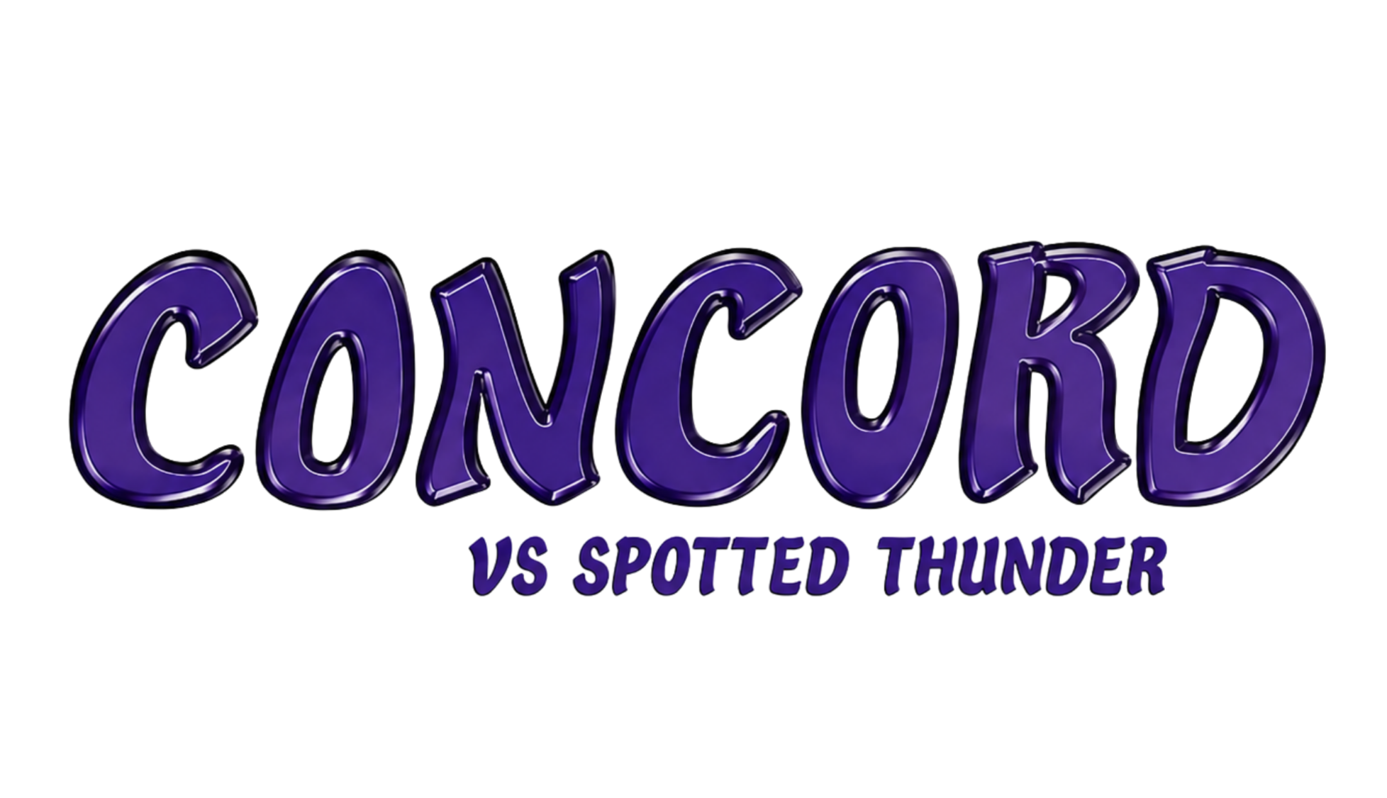
The Concord identity uses deep indigo and violet tones to create a dark underwater atmosphere, while lilac, aqua, and white accents bring in the glowing bioluminescent effect. The logo and type choices separate the two main parts of the project: the comic book identity feels bold and dramatic, while the Toxin packaging feels playful, strange, and product focused. Together, the colors, typography, and illustrated elements help the comic cover and energy drink packaging feel like they belong to the same fictional world.

Primary Typeface
Logo and Cover Title

Secondary Typeface

Logo and Product Titles
Tertiary Typeface
Story and Details


Visual World
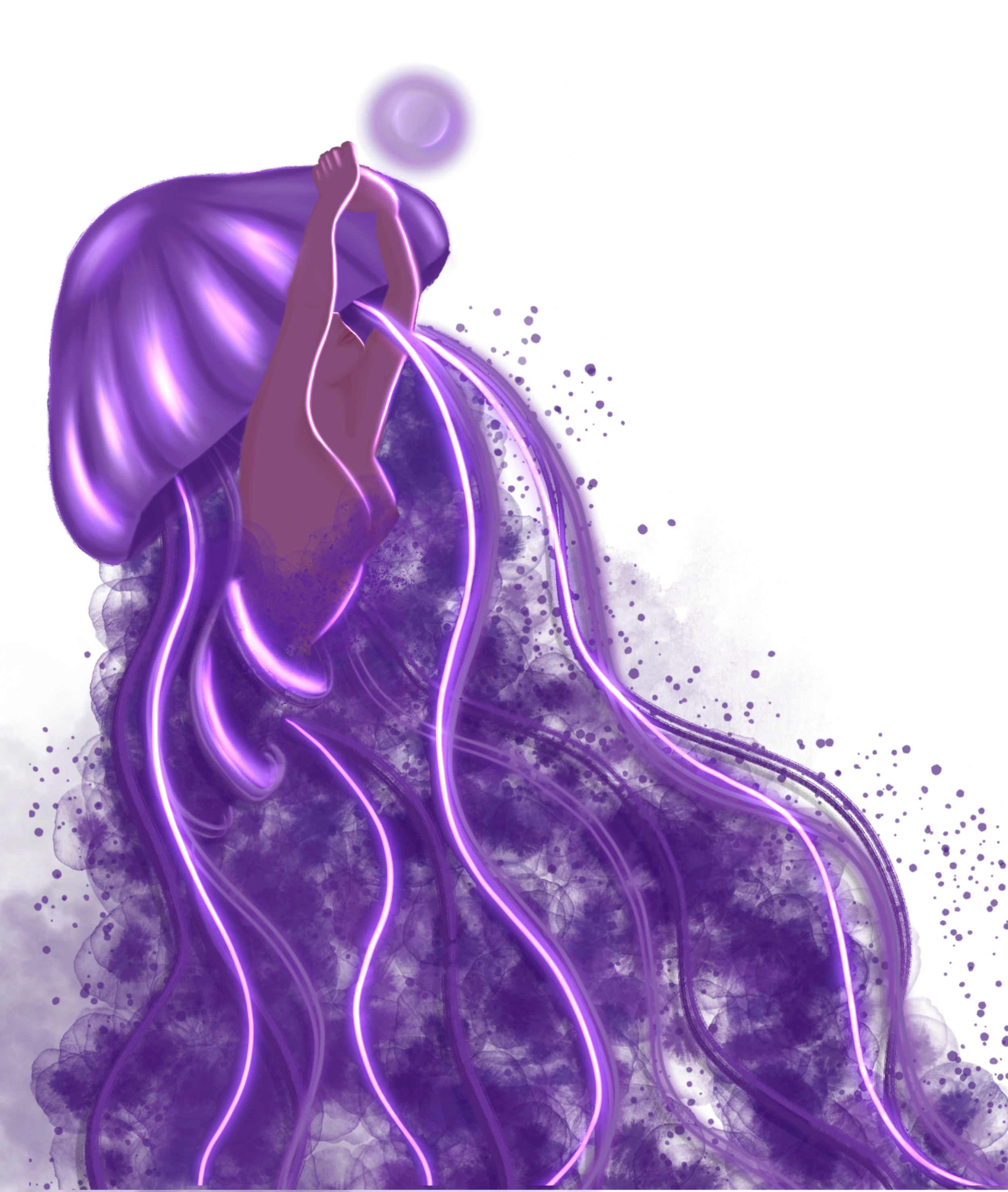
The visual direction for Concord is centered on glow, atmosphere, and fantasy. A dark purple palette creates the underwater setting, while neon highlights mimic the look of bioluminescent sea life. Soft gradients, glowing outlines, bubbles, and layered textures help the artwork feel immersive and connected to the story world.
Instead of treating the comic cover and drink packaging as separate pieces, the project uses the same visual language across both: glowing characters, fantasy-inspired typography, and underwater color effects.
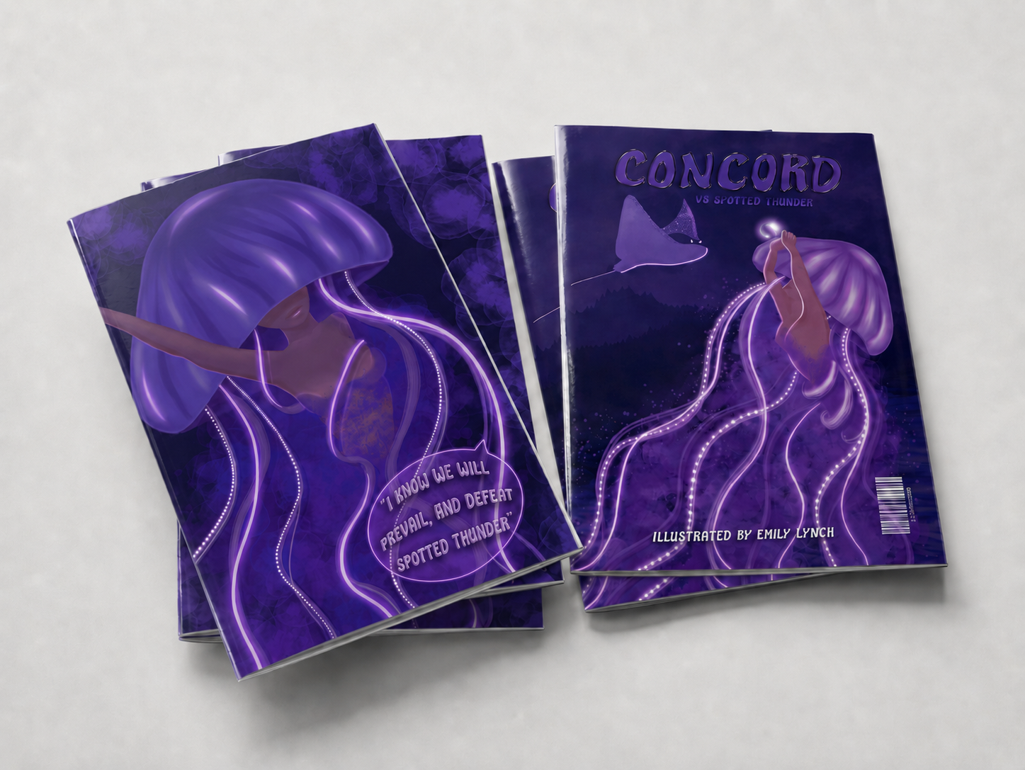
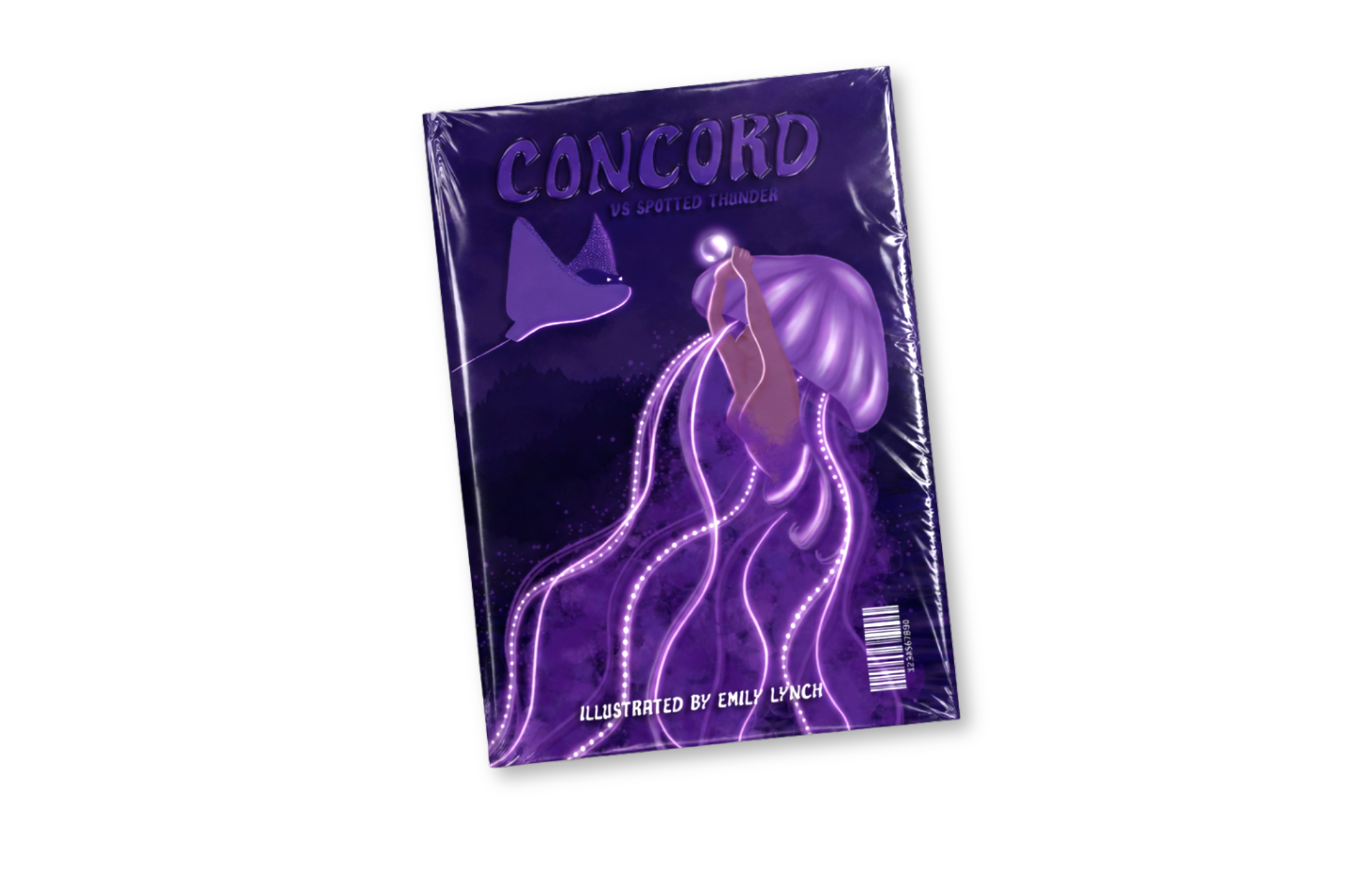
Comic Book Cover
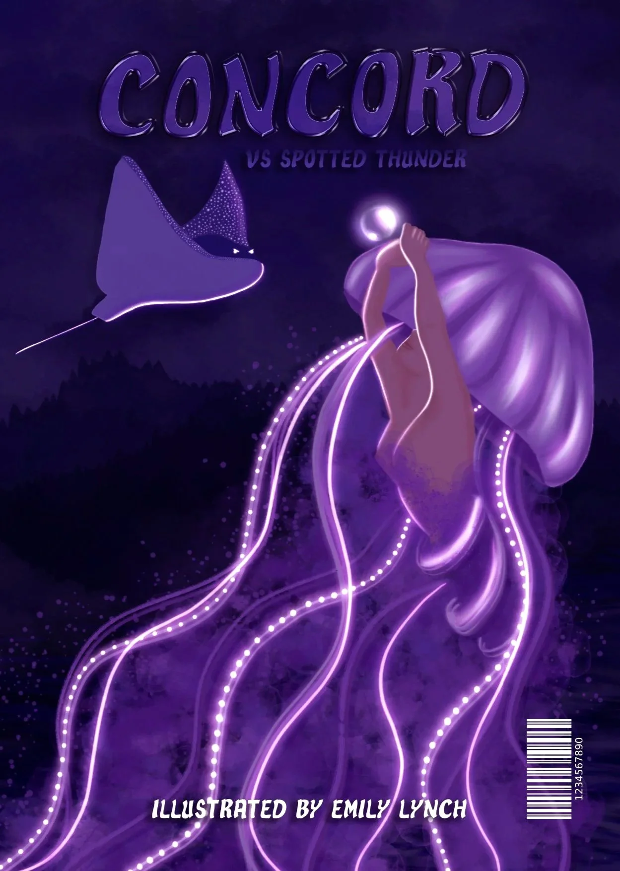
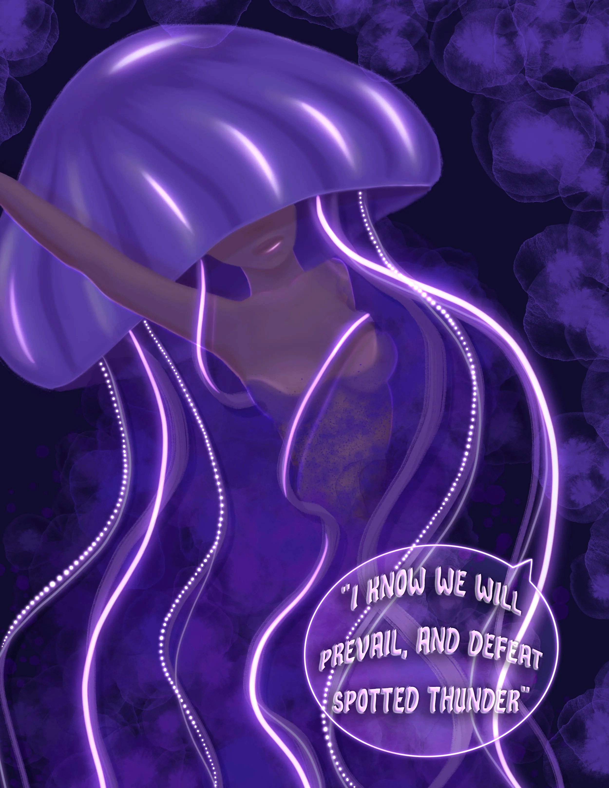
The comic book cover introduces the central conflict between Concord and Spotted Thunder. The composition use dramatic scale, glowing tentacles, and a dark underwater background to create a fantasy-action tone while keeping the main character as the visual focus.
The cover also establishes the project’s core identity system, including the Concord title treatment, purple color palette, illustrated character style, and glowing visual effects that carry into the packaging design.

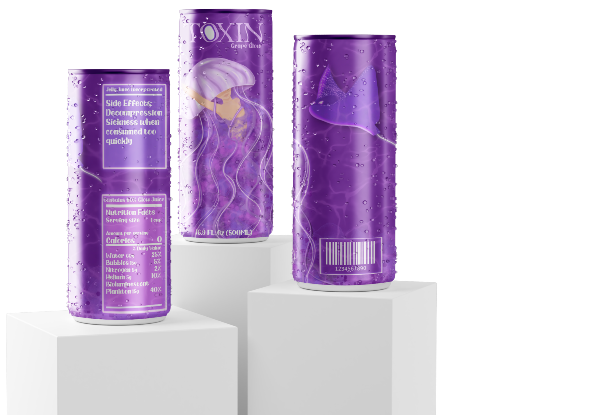
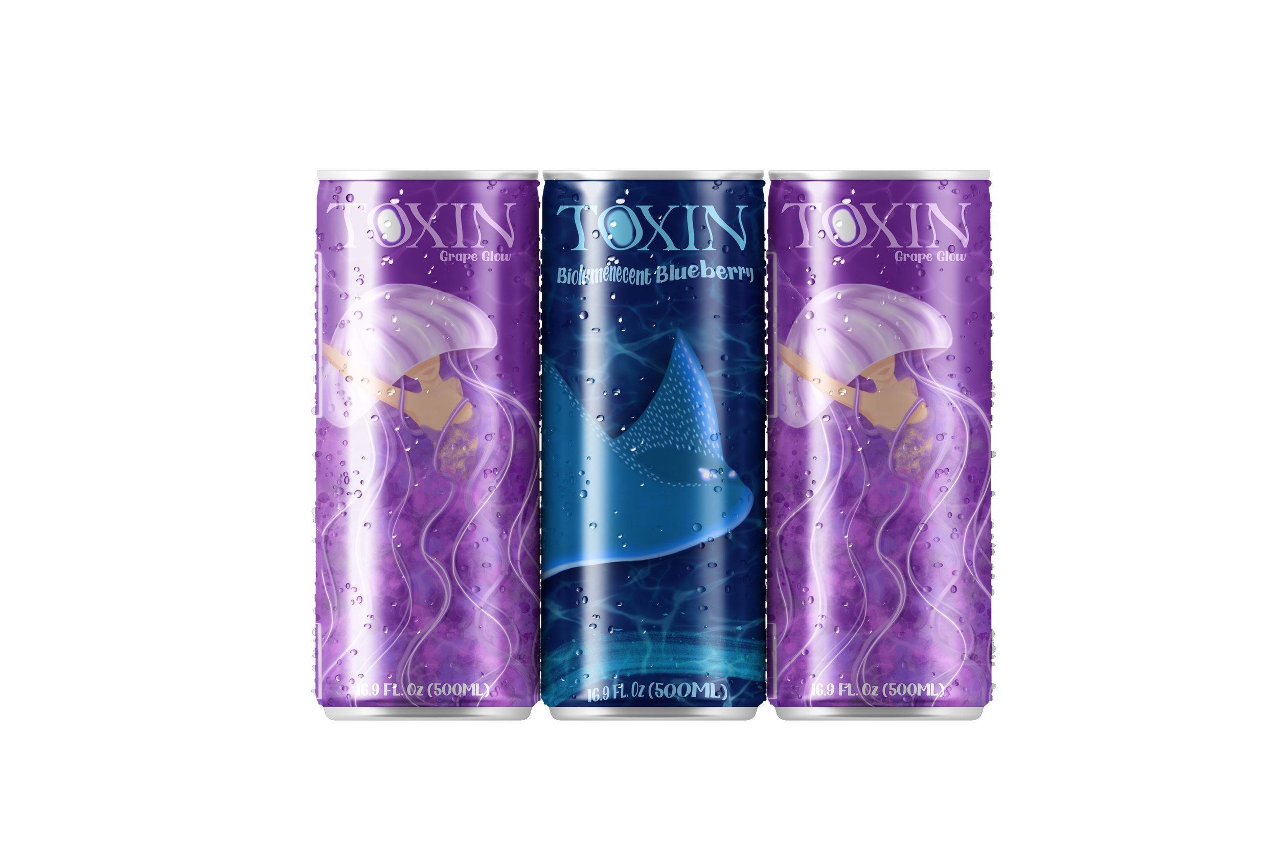
Toxin Energy Drink Packaging
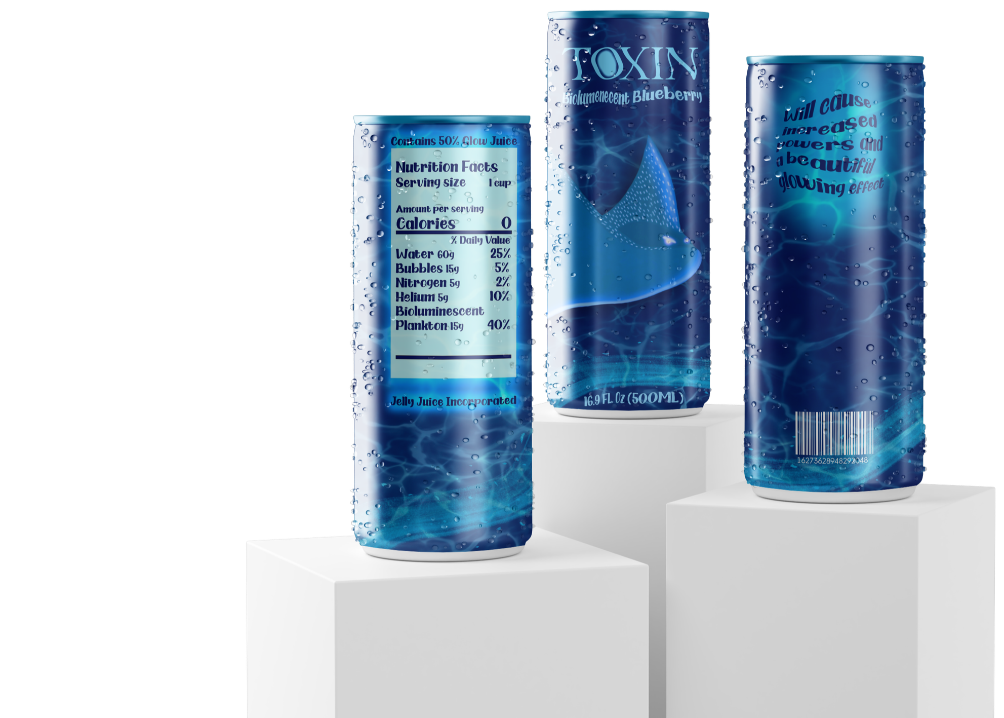
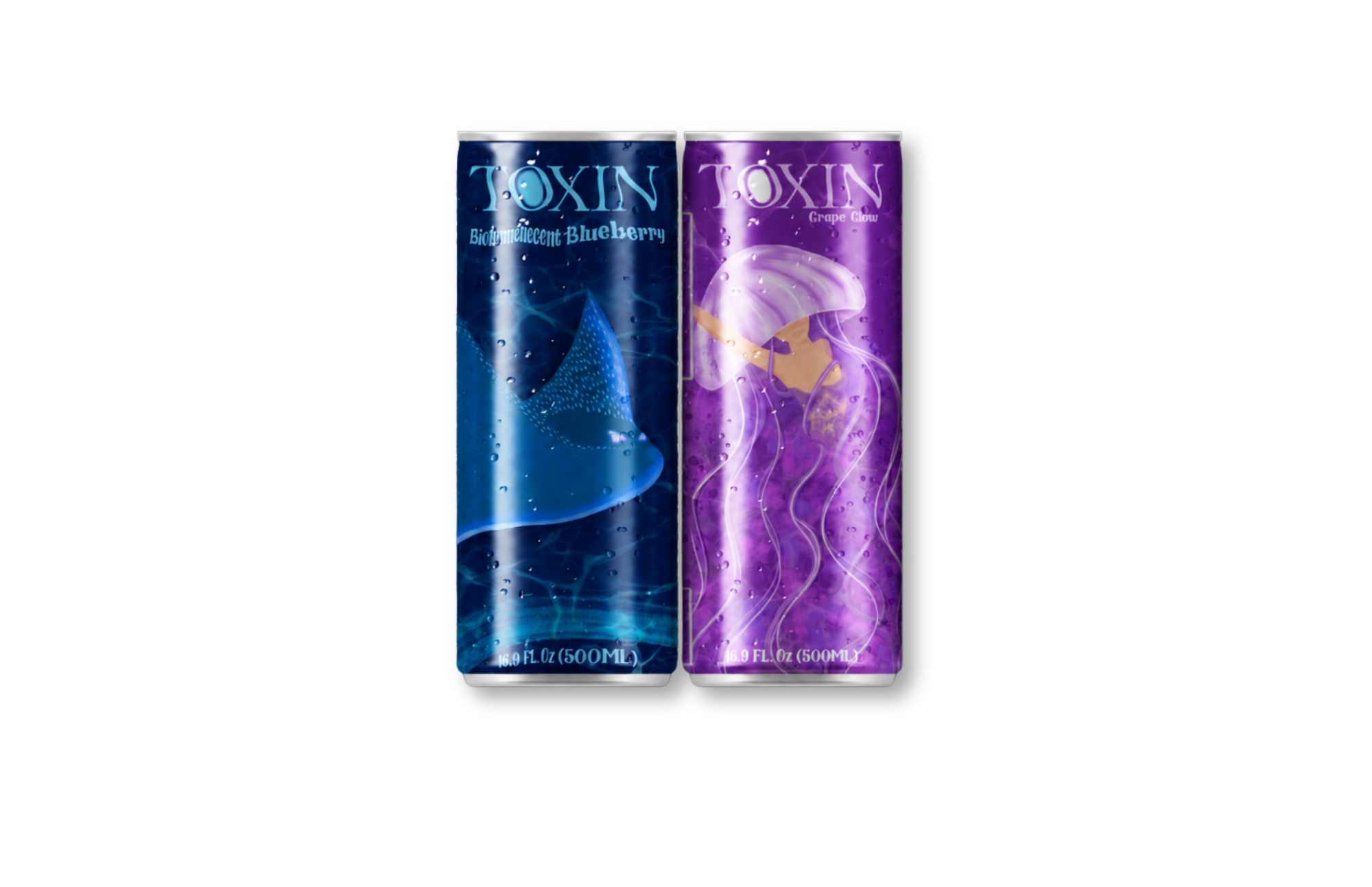
Toxin is a fictional energy drink brand designed to exist inside the Concord universe. The packaging expands the story beyond the comic cover by turning the glowing underwater world into a physical product line.
Each flavor uses its own character-inspired color direction: Grape Glow leans into Concord’s purple jellyfish forms, while Bioluminescent Blueberry uses a blue palette connected to Spotted Thunder. The cans include playful world building details such as “Glow Juice,” “Bioluminescent Plankton,” fictional side effects, and nutrition facts written to match the fantasy concept.

Packaging Details
Flavor System
Each can uses a distinct color palette while staying connected through the same glowing underwater design language
Illustration
The character artwork gives each flavor a recognizable personality and ties the packaging back to the comic book universe.
Story Details
Fictional nutrition facts, side effects, ingredients, and barcodes add humor and make the packaging feel like it belongs in the same world.
Project Reflection
Concord vs. Spotted Thunder challenged me to build a visual identity from a fictional story world. I had to think beyond one illustration and consider how characters, color, typography, packaging details, and product mockups could all feel connected.
Through this project, I strengthened my skills in custom illustration, fantasy based branding, packaging design, and visual storytelling. Even though the project is smaller in scope than some of my other portfolio pieces, it shows my ability to create a cohesive brand world from an original illustration concept.