


Blue Dragon
Branding & Identity • UX/UI & Digital • Print Production
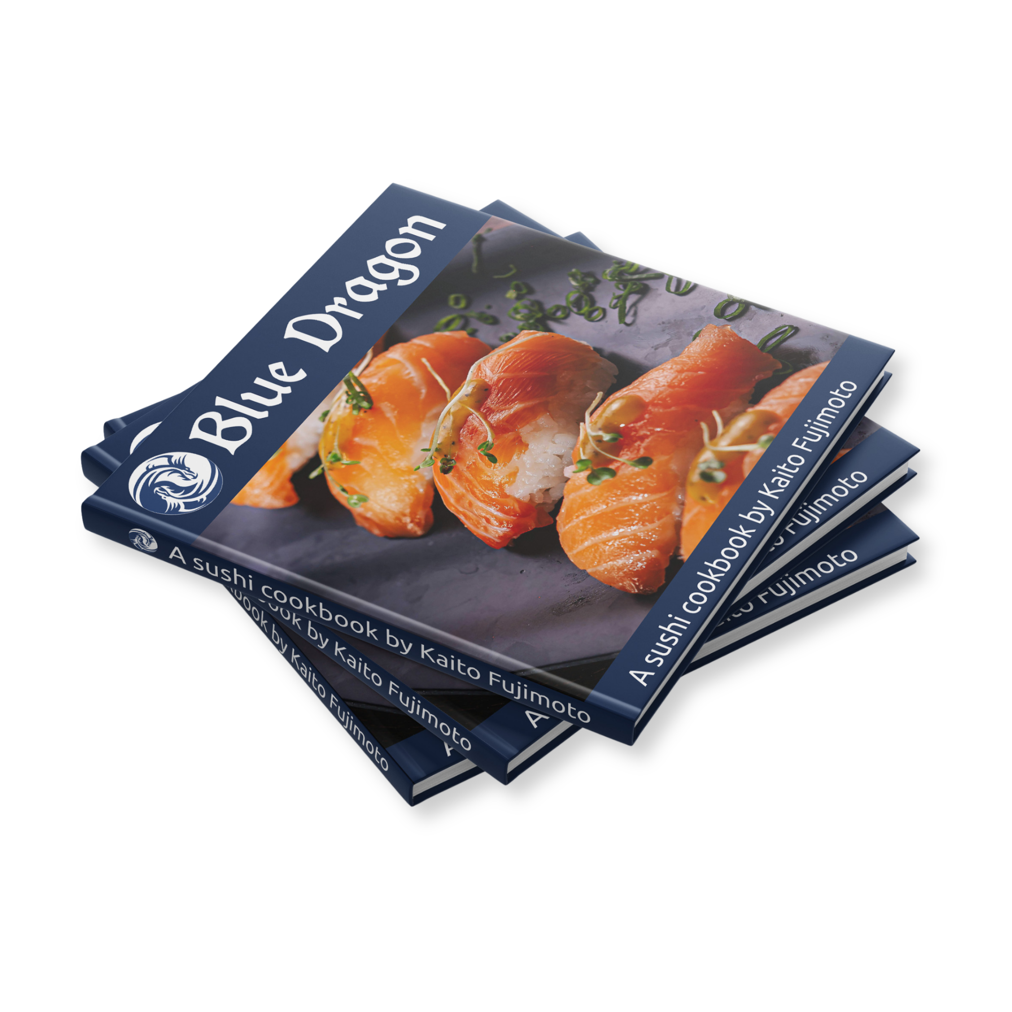
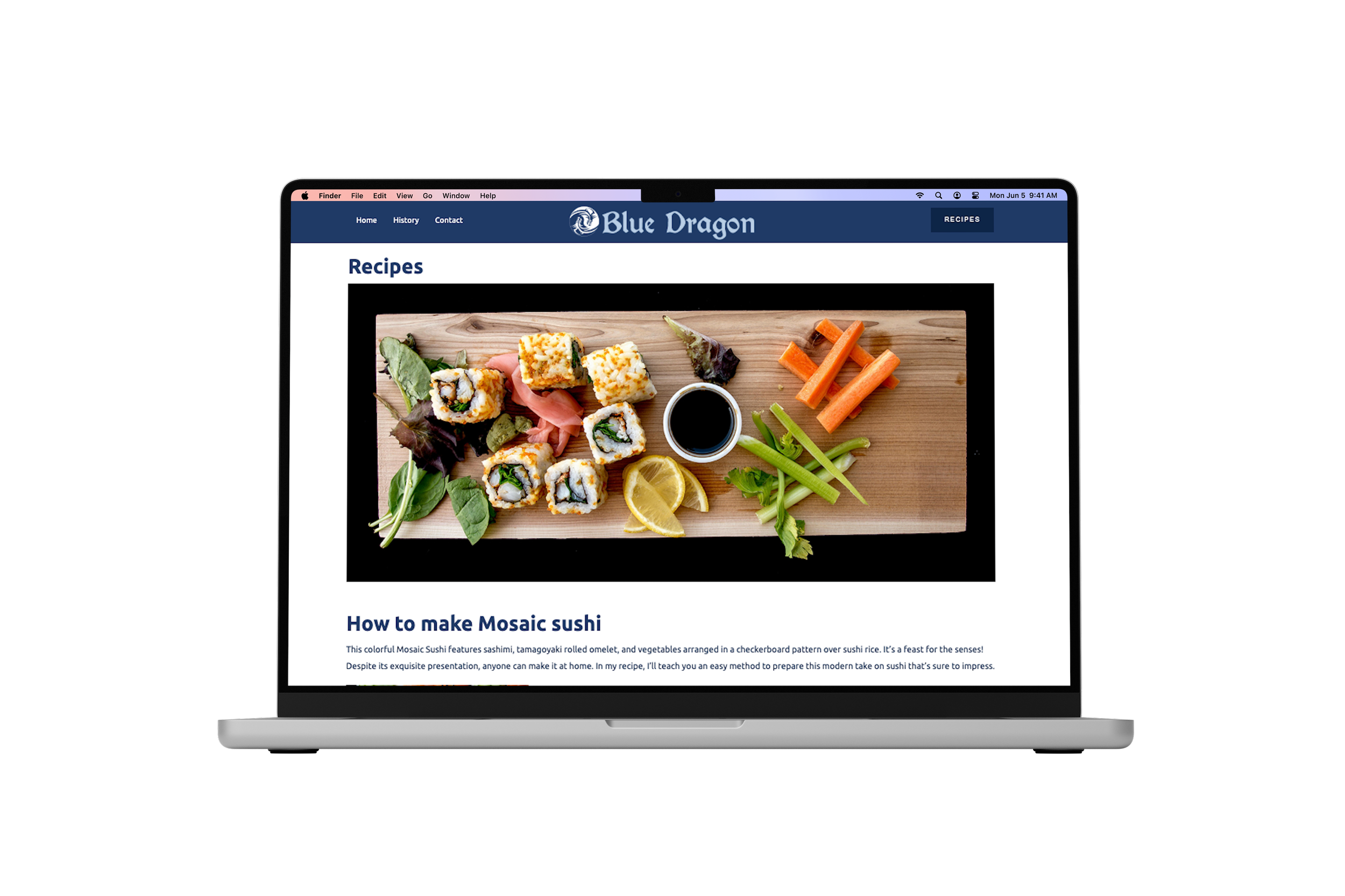
A sushi cookbook and responsive recipe website designed around the art of sushi making. The project combines traditional Japanese-inspired visual cues with a clean modern structure, using a signature dragon logo, navy brand palette, high-impact food photography, and organized recipe layouts across both print and digital formats.
The goal was to create a cohesive culinary brand that could guide users through recipe discovery, sushi history, and step-by-step preparation while feeling polished, approachable, and visually memorable.
One of the main challenges was keeping the project consistent across two very different formats. The cookbook needed to feel structured and print-ready, while the website needed to feel easy to navigate and practical for users looking for recipes. By carrying over the logo, navy palette, food photography, and recipe-focused hierarchy, the print and digital pieces feel like part of the same brand system.
Branding & Identity

RGB 16, 36, 71
CMYK 100, 88, 42, 44
HEX #102447
PMS P 289 C
Navy
RGB 29, 57, 103
CMYK 99, 85, 33, 21
HEX #1D3967
PMS P 534 C
Blue
RGB 182, 206, 228
CMYK 27, 11, 4, 0
HEX #B6CEE4
PMS P 544 C
Pale Blue
RGB 0, 0, 0
CMYK 72, 68, 67, 88
HEX #000000
PMS Black C
Black
RGB 255, 255, 255
CMYK 0, 0, 0, 0
HEX #ffffff
PMS P 1-1 C
White

Primary Typeface

Logo and Headers (Regular)
Secondary Typeface
Subhead and Body (Regular)
The Blue Dragon identity is built around a strong navy-and-white visual system, giving the project a clean, traditional, and trustworthy feel. The dragon mark creates a recognizable symbol for the brand, while the decorative title typography gives the cookbook and website a distinct Japanese-inspired personality.
Across the cookbook and website, the identity is supported by high-contrast food photography, structured recipe information, and consistent navigation elements that make the content feel both elegant and functional.

Responsive Recipe Website
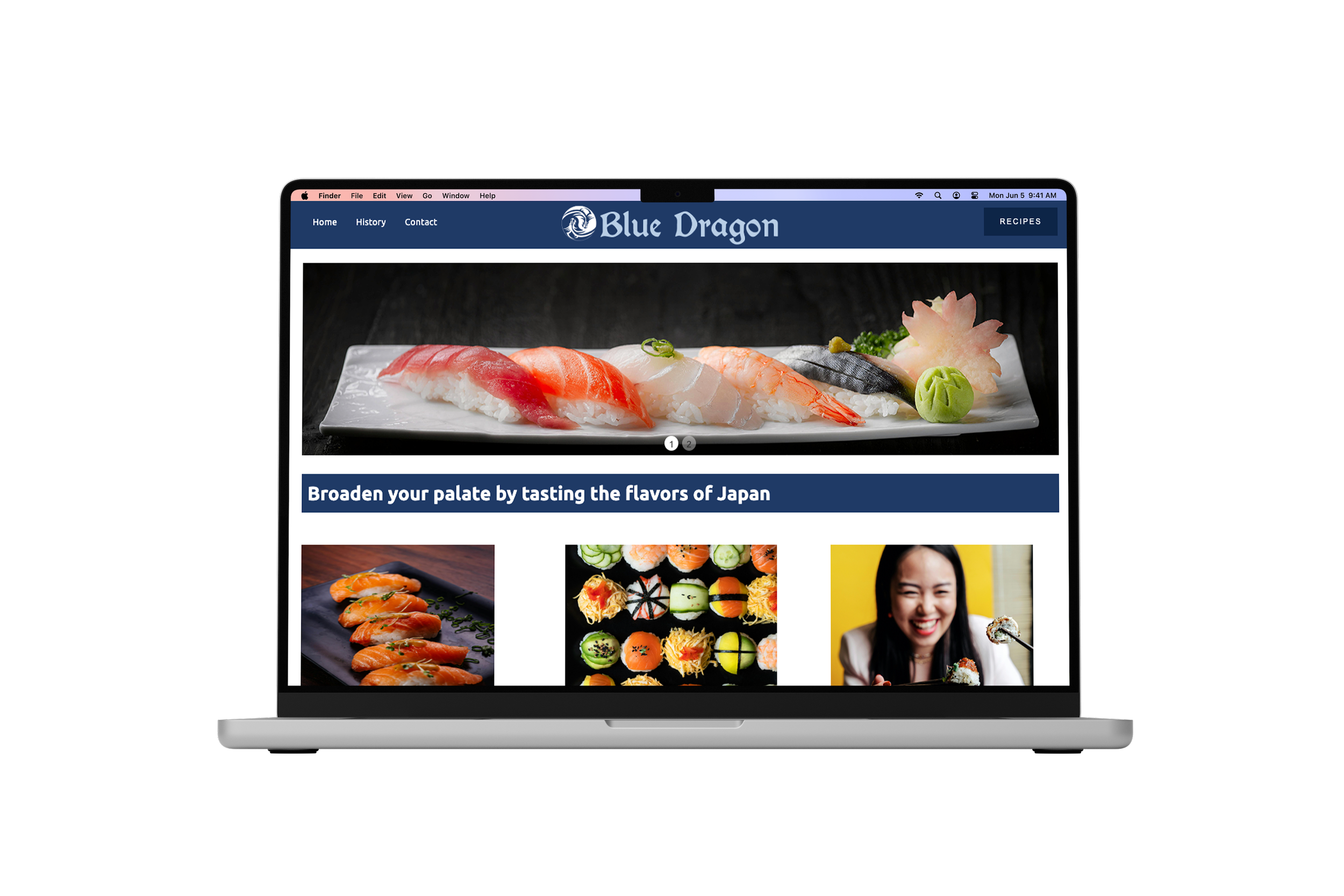
The digital side of Blue Dragon translates the cookbook into a responsive recipe website. The site gives users a simple way to explore sushi history, recipe content, and contact information while keeping the same navy palette, dragon branding, and food-focused imagery from the print piece.
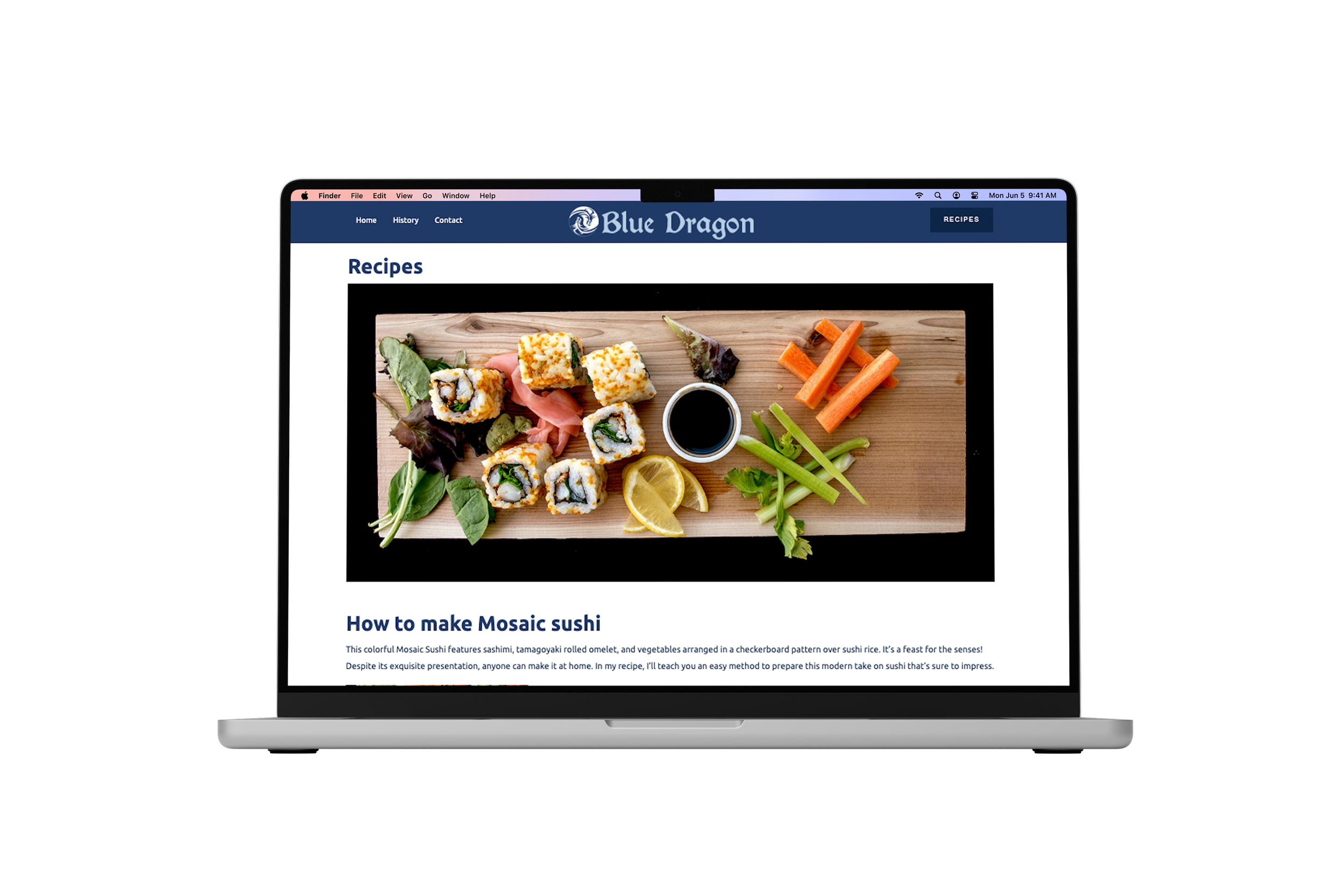
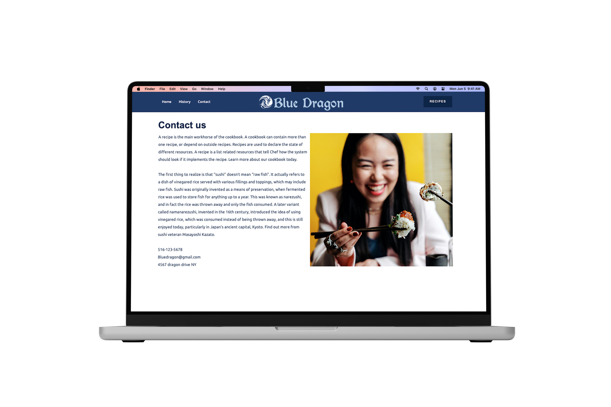
The website structure keeps the experience simple and familiar: a homepage introduces the brand, the history page adds educational context, the recipes page organizes step-by-step sushi content, and the contact page completes the site with brand and communication details.
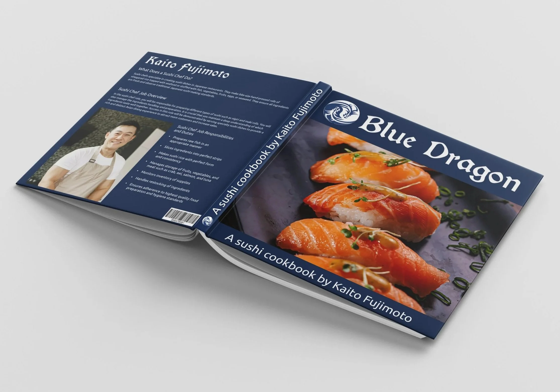
Printed Sushi Cookbook
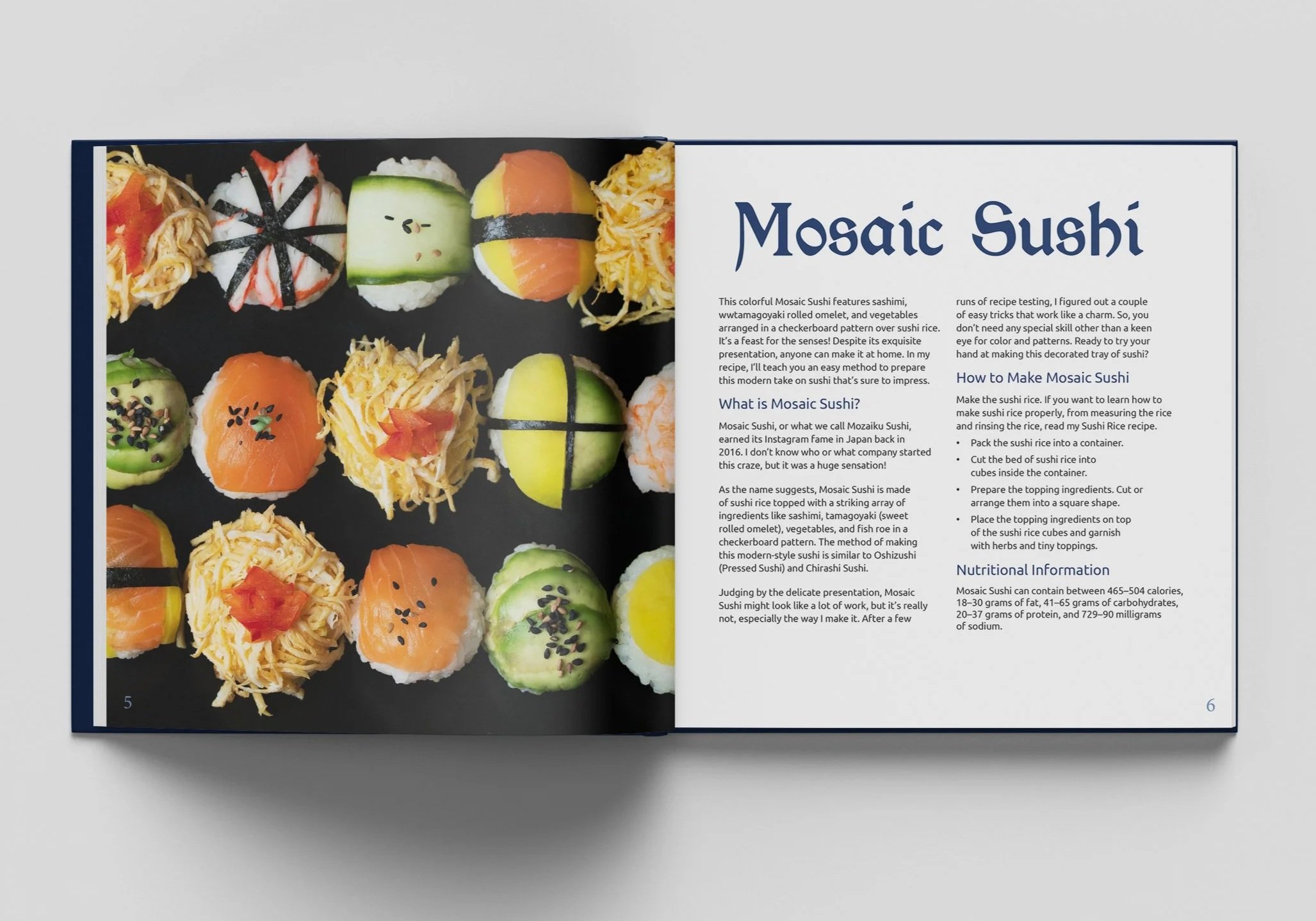
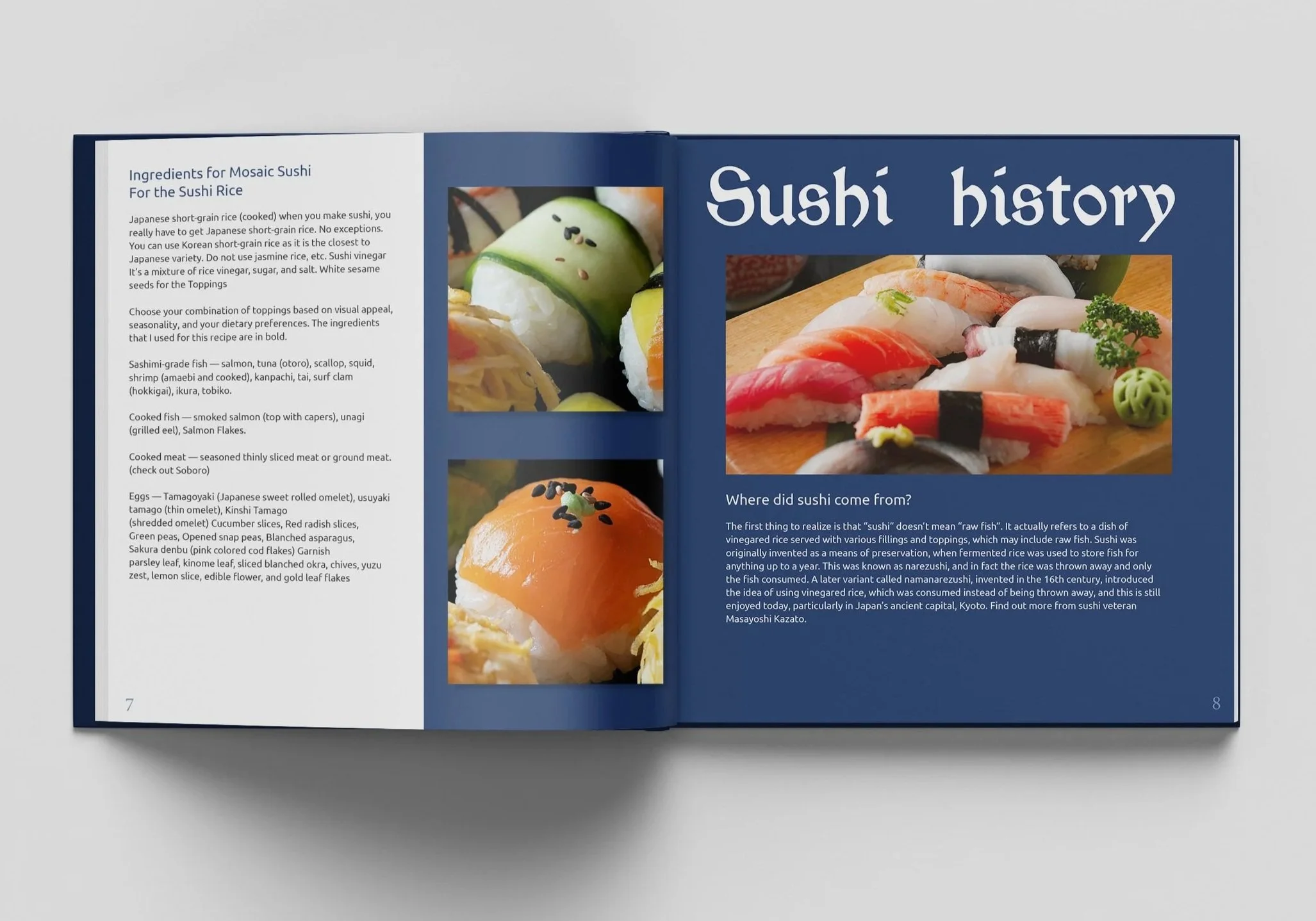
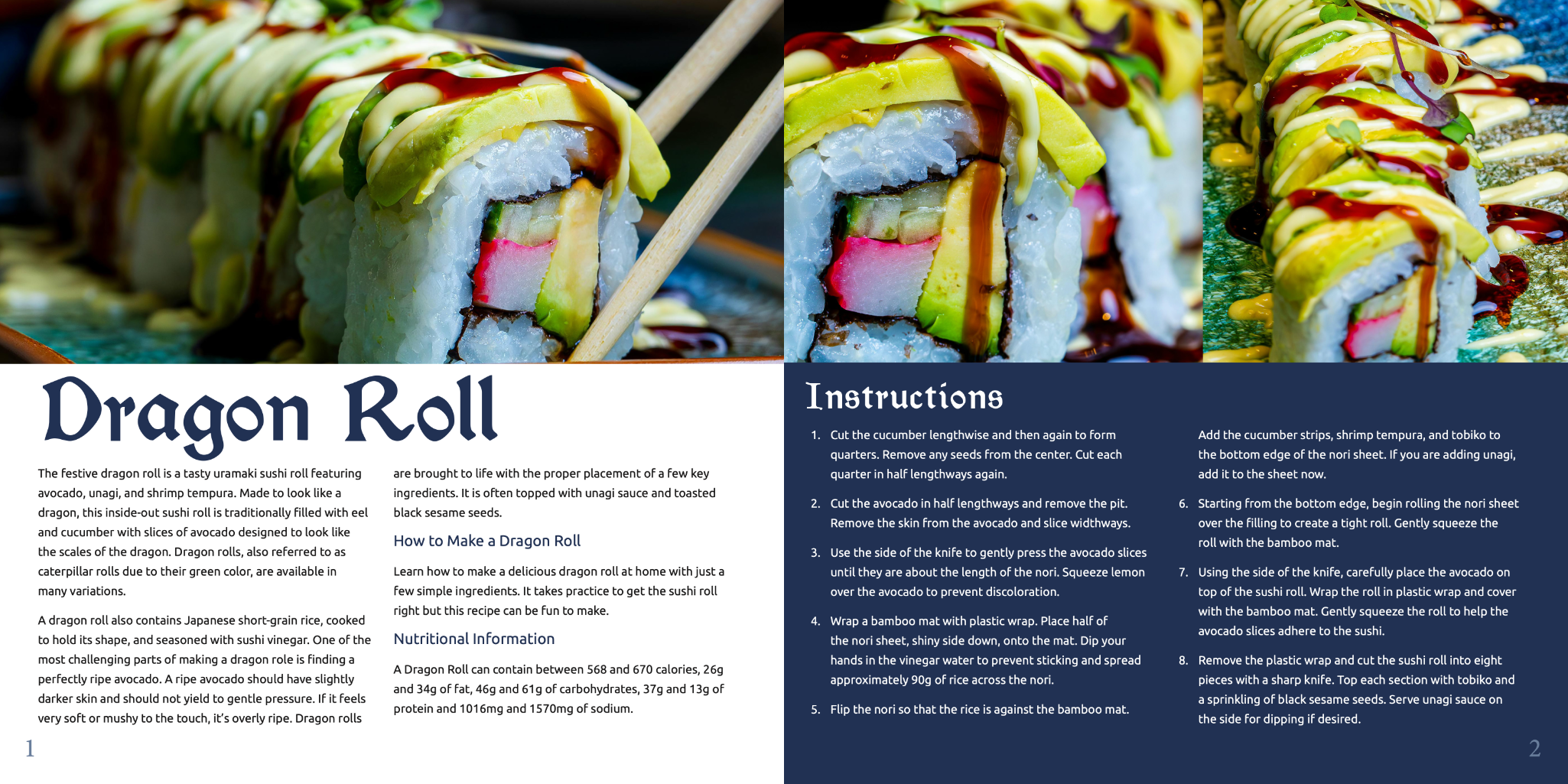
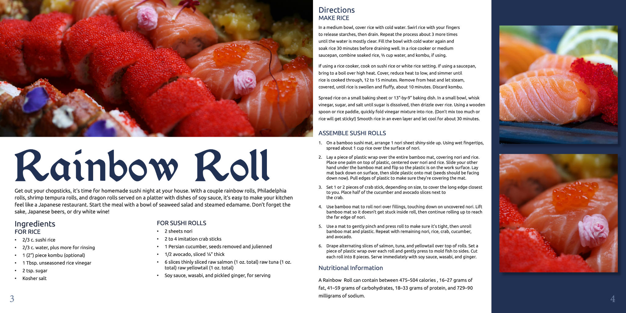
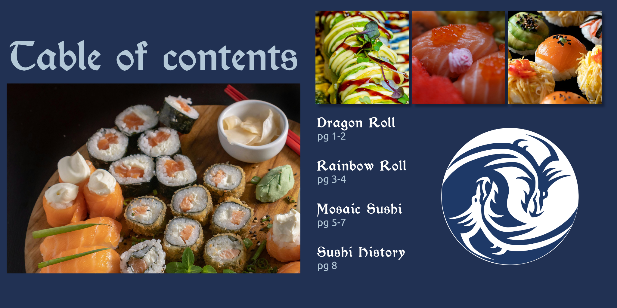
Blue Dragon organizes each recipe with a strong image led hierarchy, clear headings, preparation instructions, ingredient details, and nutrition information. The navy-and-white system keeps the pages consistent while the food photography gives each recipe its own visual personality.

Design System Details
Logo System
The dragon mark gives the project a recognizable visual anchor and connects directly to the Blue Dragon name.
Recipe Layouts
Recipe pages organize ingredients, directions, nutritional information, and photography into a clear reading flow.
Photography Direction
Large sushi photography creates appetite appeal while helping each recipe section feel distinct.
Project Reflection
Blue Dragon challenged me to build a cohesive brand across both print and digital media. I had to balance decorative visual elements with practical recipe information, making sure the cookbook felt expressive while the website stayed clear, organized, and easy to use.
Through this project, I strengthened my skills in brand identity, editorial layout, recipe-based content organization, web design, and visual consistency across multiple formats.
A link to the full cookbook is included below for a closer look at the complete print layout and recipe system.