


Ecotrove
Branding & Identity • Packaging Design • Advertising & Campaigns • UX/UI & Digital • Print Production
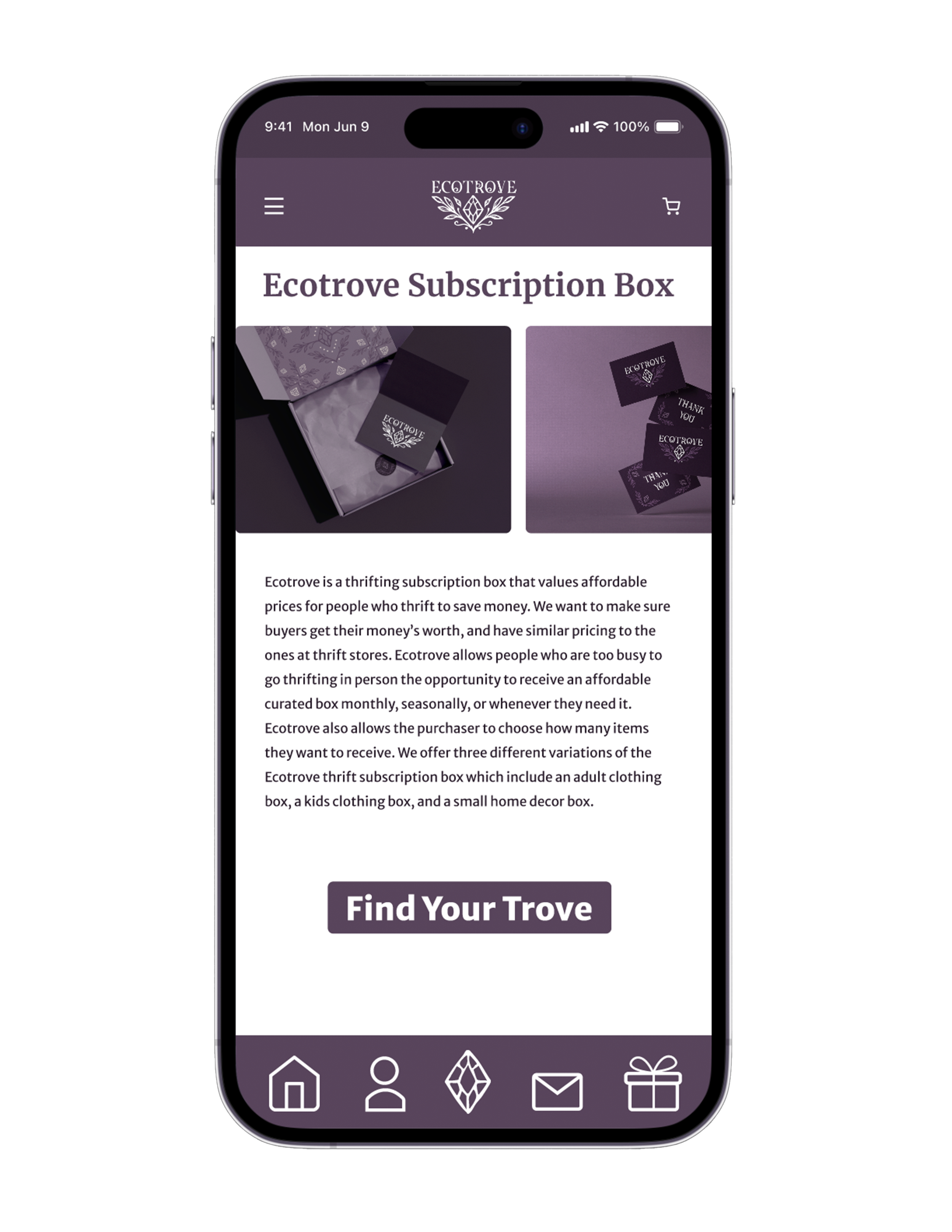
A thrifting subscription box built for people who want to save money without losing the thrill of a good find. Buyers choose between an adult clothing box, a kids' box, or a small home decor box, delivered monthly, seasonally, or whenever they need it, priced to match what they'd pay in store.
The idea traces back to my step mom, who has spent years sending boxes of clothes, toys, and snacks to her family in the Philippines, even when money was tight. Watching her share so generously inspired me to find my own way to help people stretch their money further. Ecotrove is my attempt to bring that same spirit of affordable, thoughtful giving to thrifting.
Branding & Identity

RGB 41, 30, 44
CMYK 71, 77, 55, 67
HEX #291E2C
PMS P 98-16 C
Plum
RGB 89, 69, 92
CMYK 64, 73, 43, 28
HEX #59455C
PMS P 98-15 C
Dusty Violet
RGB 121, 104, 123
CMYK 54, 49, 37, 11
HEX #79687B
PMS P 94-10 C
Lavender
RGB 214, 202, 199
CMYK 15, 18, 18, 0
HEX #D6CAC7
PMS P 33-1 C
Soft Taupe
RGB 255, 255, 255
CMYK 0, 0, 0, 0
HEX #ffffff
PMS P 1-1 C
White
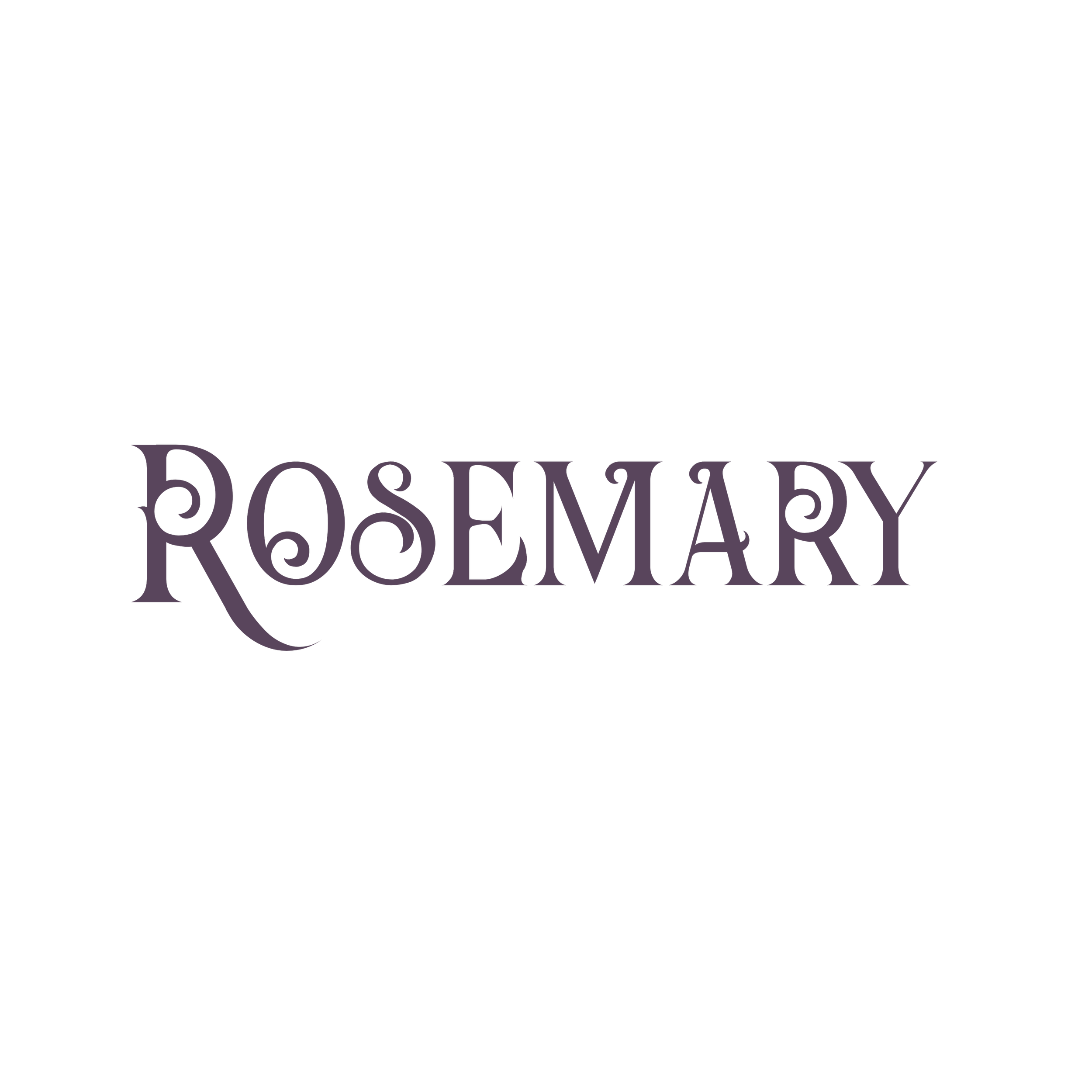
Primary Typeface
Logo and Header
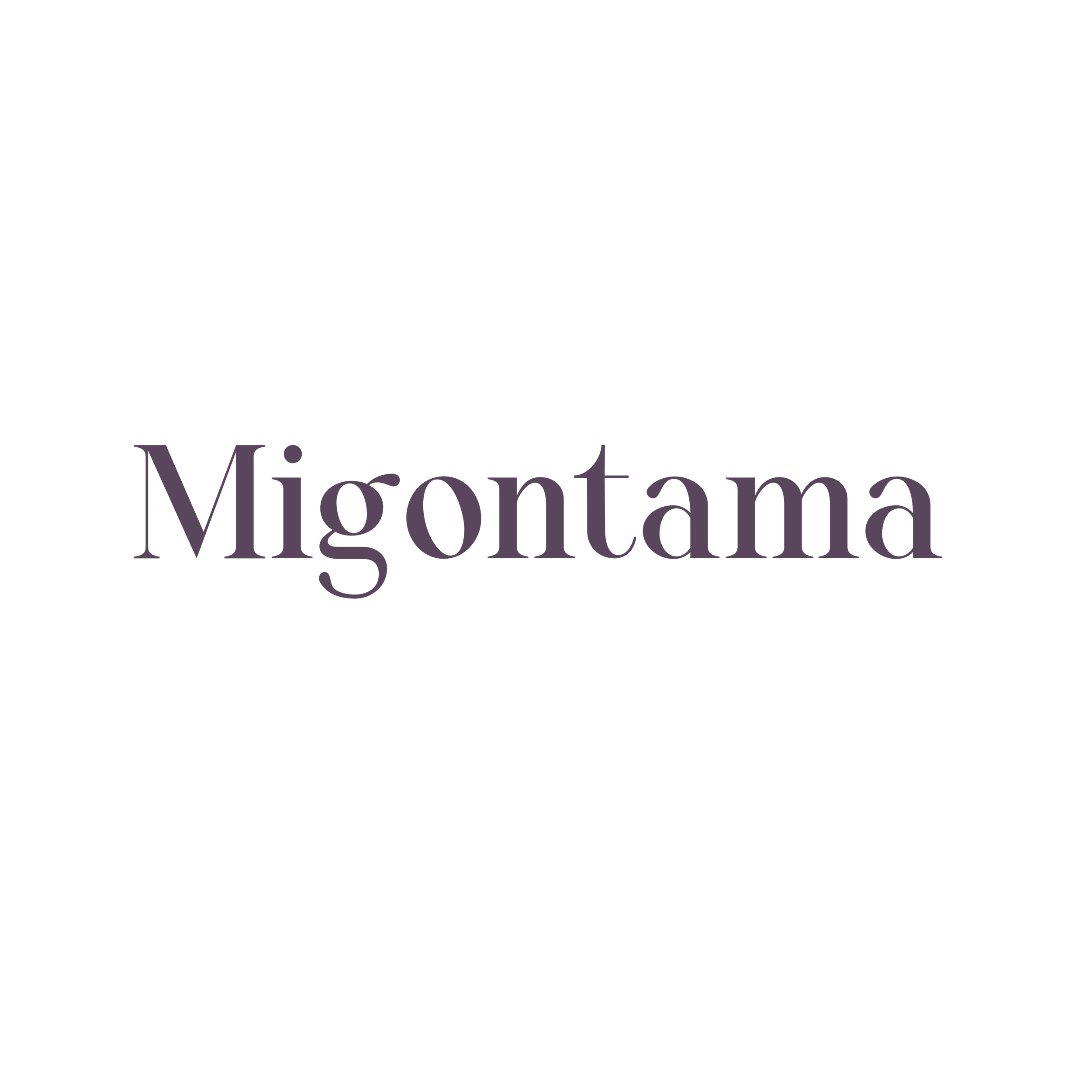
Secondary Typeface
Title (Bold) and Body (Regular)
Ecotrove's palette draws on muted, dusty tones reminiscent of well loved fabric and aged paper, echoing the character of a great thrift find. Rosemary's ornate detail brings a vintage, treasure hunt feeling to the logo, while Migontama keeps titles and body copy clean and easy to read, so the brand feels considered without ever feeling unaffordable or exclusive.

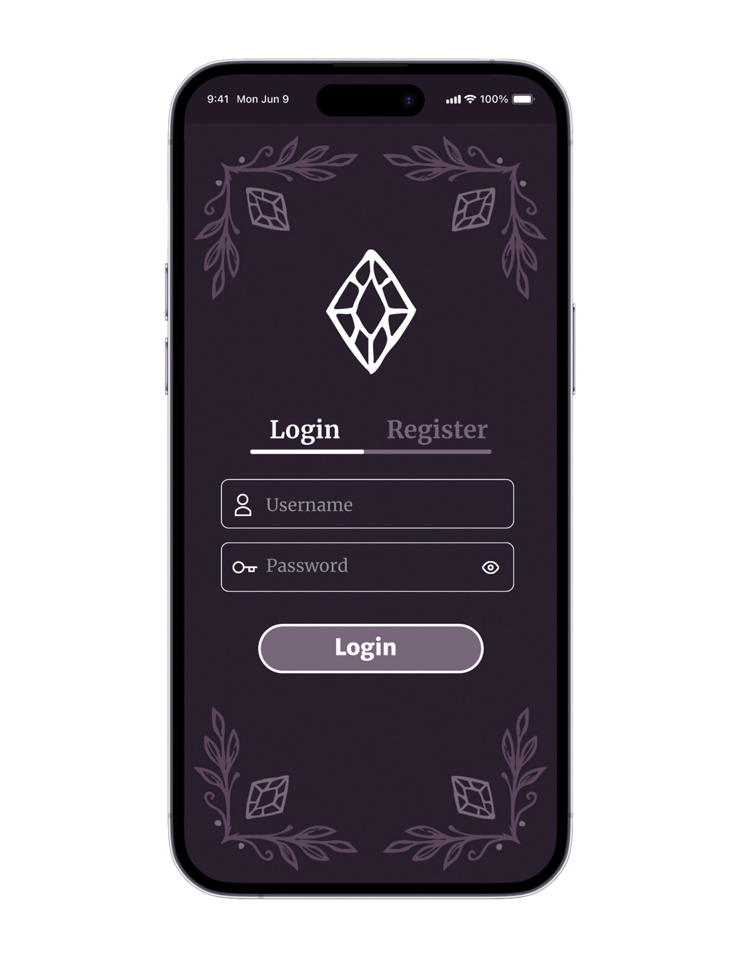
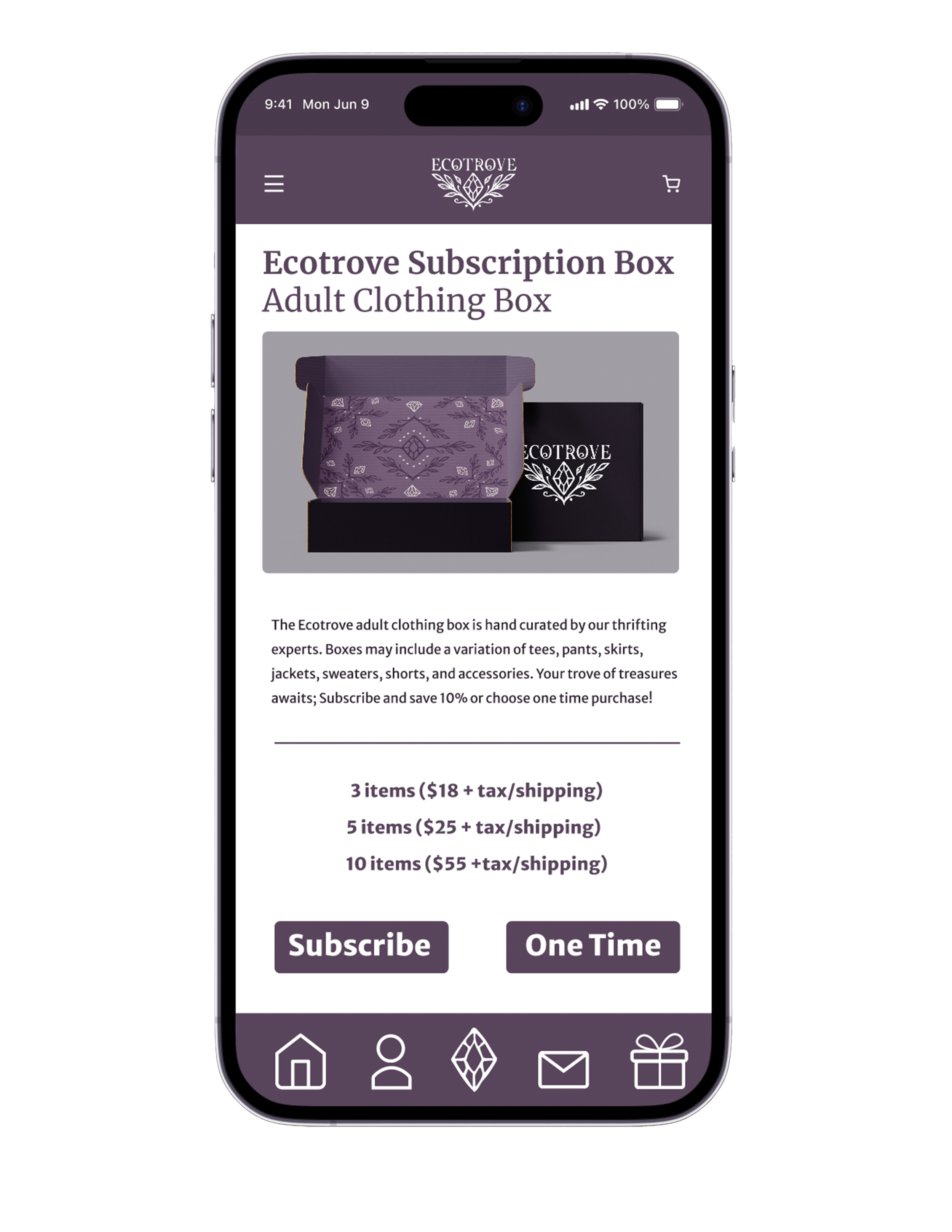
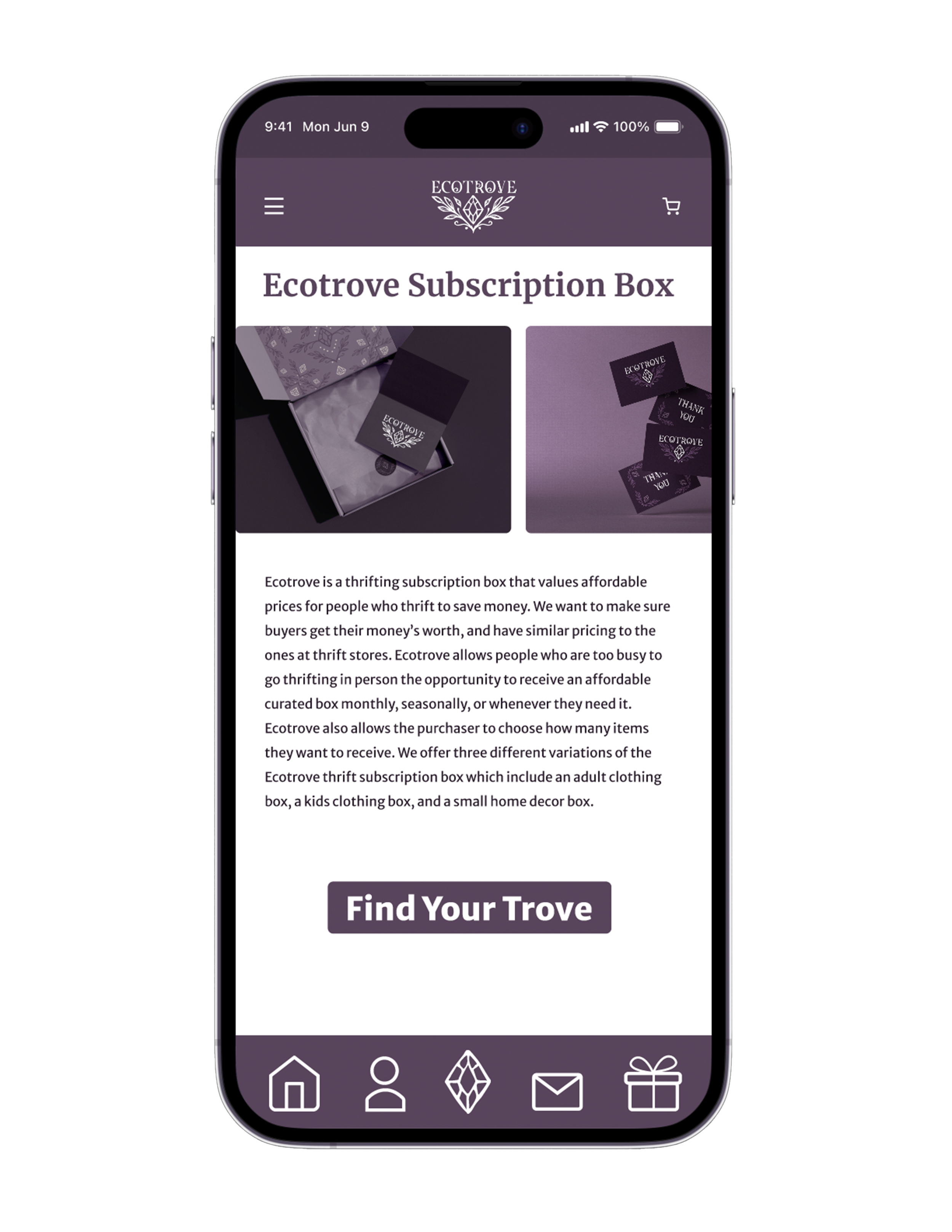
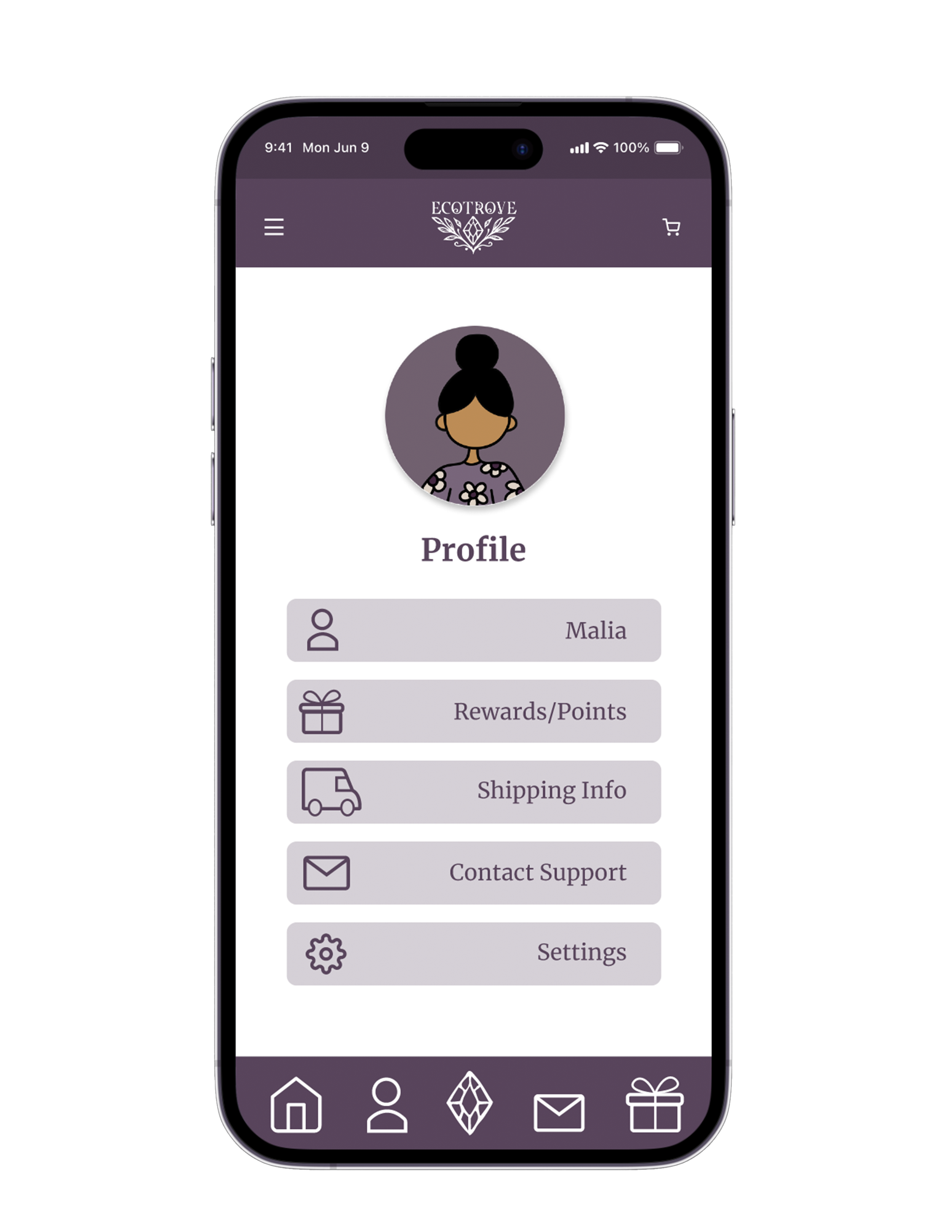
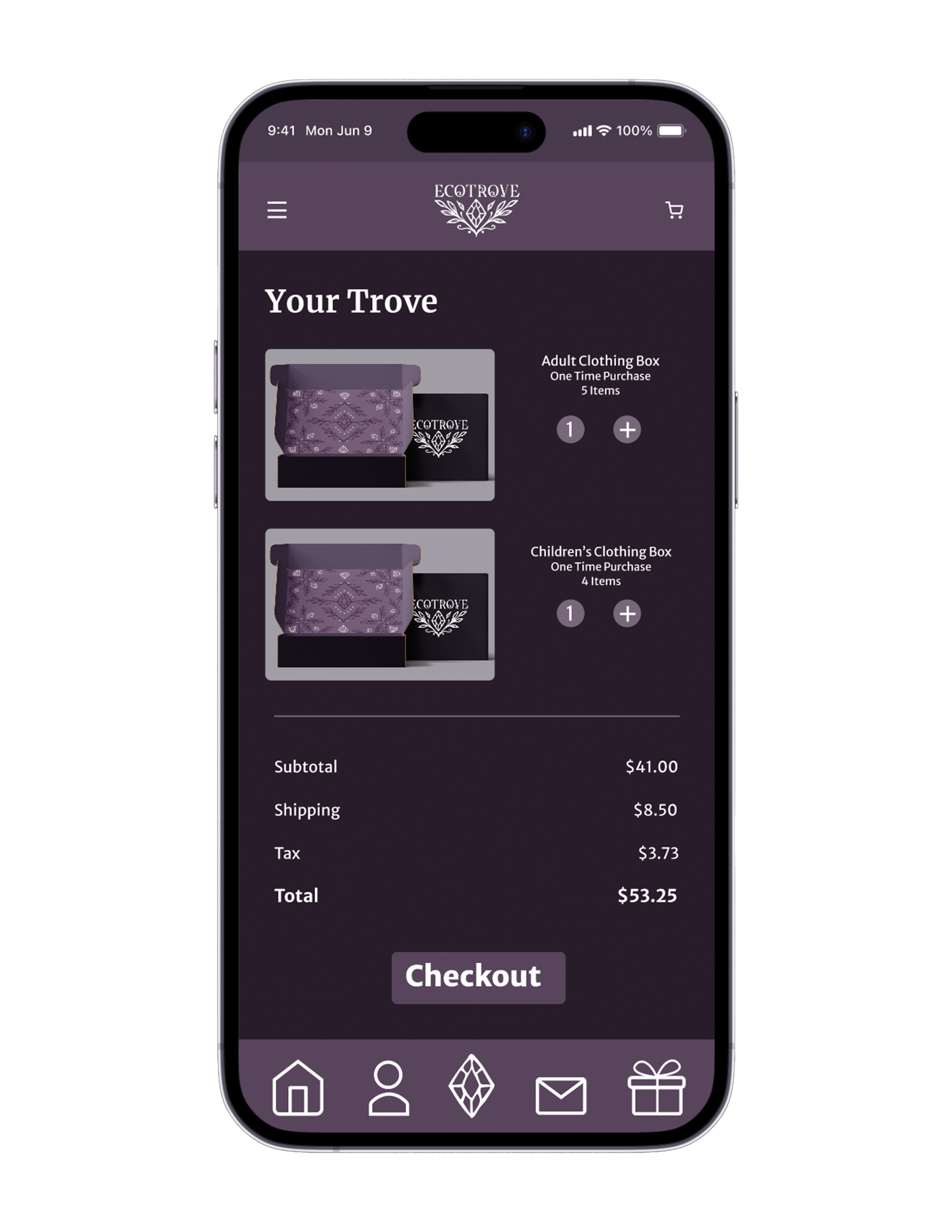
Ecotrove app
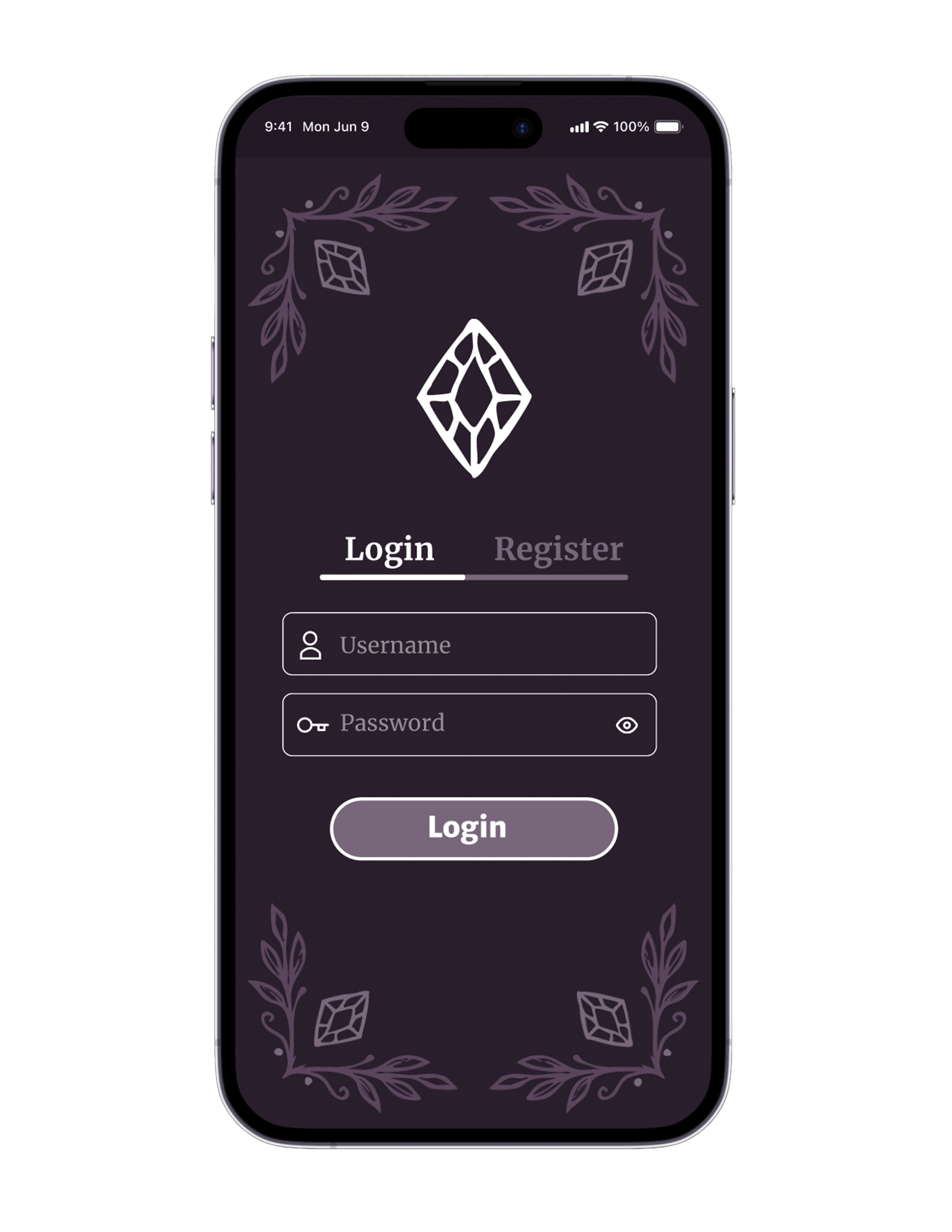
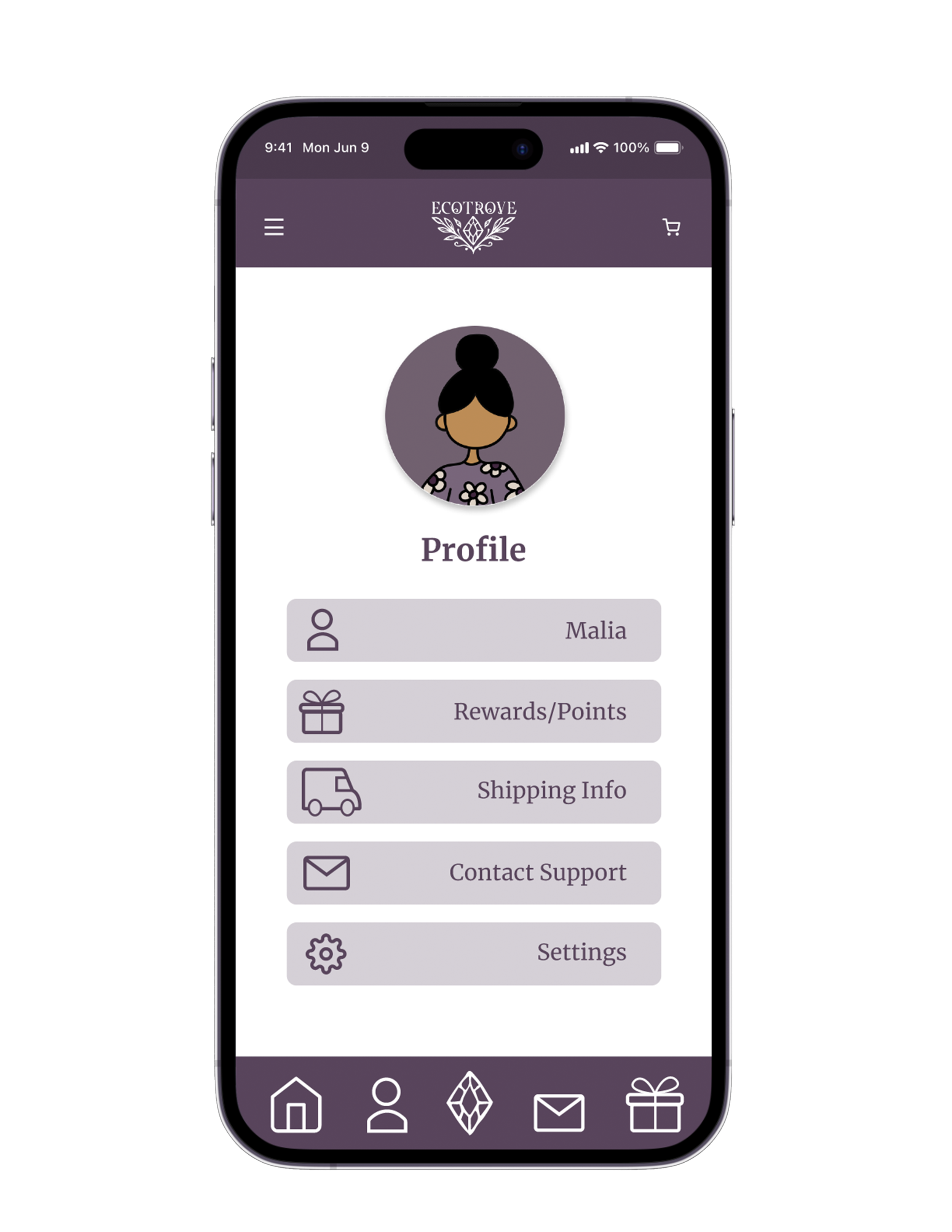
Prototyped in Figma to let buyers browse box options, manage their subscription, and check out in just a few taps, keeping the same warm, vintage-inspired branding carried over from the physical packaging.
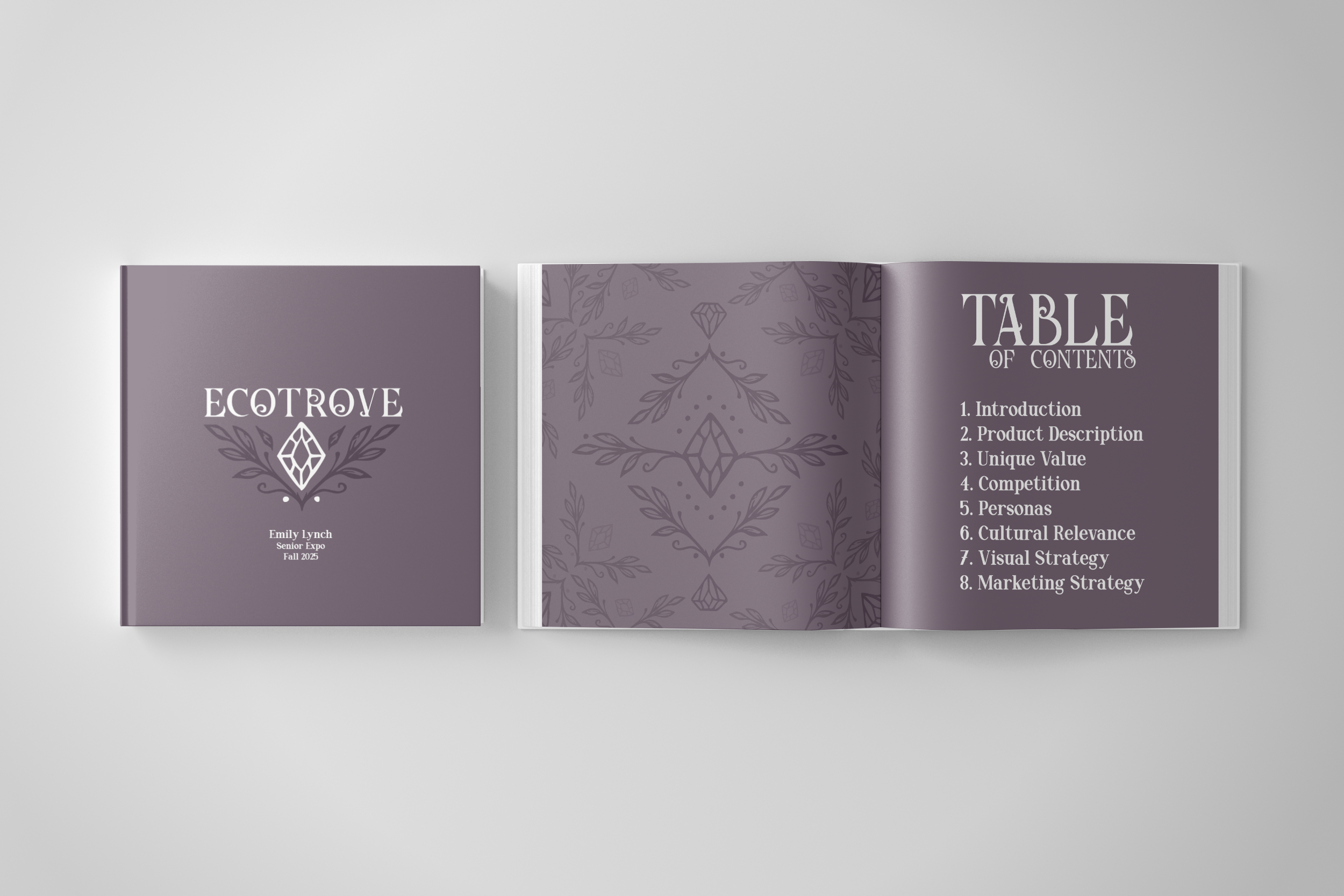
Ecotrove Book
To present my senior project at FSC's Visual Communications Senior Expo, I compiled the brand's full research and design process into a 38 page book, designed in InDesign. The cover and inside spreads carry the same deep purple palette and diamond-and-leaf pattern used across the rest of the brand.
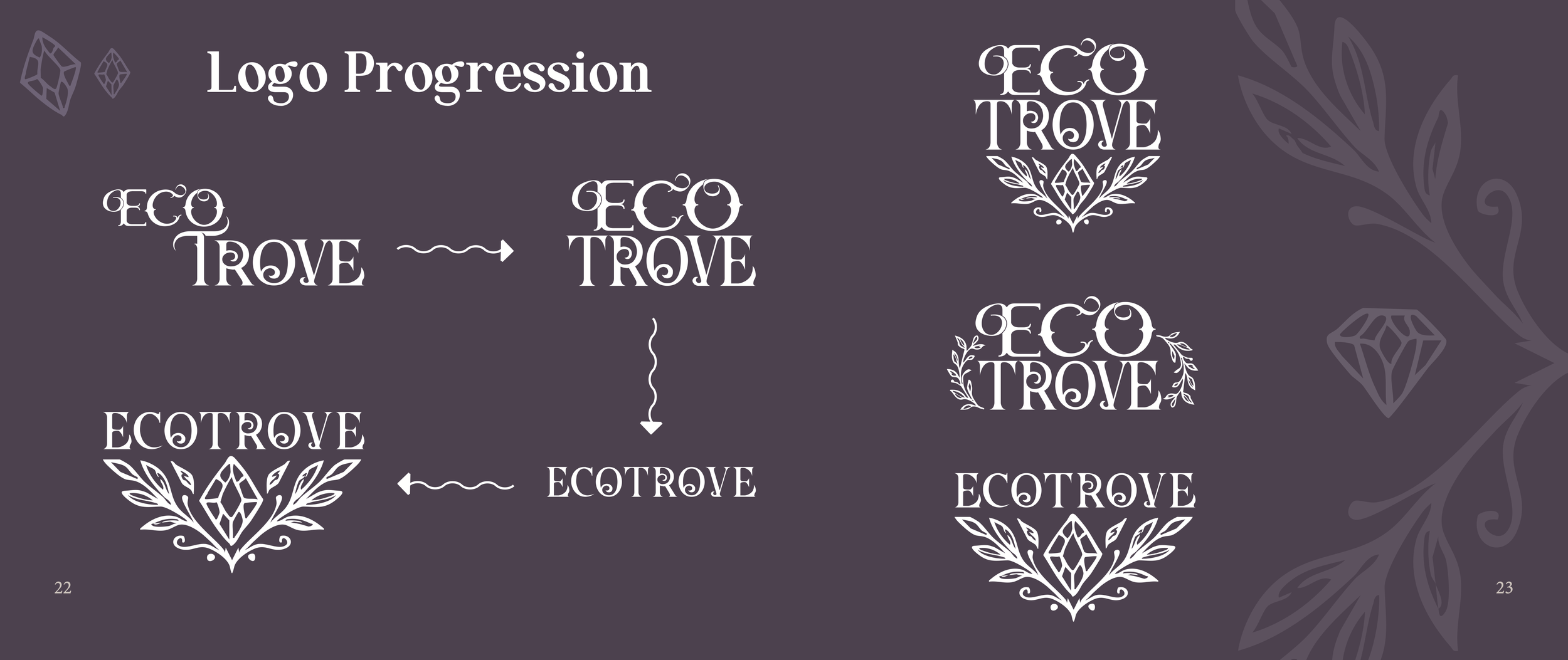
The Ecotrove wordmark went through several rounds of refinement, from an early two-line lockup to the final single-line version paired with the diamond emblem, until the proportions felt balanced enough to work at any size.
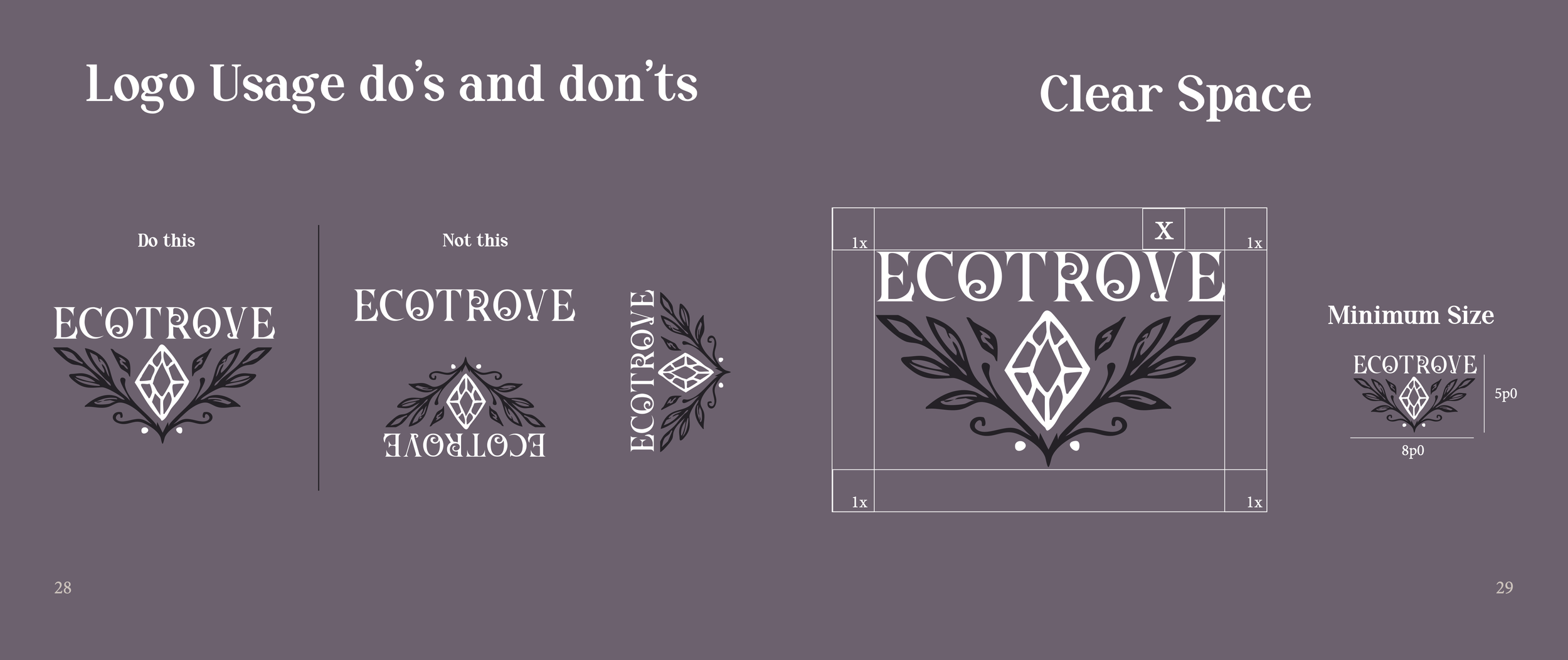
To keep the logo consistent wherever it's used, I set clear space and minimum size requirements, along with usage rules, like never flipping or rotating the emblem, so the mark stays recognizable across every application.
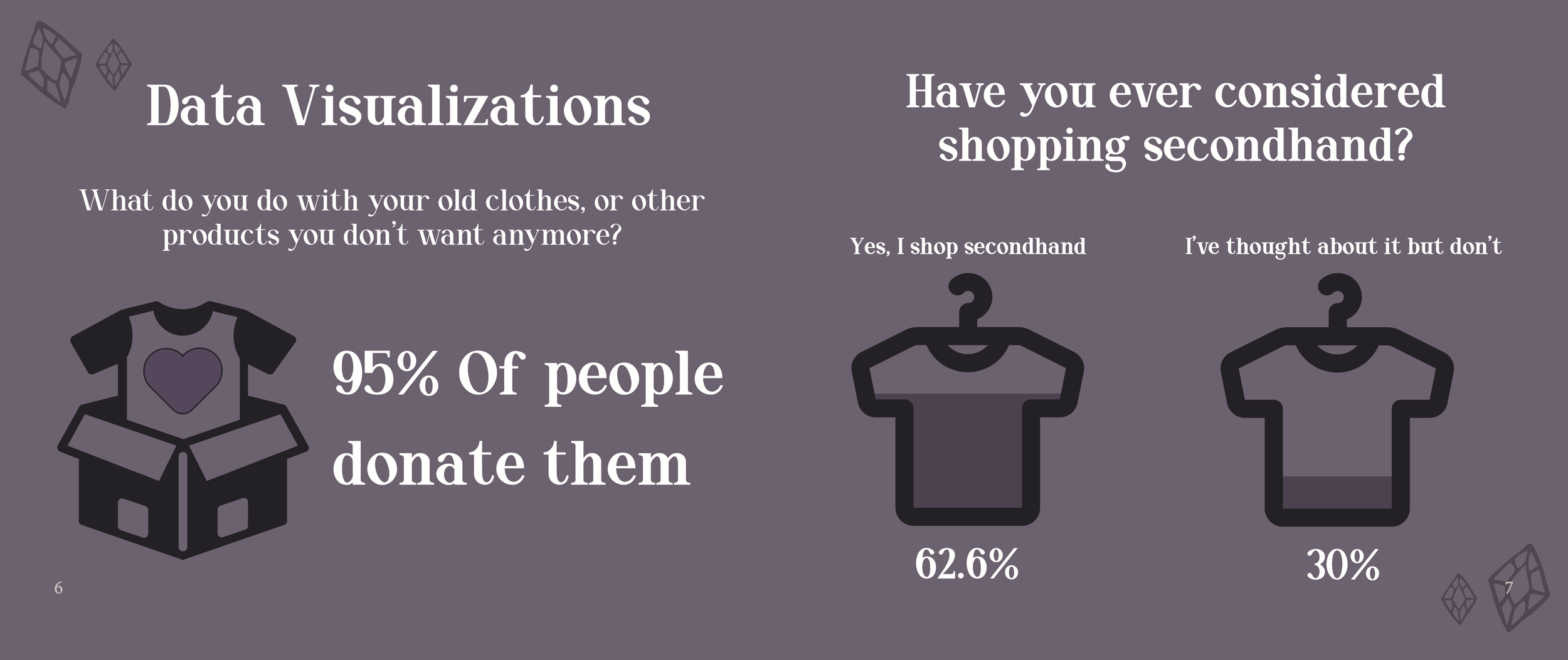
Early survey research showed that 95% of people already donate unwanted clothing, and over 60% have shopped secondhand, confirming real, existing interest in sustainable shopping for Ecotrove to tap into.
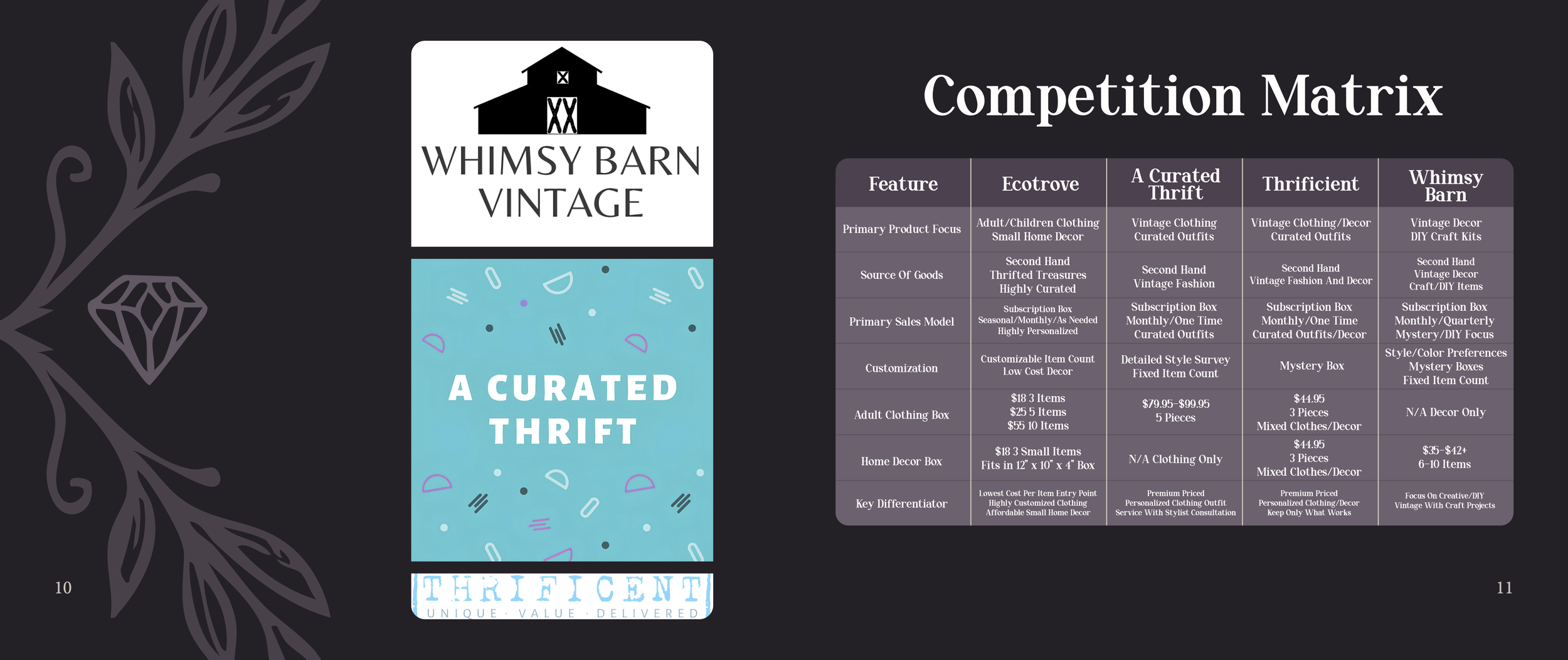
I built a full feature comparison against three existing thrift subscription brands to pinpoint where Ecotrove could stand out, landing on the lowest cost per item and the only home decor option among them.

Audience Personas
Personas were developed based on real interviews, including my own stepmom, husband, and friends. I created three personas to ground Ecotrove's pricing and features in real financial needs rather than assumptions: a budget-conscious single mom, an international grad student, and a college student.
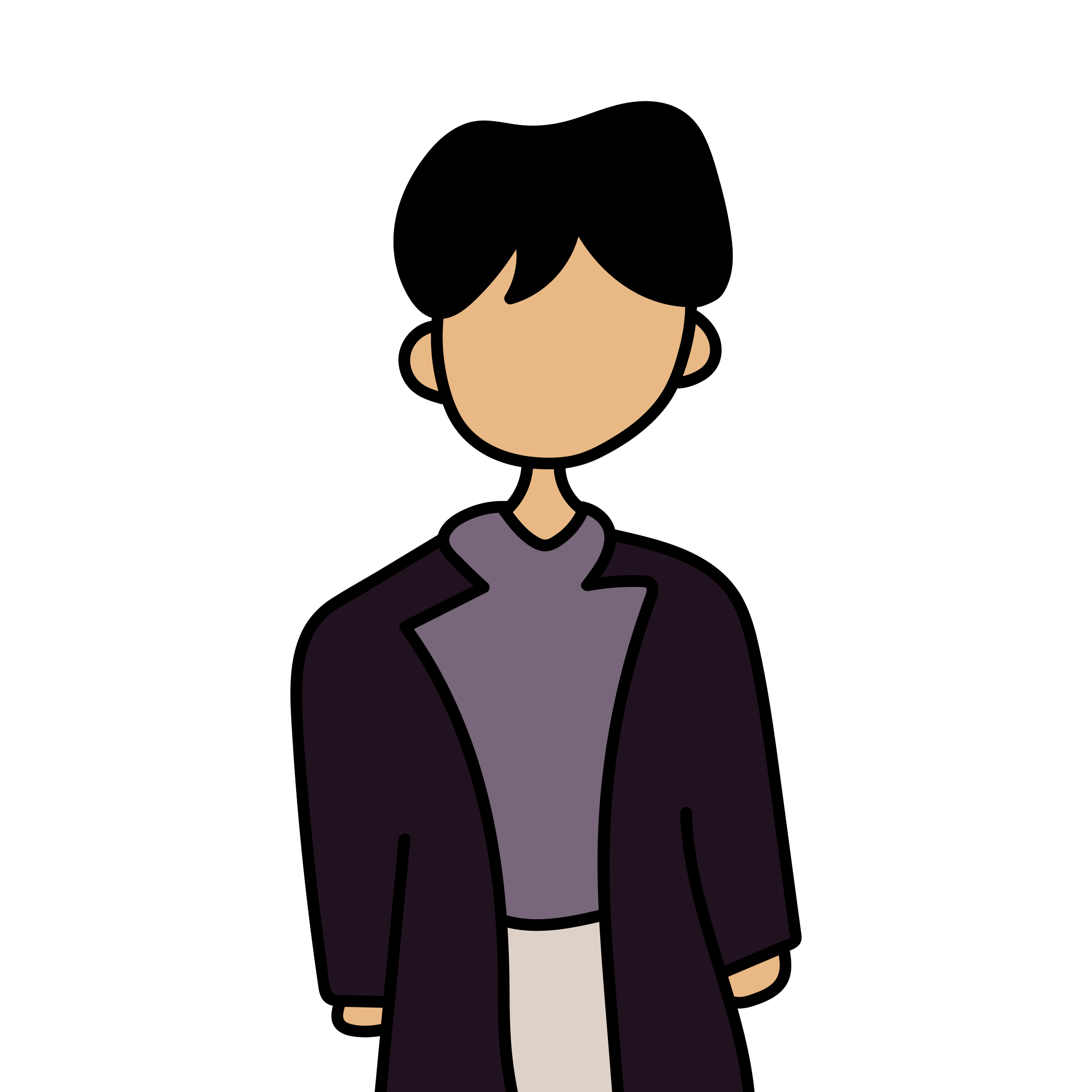
Bryson was hesitant about secondhand cleanliness and needed an easy, low-risk way to furnish his apartment. Ecotrove's curated quality and flexible box combinations address both concerns directly.
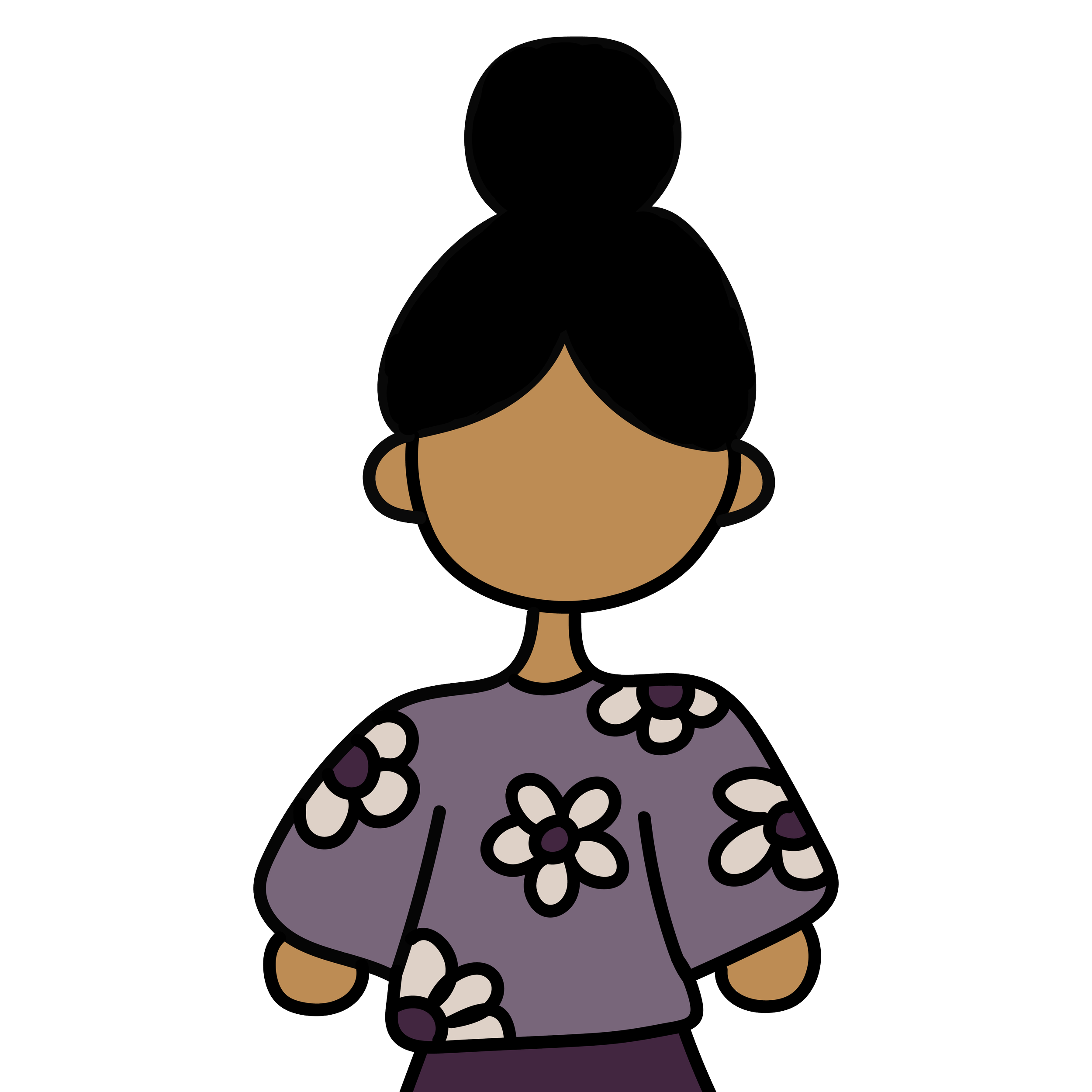
Malia needed convenience and quality on a tight budget. Ecotrove's low per-item cost and at-home delivery solve both, while a free toy in the kids' box adds extra value for her daughter.

Lira wanted affordability and a personalized aesthetic on a student budget. Ecotrove's quiz based customization and low item costs let her tailor purchases without overspending.
Print Production
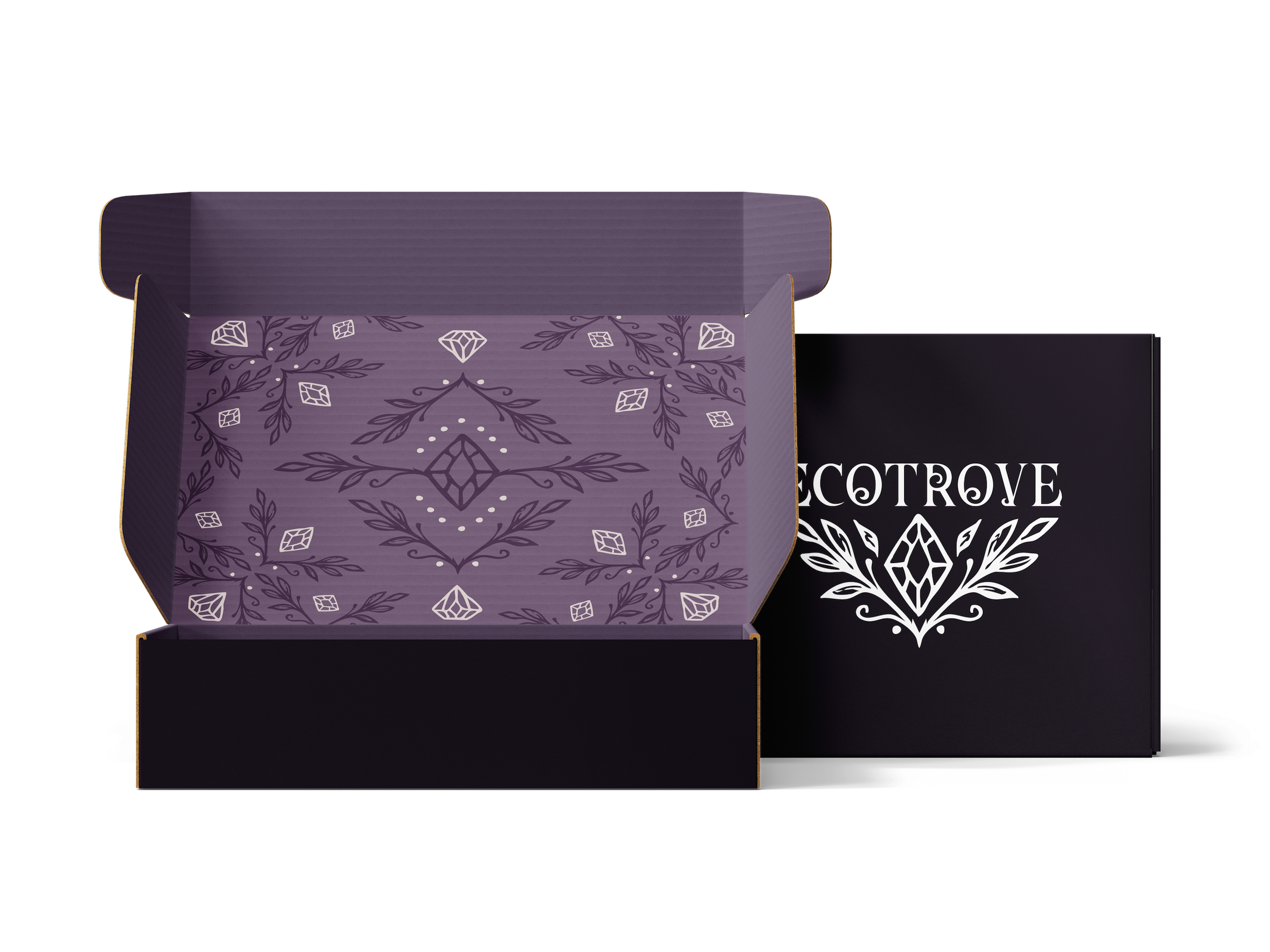
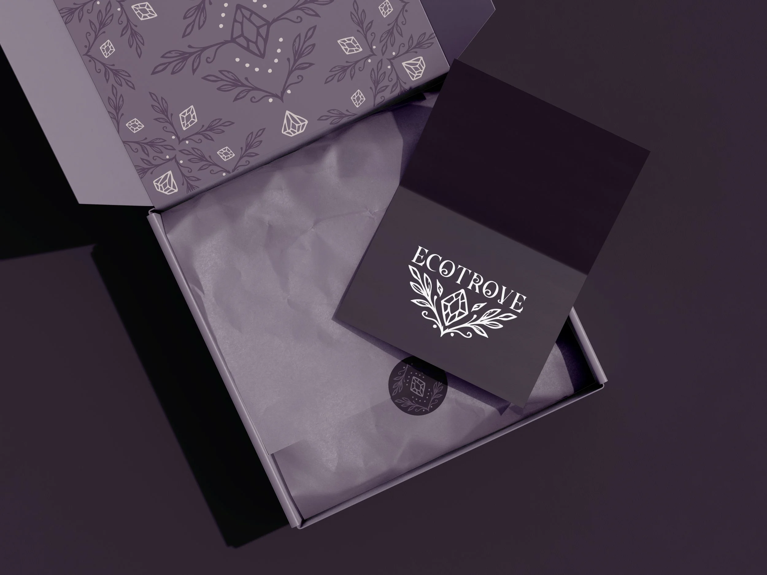
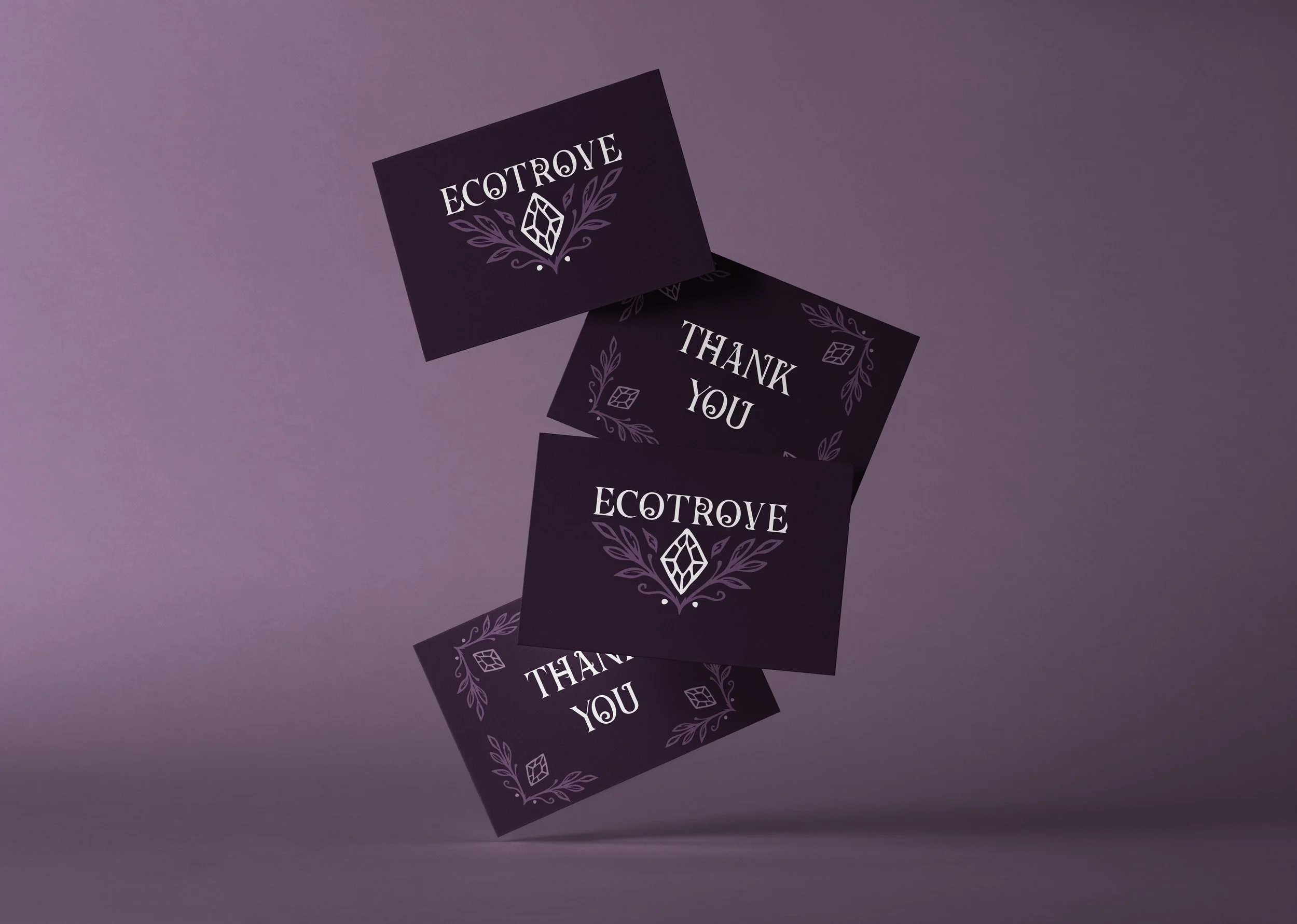
Before the boxes were printed, I designed digital mockups of the full unboxing experience, including the patterned interior and a branded thank-you card, to finalize the packaging system end to end.
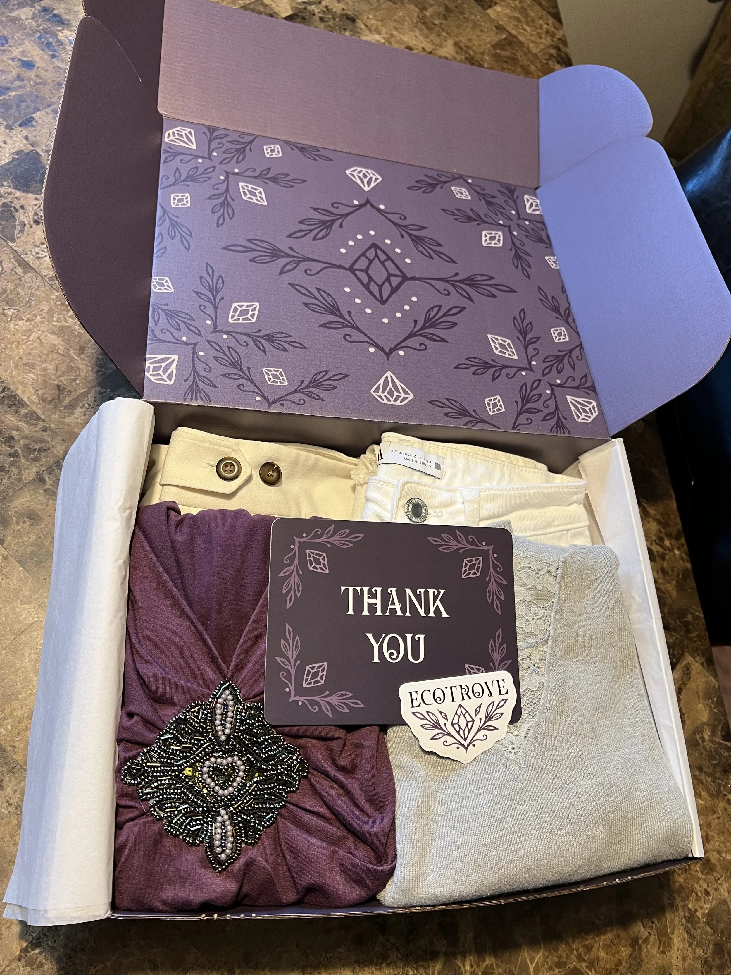
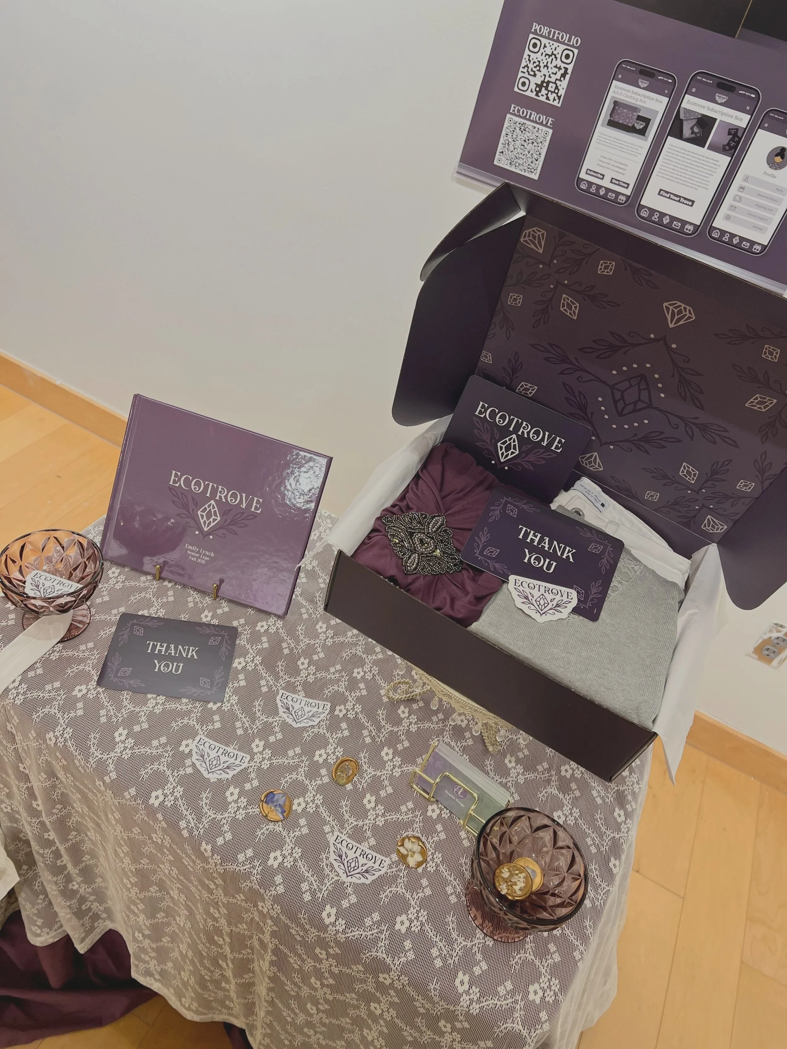
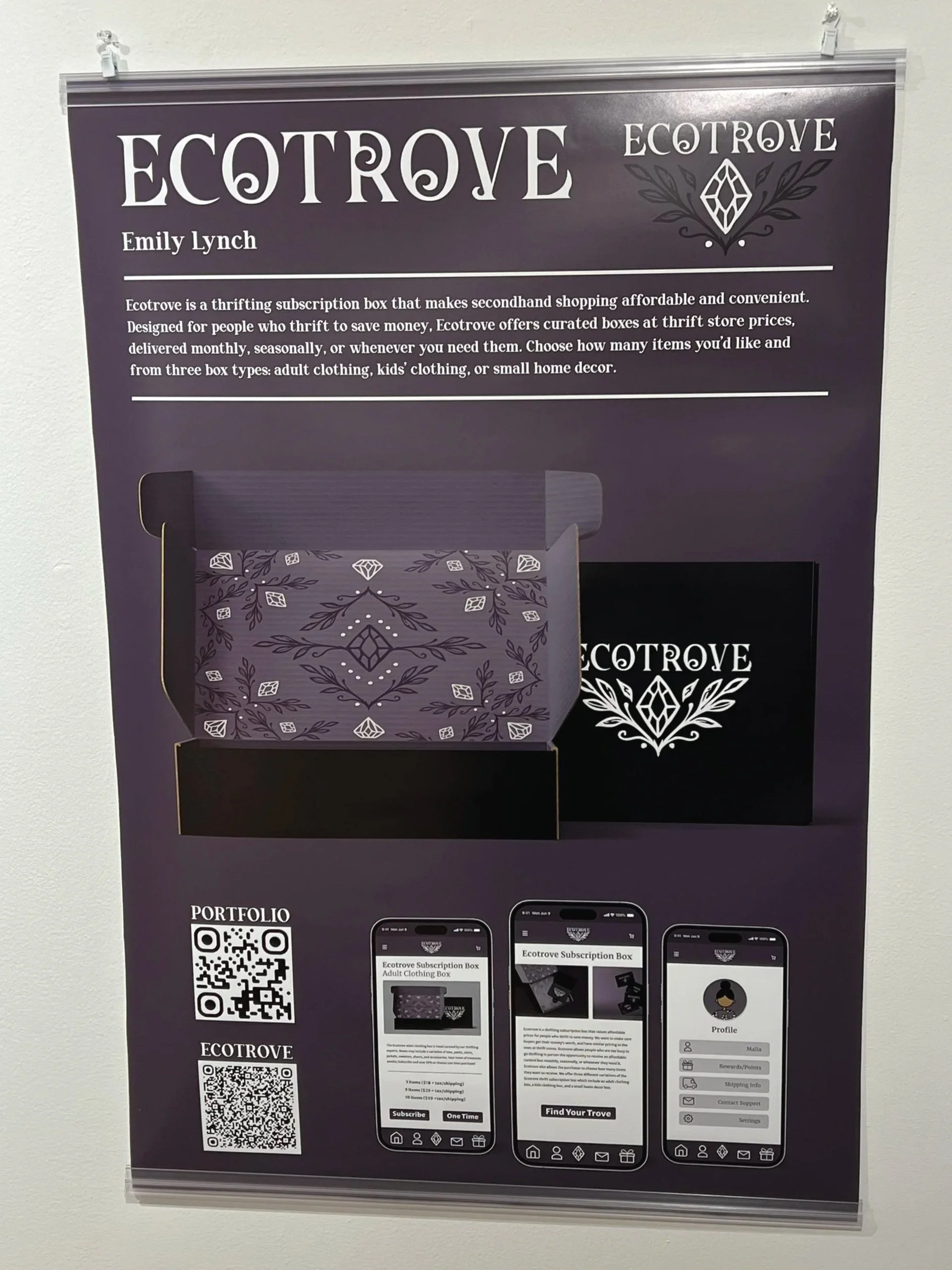
The final box was printed and assembled for my Senior Expo presentation, complete with a handmade wax-seal-style sticker, a printed thank-you card, and real curated clothing items inside. Ecotrove was exhibited at Farmingdale State College's Visual Communications Senior Expo alongside the printed book, app prototype, and branded merchandise, with a printed poster summarizing the project accompanying the physical display.

Promotional Products
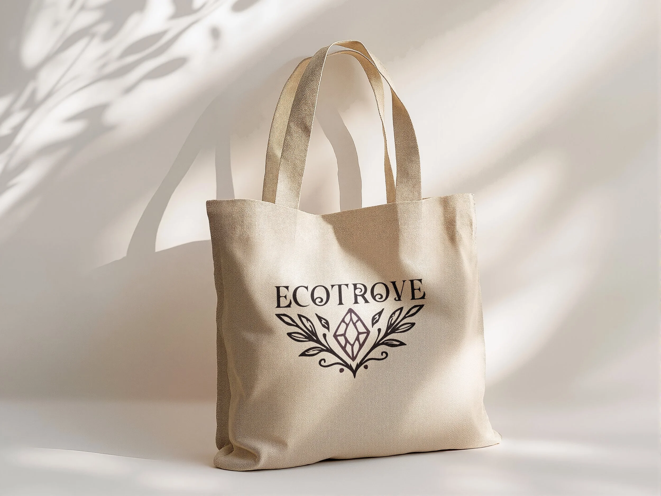
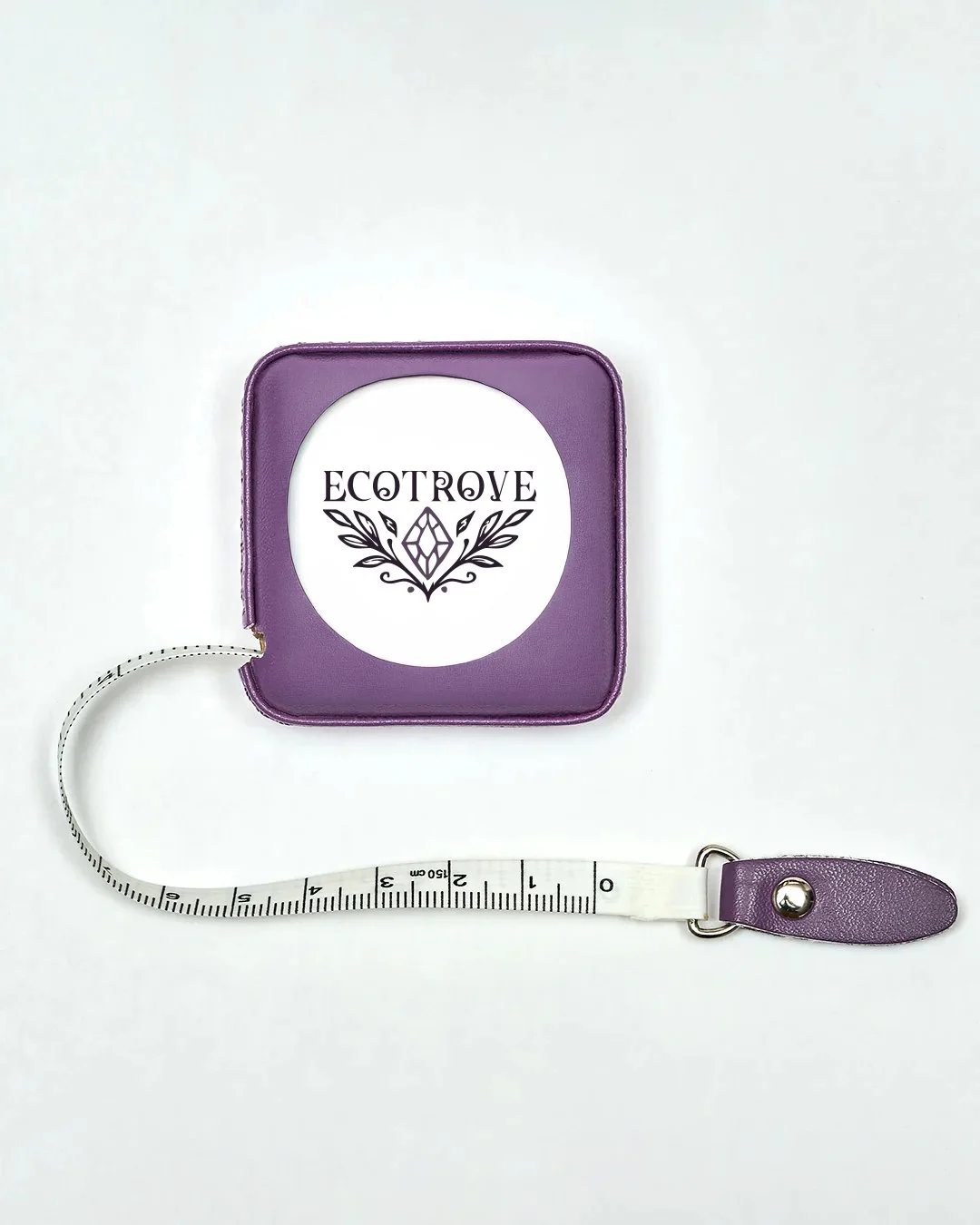
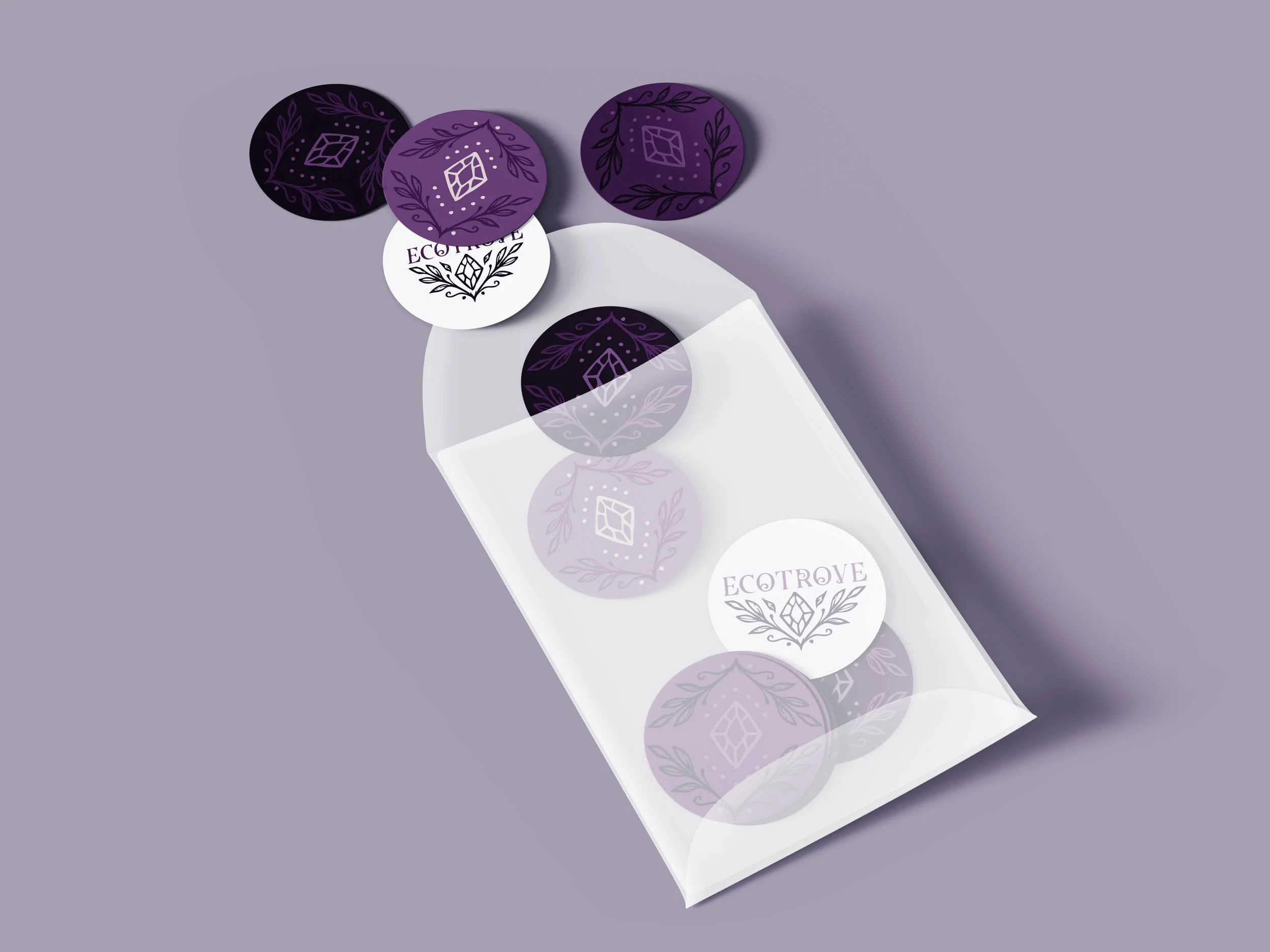
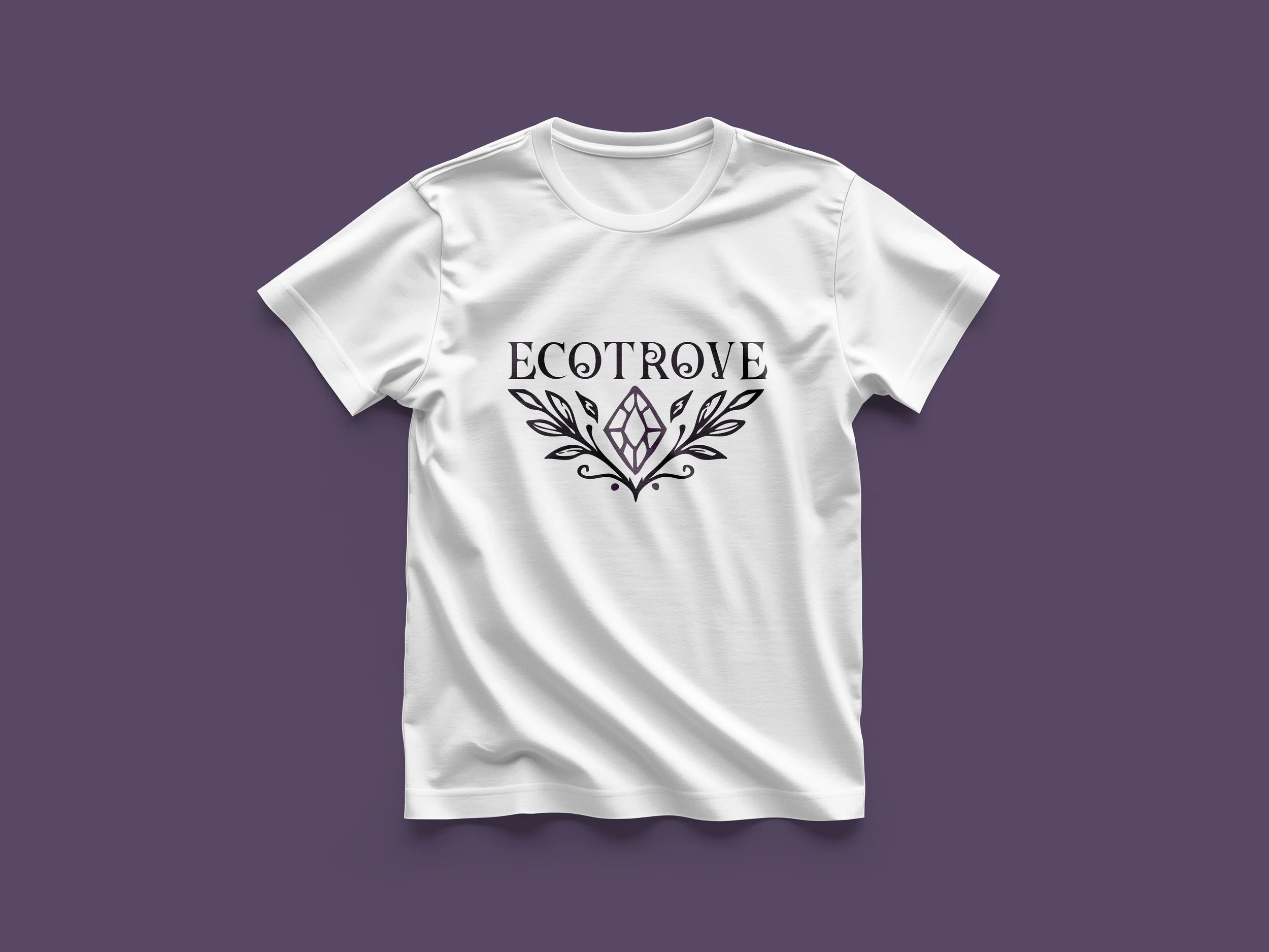
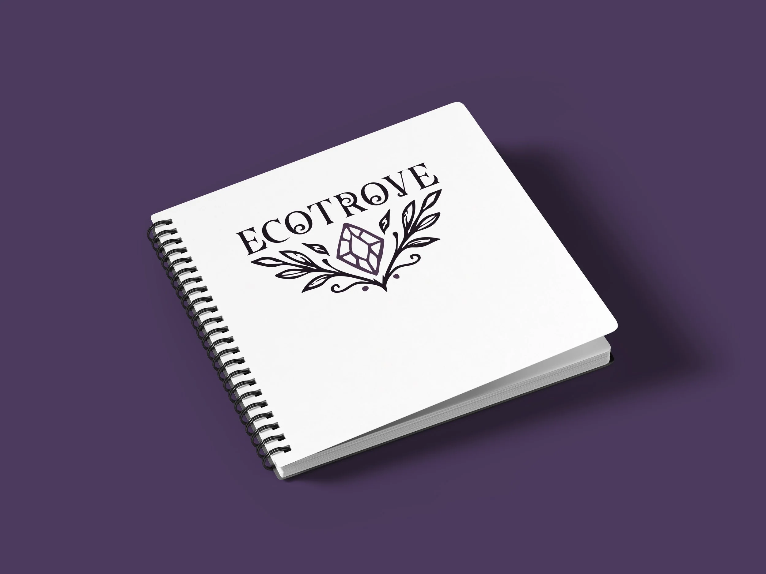
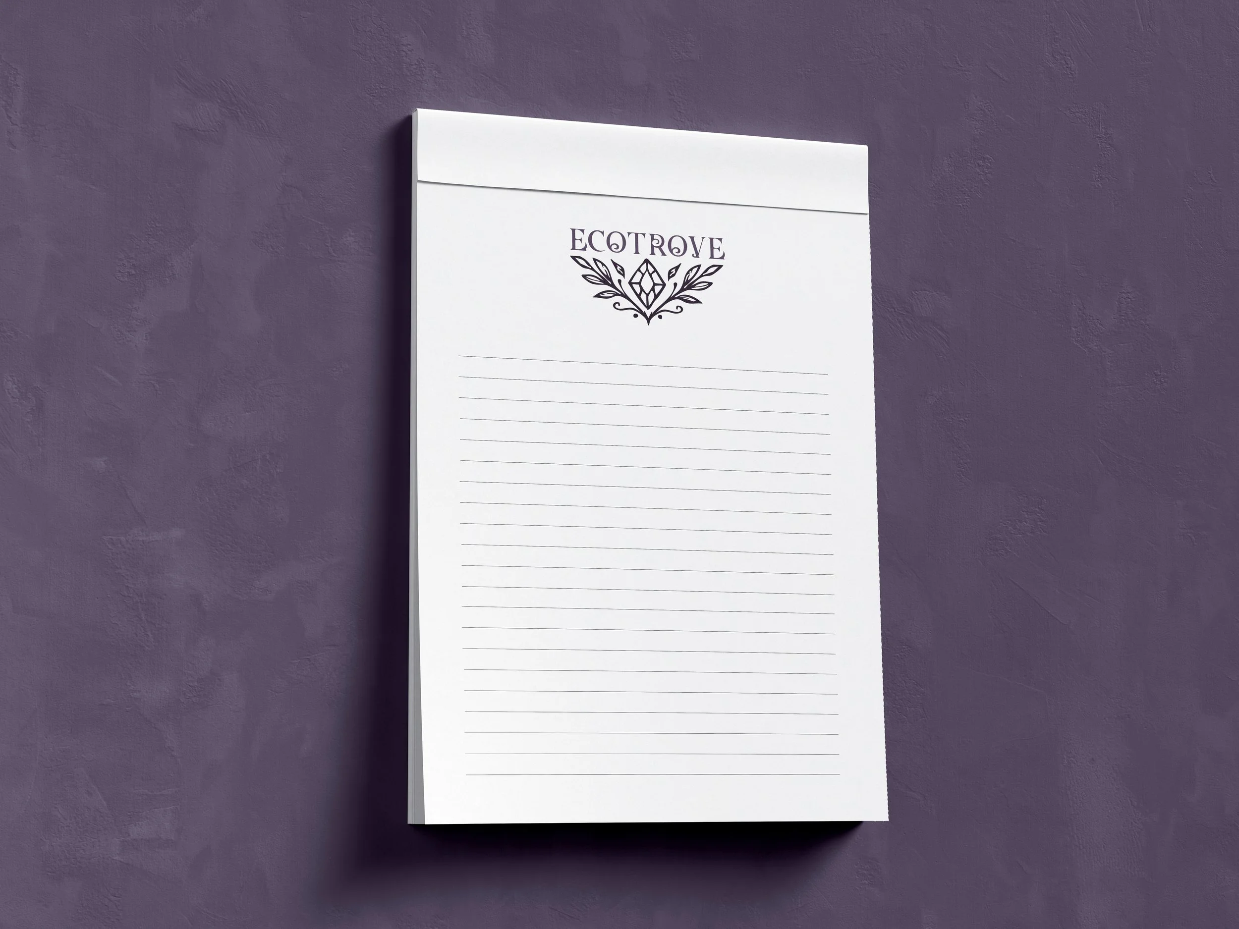
To extend the brand beyond the box itself, I designed a line of Ecotrove merchandise, including a notepad, stickers, a spiral notebook, a t-shirt, and a tape measure, alongside a canvas tote bag, so the identity carries through to everyday items customers might use and share.
Advertising & Brand Collateral
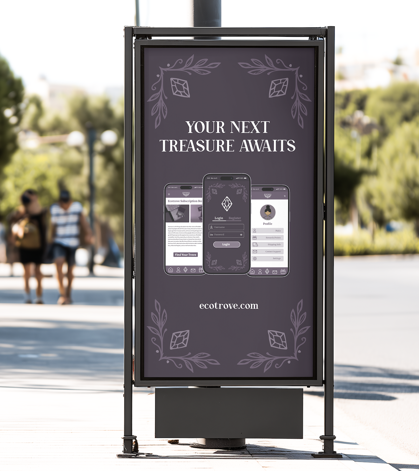
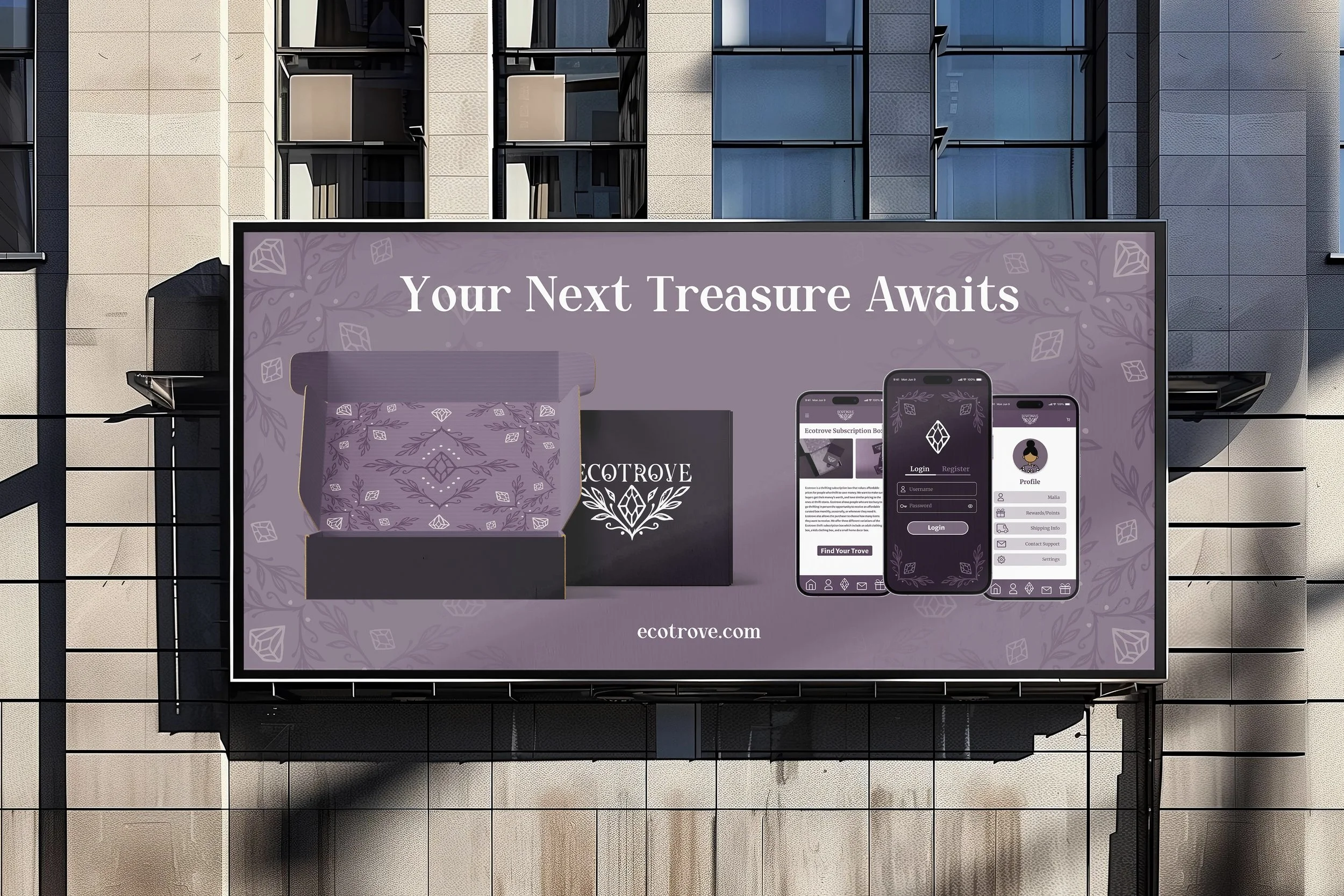
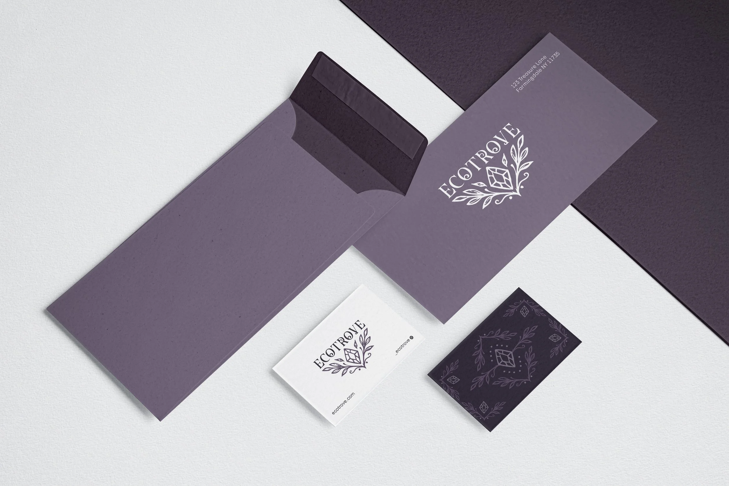
To reach new customers where they already are, I designed out-of-home ads for public transit and city streets, leading with the tagline "Your Next Treasure Awaits" to catch the eye of anyone scrolling past on a commute or waiting at a bus stop. Branded business cards and envelopes round out the stationery suite, keeping the same diamond-and-leaf pattern and wordmark consistent across every piece of written correspondence.
Project Reflection
Ecotrove gave me the chance to work across nearly every stage of the design process: developing personas and competitive research, building a full brand identity system, designing packaging from concept through production-ready dielines, prototyping an app in Figma, and laying out a 38-page brand book in InDesign.
More than any single skill, this project taught me how to turn a personal story into something real. What started as an idea inspired by my step mom's generosity became a finished product I could hold, present, and share at my Senior Expo, proof that thoughtful design can come from genuinely caring about the people it's meant to help.
You can explore the full brand book and try the app prototype using the links below.