


Auteur Film Festival
Advertising & Campaigns • UX/UI & Digital • Print Production
Ingmar Bergman: The Complete Canon, a multi-channel advertising campaign designed to introduce a newer generation to the cinema of legendary Swedish filmmaker Ingmar Bergman. The campaign promotes a summer 2028 film festival through magazine advertising, mobile and tablet interstitials, an Instagram carousel, and large-format urban transit panels.
The goal was to make Bergman’s classic black-and-white cinema feel immediate, contemporary, and worth experiencing on the big screen. Across every format, the campaign balances two objectives: driving ticket interest among younger moviegoers while also presenting the festival as a valuable cultural opportunity for sponsors and partners.
Auteur Film Festival is built around a simple idea: cinematic history should feel alive, not distant. The campaign repositions Bergman’s work for modern audiences by pairing archival black-and-white film imagery with bold typography, dramatic cropping, and a sharp 100% cyan accent.
Branding & Identity
RGB 34, 31, 31
CMYK 0, 9, 9, 87
HEX #221F1F
PMS Black C
Black
RGB 64, 64, 64
CMYK 0, 0, 0, 75
HEX #404040
PMS Black 7 C
Dark Gray
RGB 218, 218, 218
CMYK 0, 0, 0, 15
HEX #DADADA
PMS Cool Gray 1 C
Light Gray
RGB 0, 255, 255
CMYK 100, 0, 0, 0
HEX #00FFFF
PMS Process Cyan C
Cyan
RGB 255, 255, 255
CMYK 0, 0, 0, 0
HEX #ffffff
PMS P 1-1 C
White
Every piece in the campaign shares one visual language: high-contrast black-and-white photography, bold editorial typography, and a restrained palette interrupted by 100% cyan. The system references Bergman’s classic cinematography while giving each placement a more contemporary advertising presence, using scale, contrast, and strong hierarchy to make the films feel relevant to a new generation of viewers.
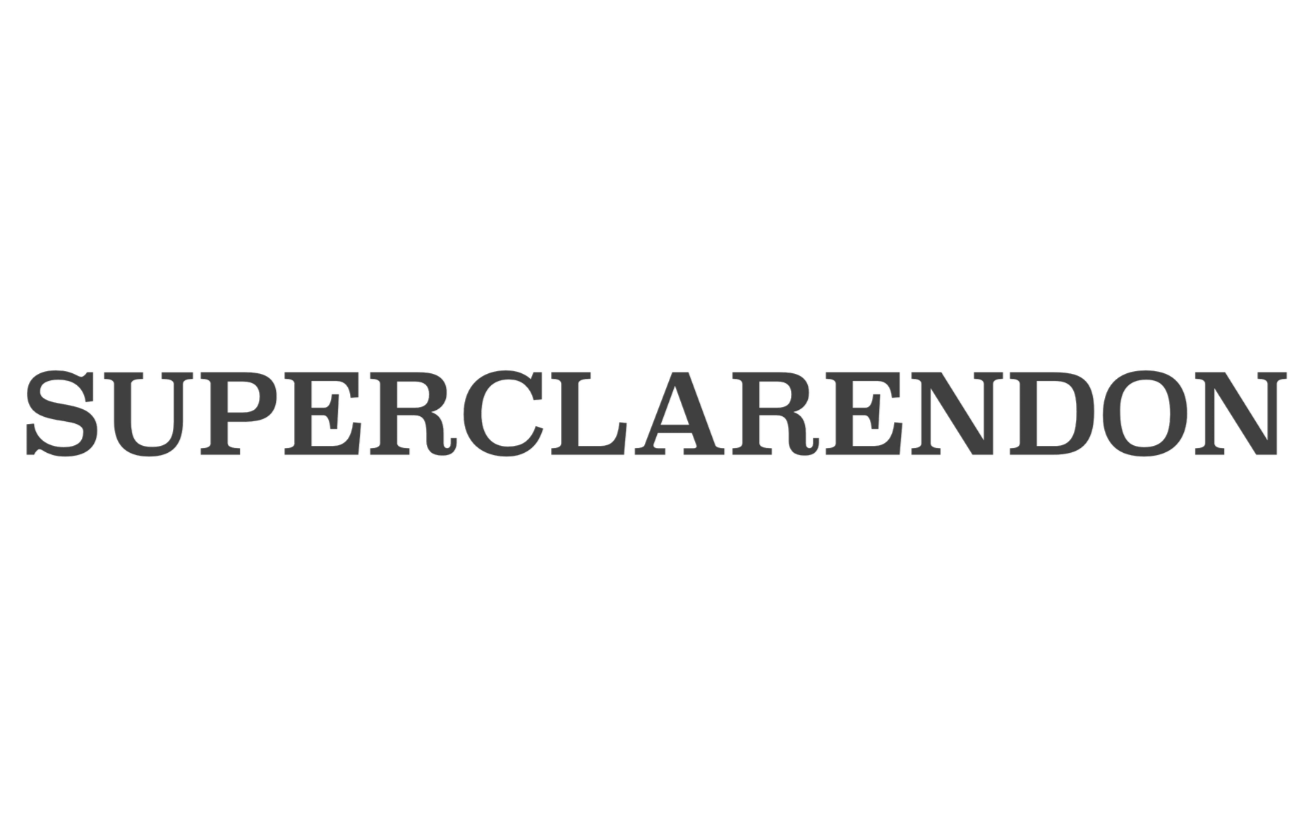
Primary Typeface
Titles and Headlines (Regular Caps)
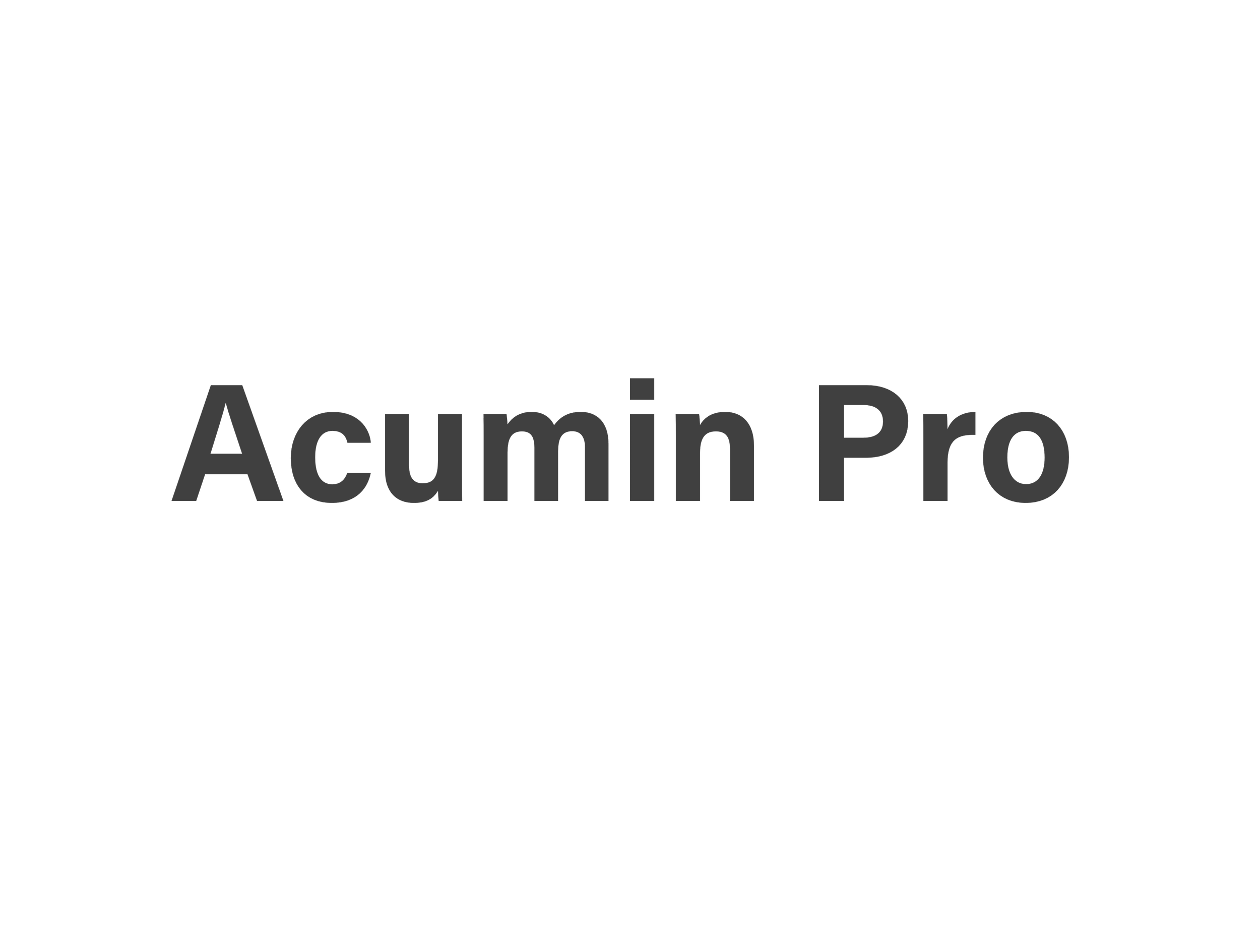
Secondary Typeface
Campaign Copy and Supporting Details (Bold)

Magazine Advertising
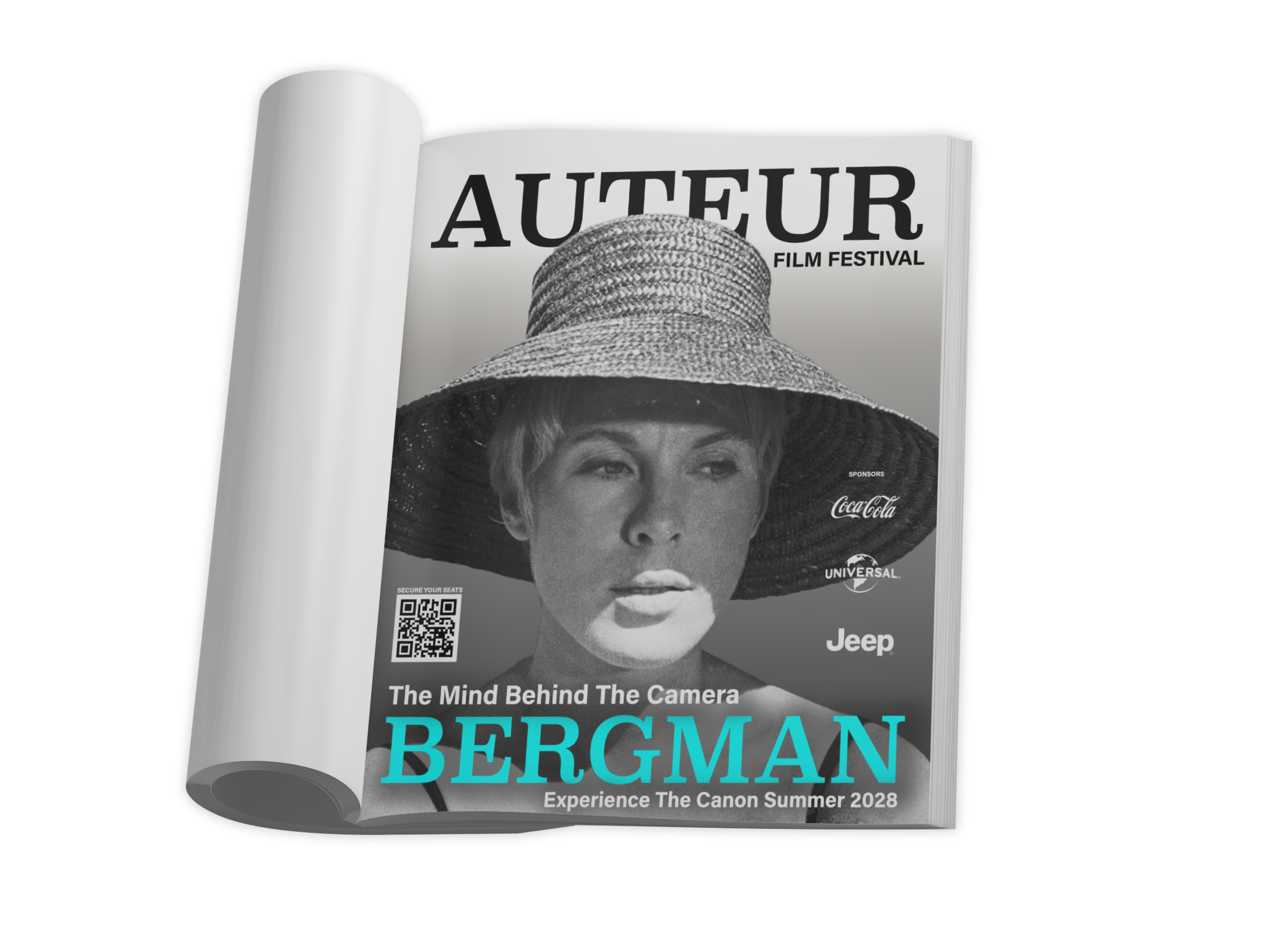
The print campaign is split into two audience directions: sponsor facing B2B advertising and consumer facing ticket promotion. Both sets use the same cinematic visual system, but the messaging changes depending on who the ad is speaking to.
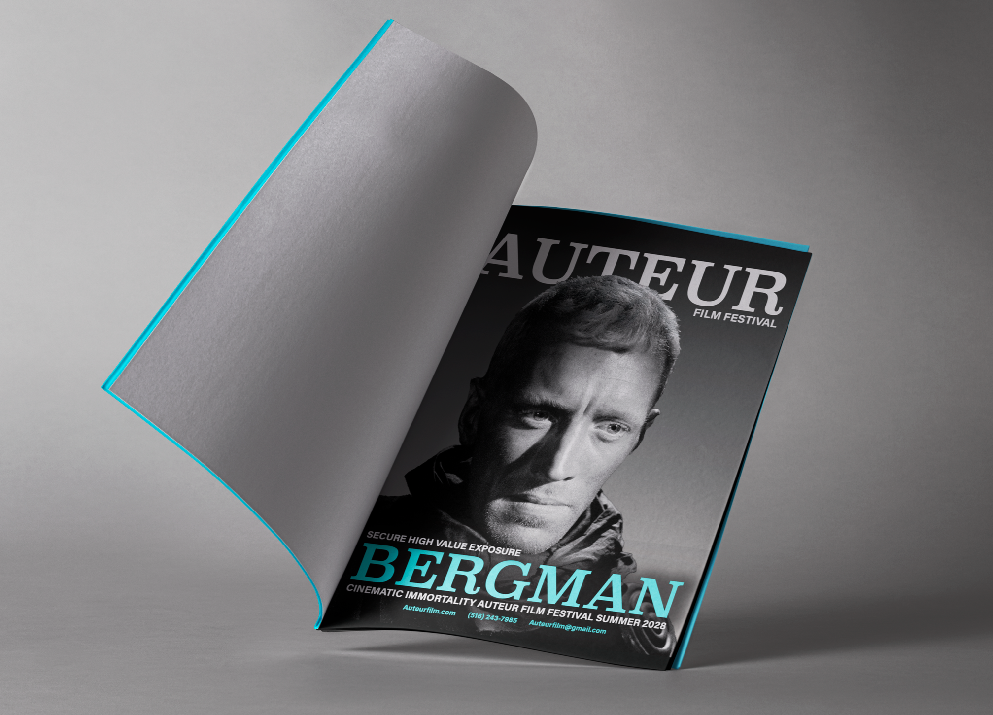
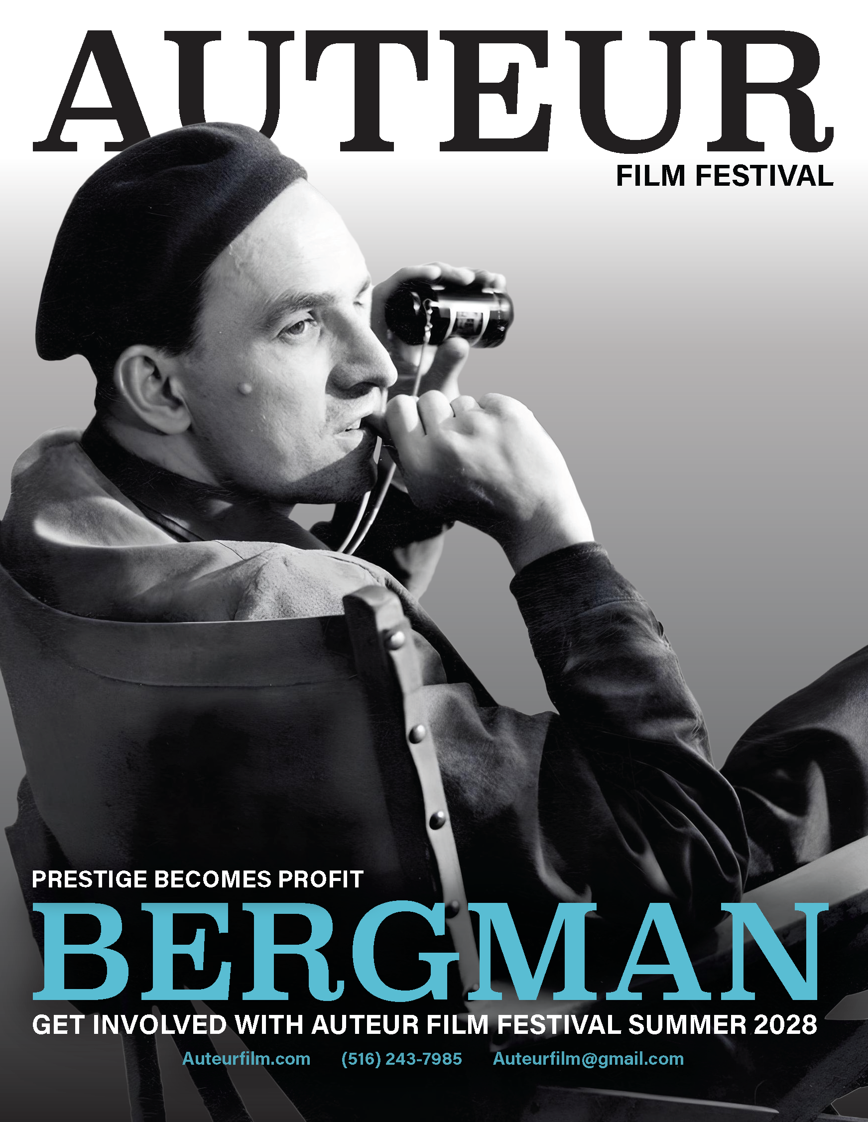
The B2B magazine ads position Auteur Film Festival as a high value sponsorship opportunity. These ads speak to sponsors and partners by emphasizing cultural relevance, audience exposure, and the prestige of supporting a festival centered on one of cinema’s most influential directors.
The “Prestige Becomes Profit” and “Secure High Value Exposure” ads use severe portraiture, large-scale typography, and direct sponsor-oriented messaging to make the festival feel valuable from a business and brand visibility perspective.
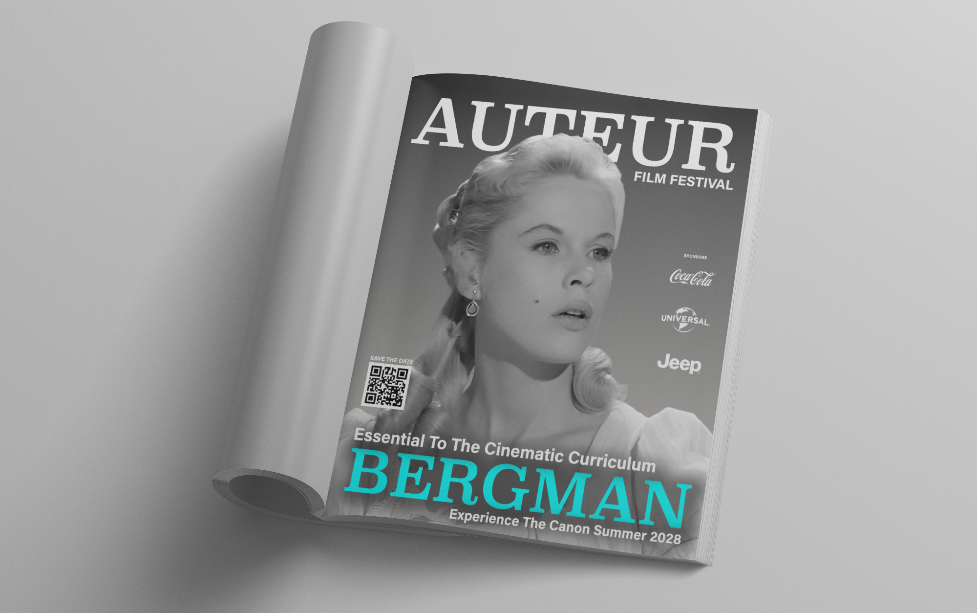
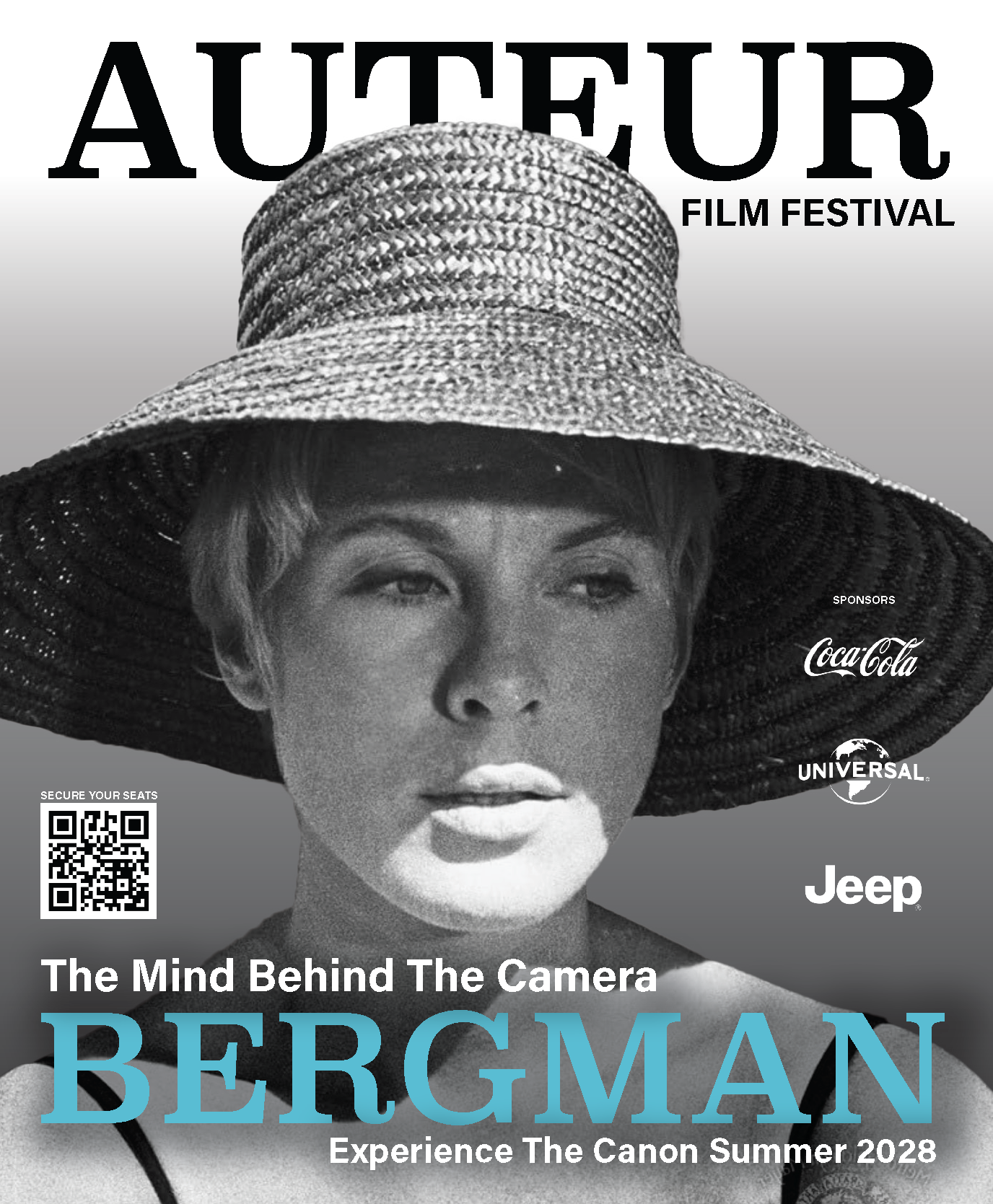
The consumer magazine ads shift the campaign toward ticket buyers. These pieces invite viewers to experience Bergman’s films on the big screen, using warmer portrait choices, QR-code calls to action, and more direct event language such as “Secure Your Seats” and “Save the Date.”
While the B2B ads sell the festival’s value to sponsors, the consumer ads sell the experience itself: The chance to see Bergman’s cinematic canon in a contemporary festival setting.

Interstitial Ads
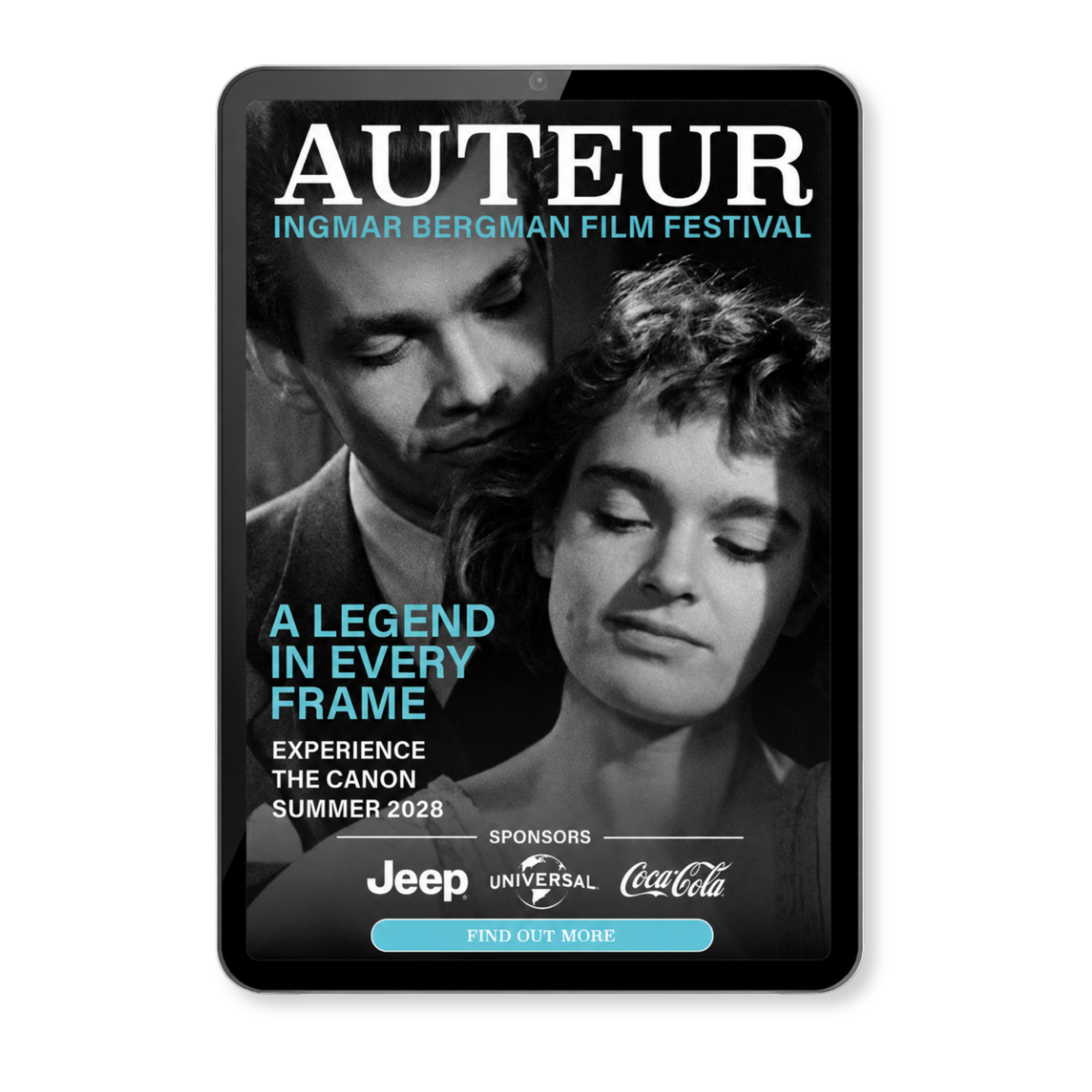
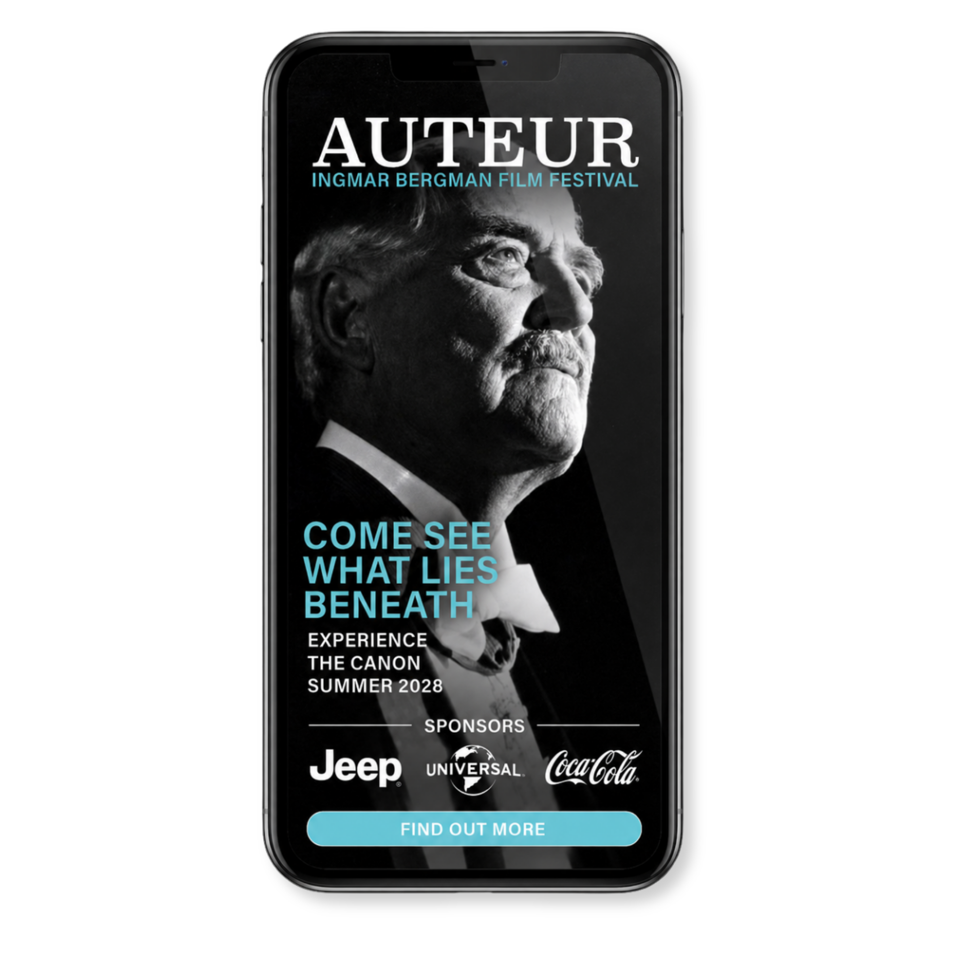
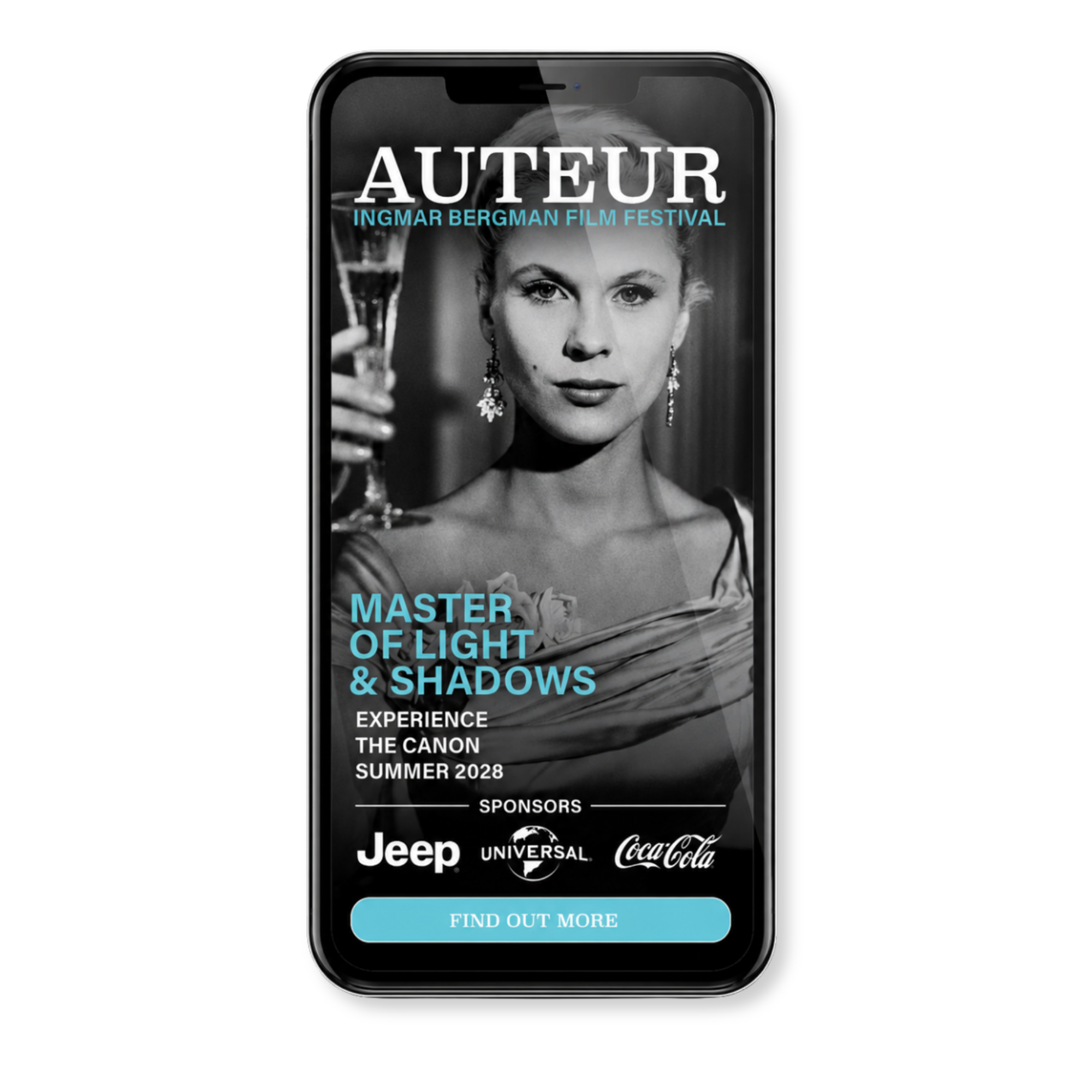
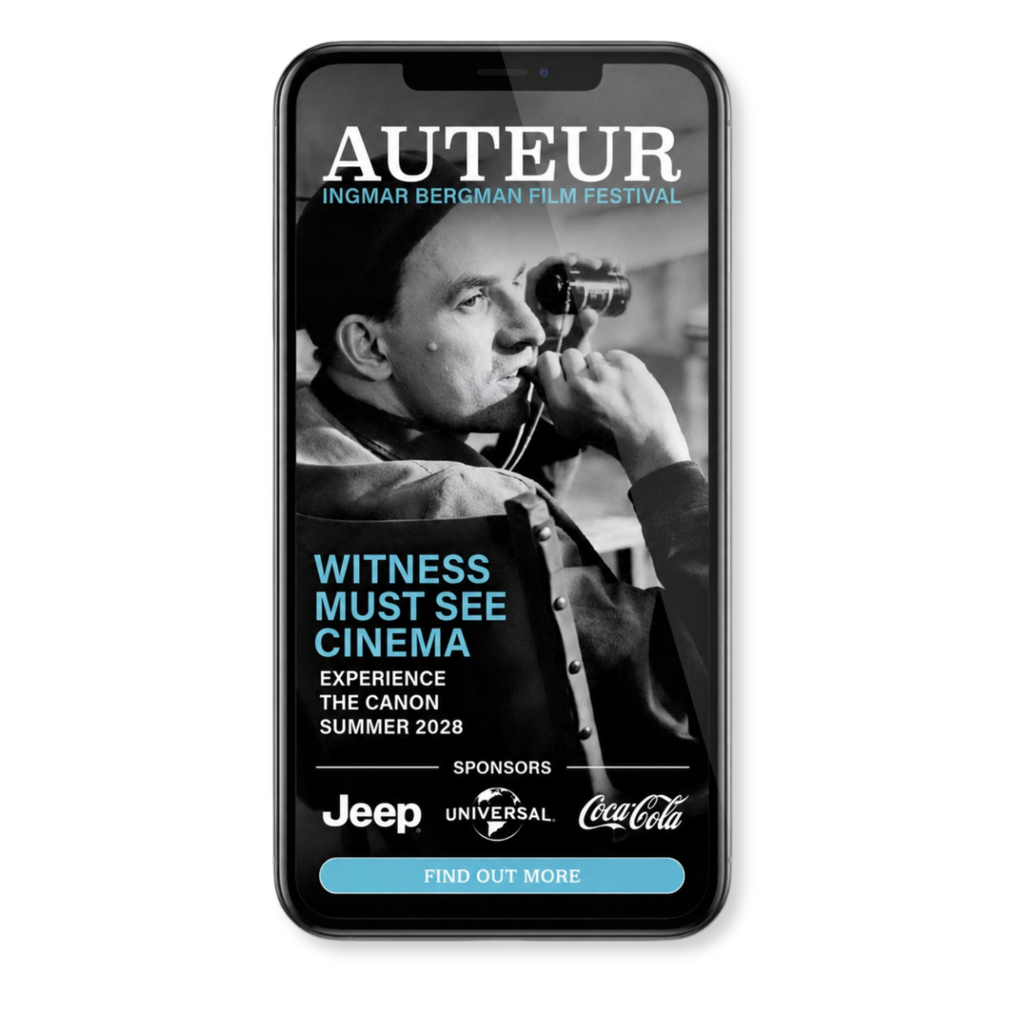
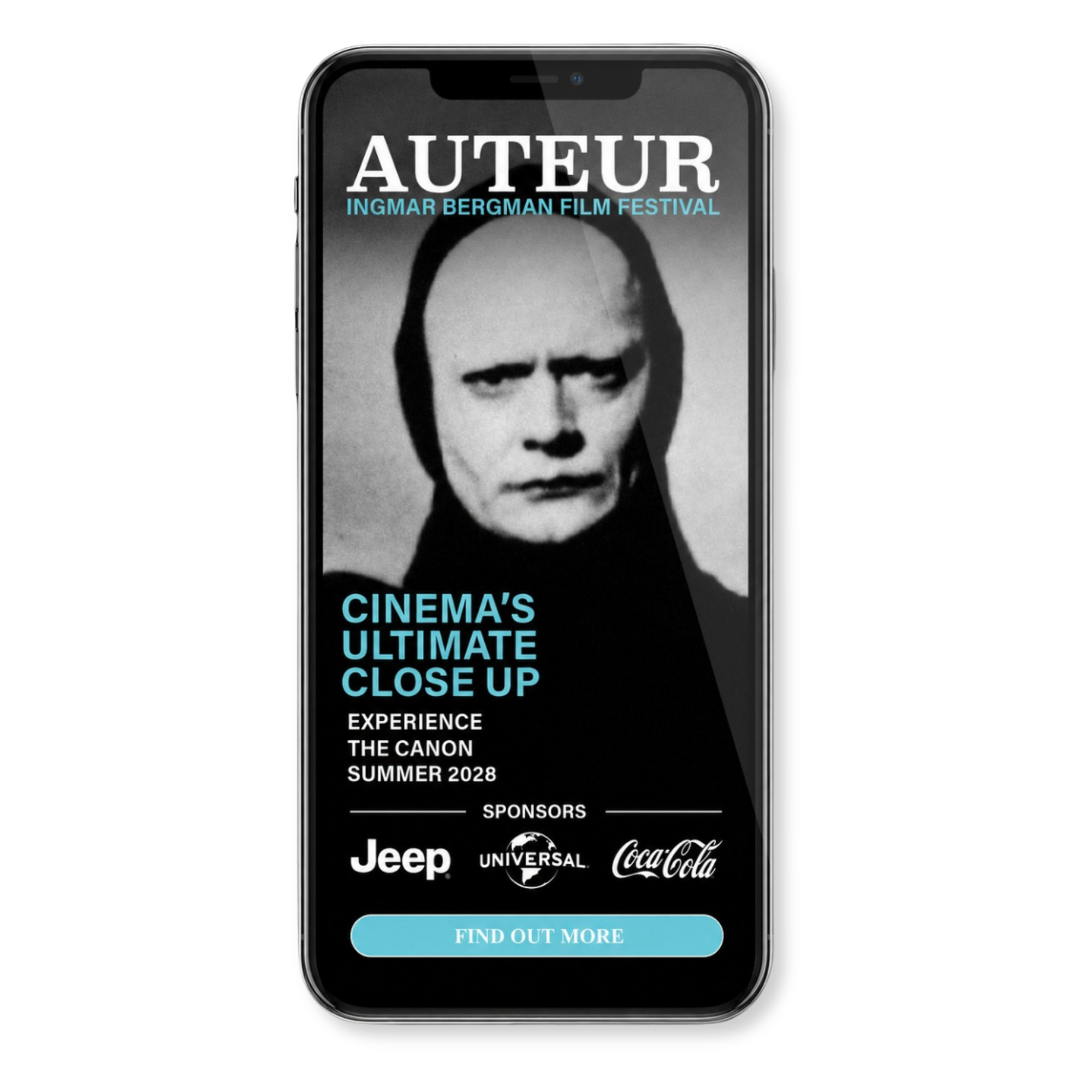
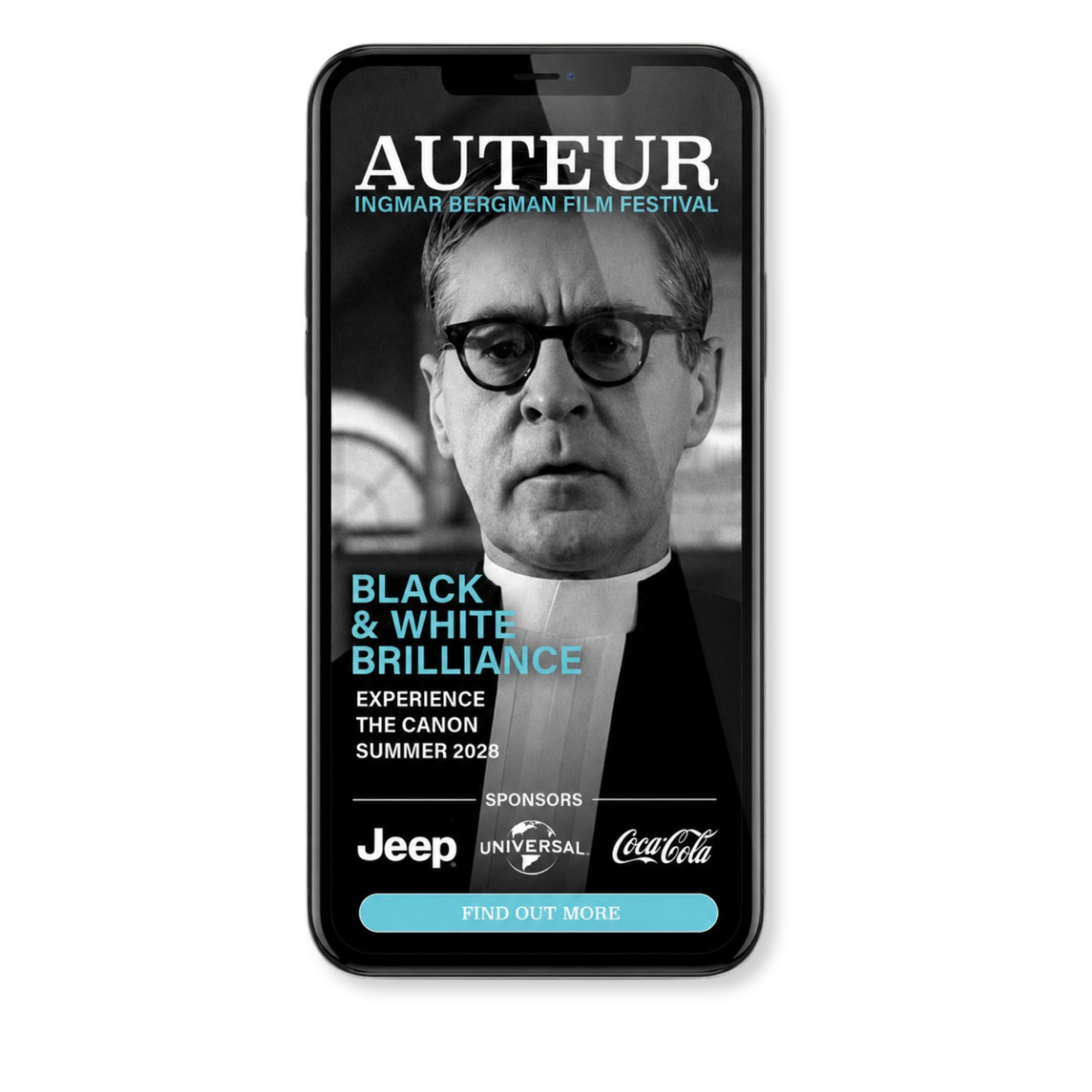
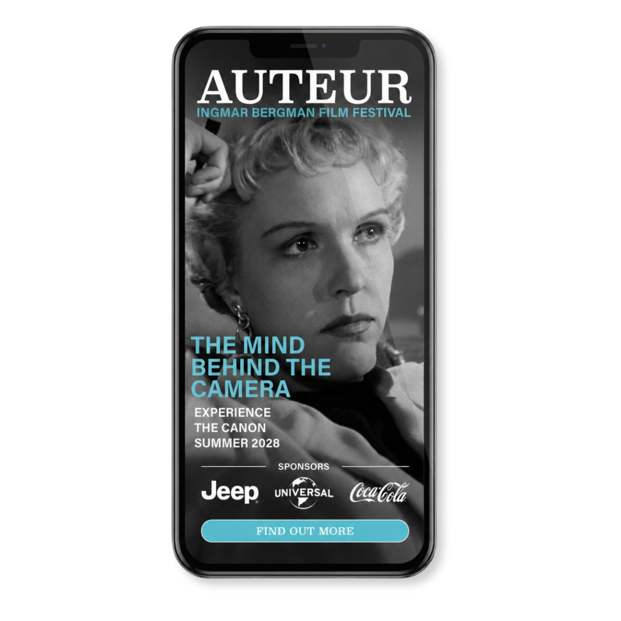
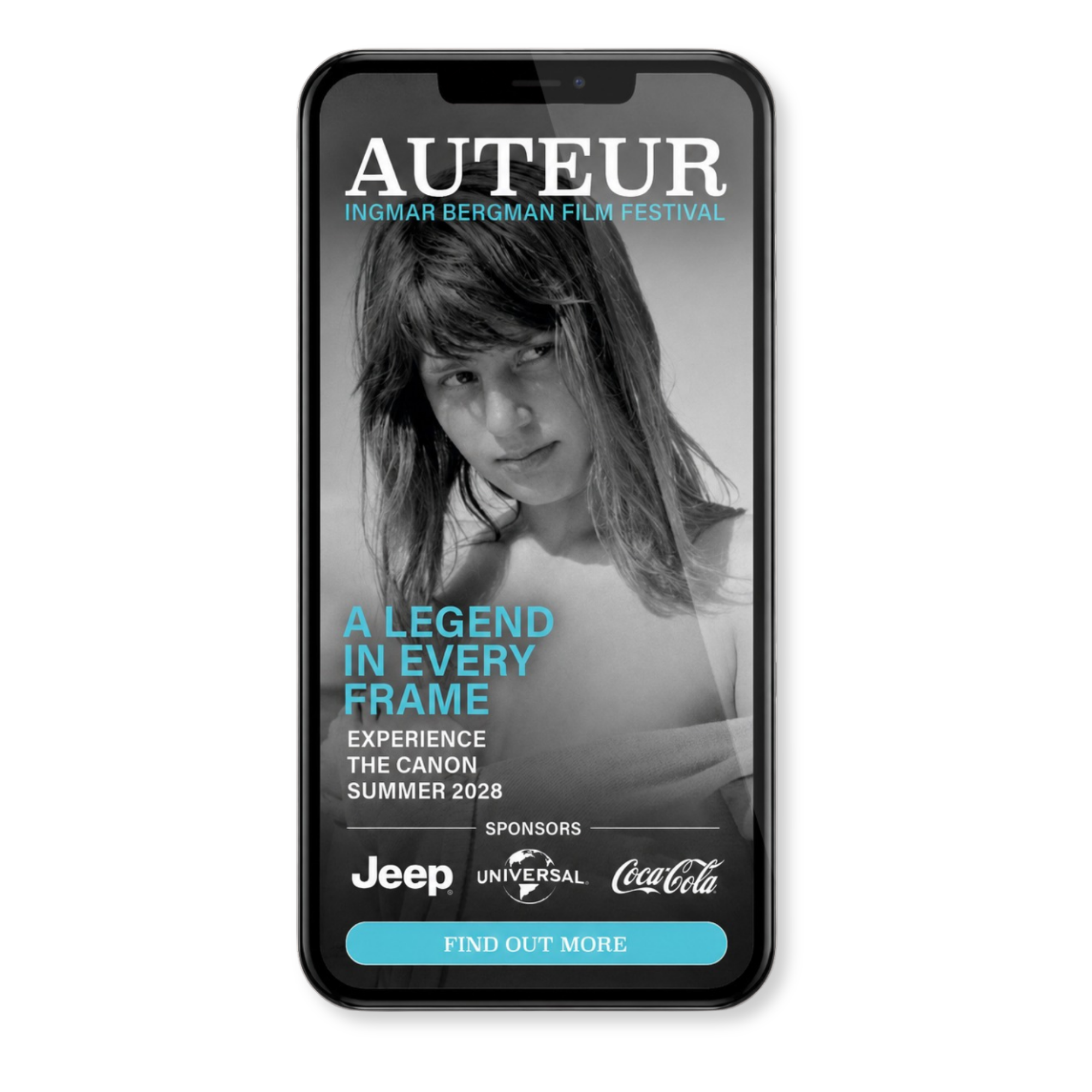
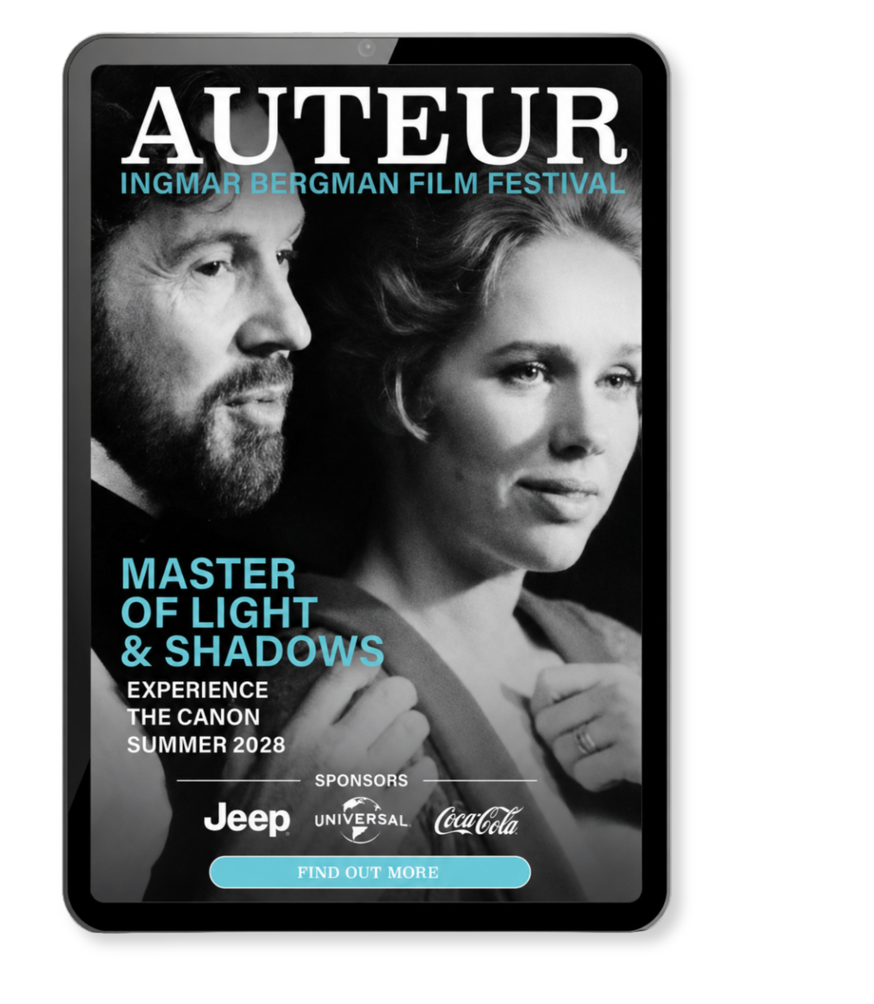
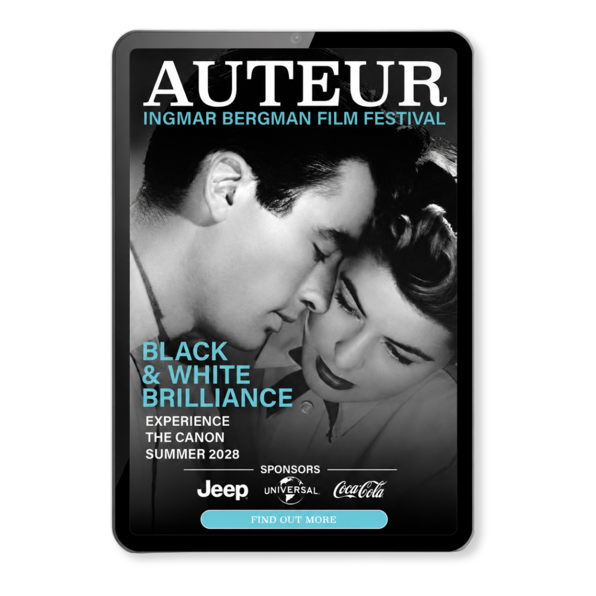
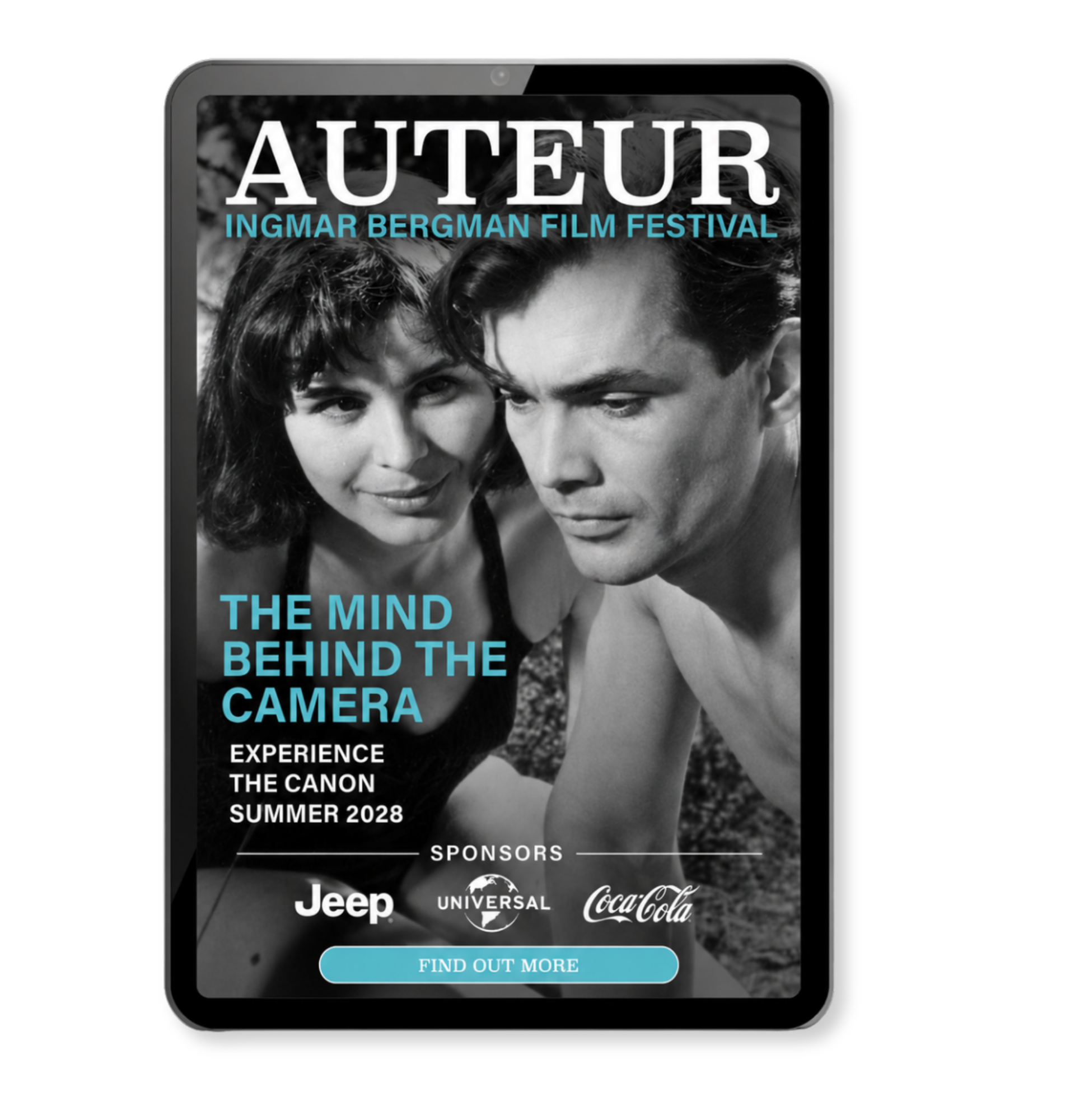
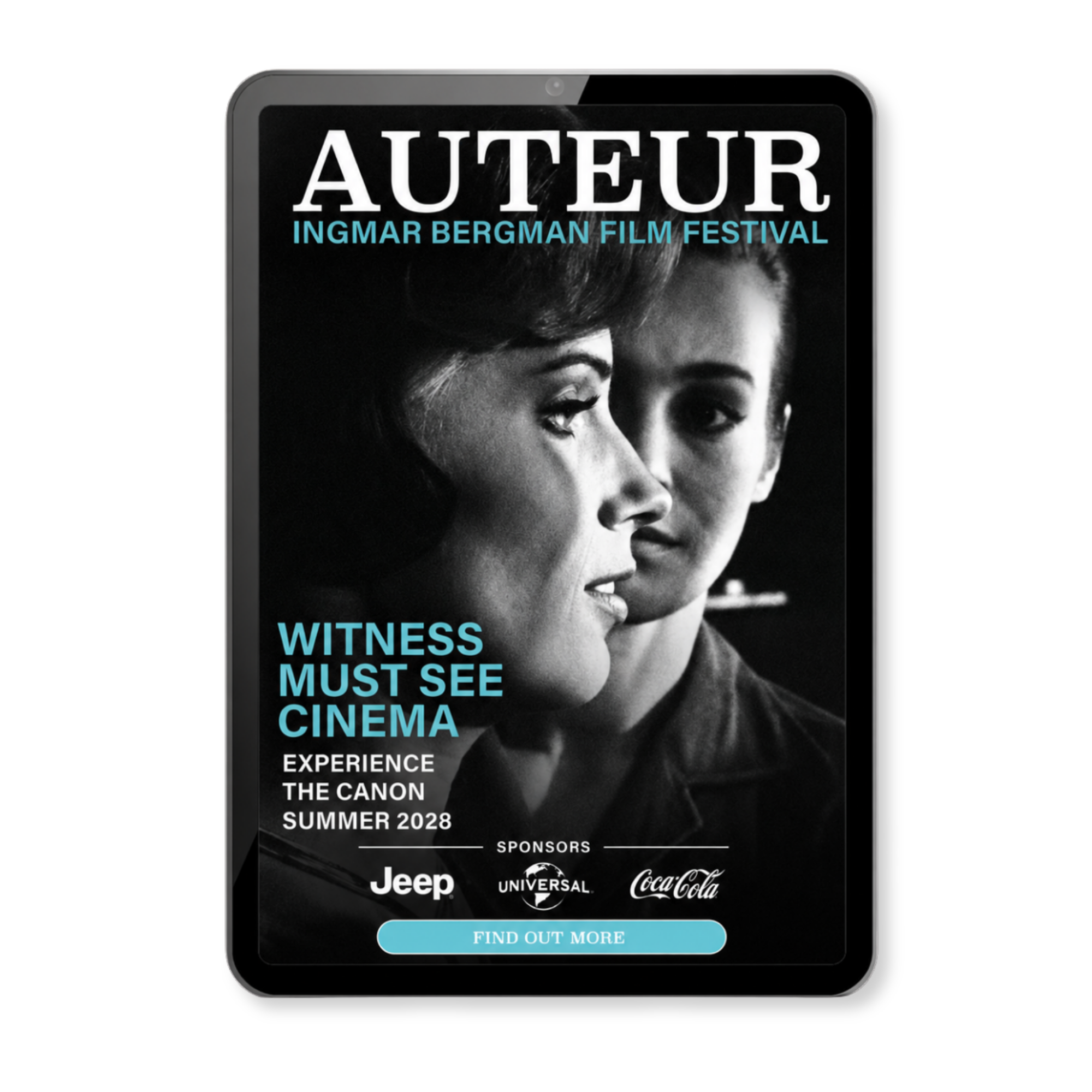
The mobile and tablet interstitials extend the campaign into full-screen digital advertising. Designed for mobile and tablet formats, these ads use dramatic black-and-white portraits and film stills, sponsor logos, short taglines, and a clear “Find Out More” call to action.
Because interstitial ads interrupt the viewer’s screen, the layouts rely on strong contrast, large type, and quick-read messaging. Phrases like “The Mind Behind the Camera,” “Black & White Brilliance,” “A Legend in Every Frame,” and “Master of Light & Shadows” turn the campaign’s cinematic tone into short, memorable digital moments.
Instagram Carousel
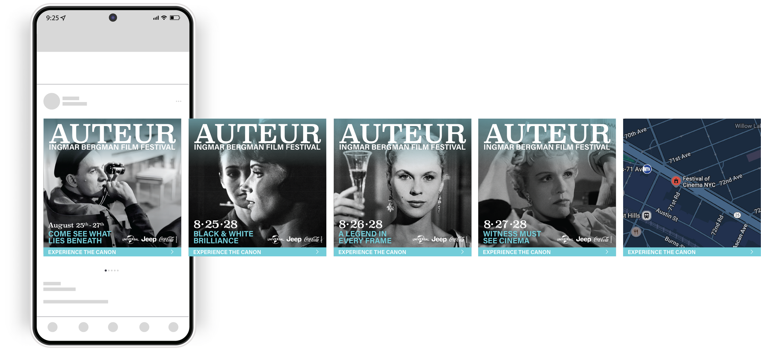
The Instagram carousel adapts the campaign into a swipeable social format. Each square frame continues the black-and-white cinematic style while using a repeated AUTEUR header, sponsor placement, event dates, and concise promotional taglines.
The carousel builds momentum from frame to frame with lines such as “Come See What Lies Beneath,” “Black & White Brilliance,” “A Legend in Every Frame,” and “Witness Must See Cinema.” Together, the slides function as both a teaser and a schedule-based reminder for the festival dates.

Urban Transit Panels
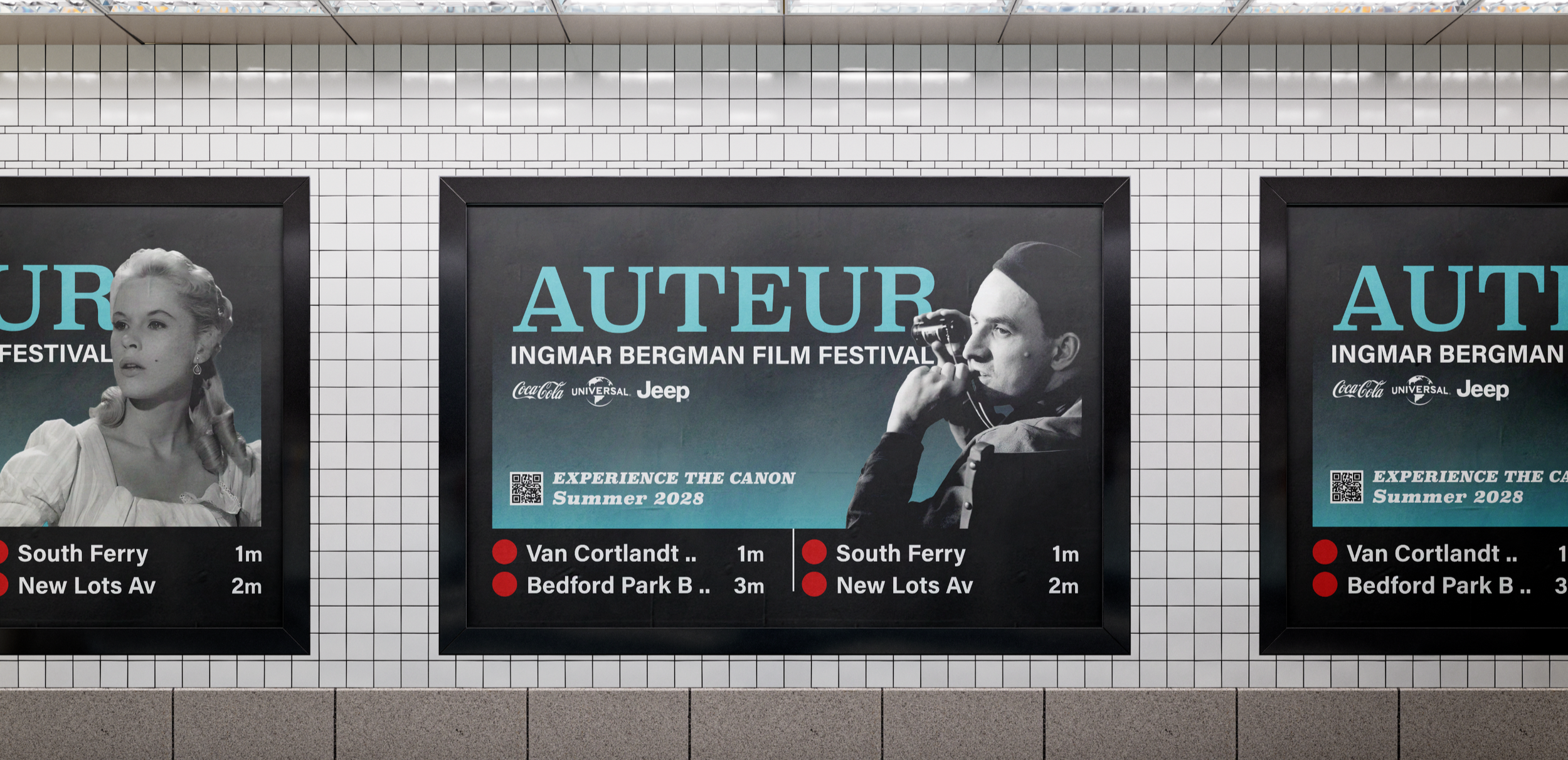
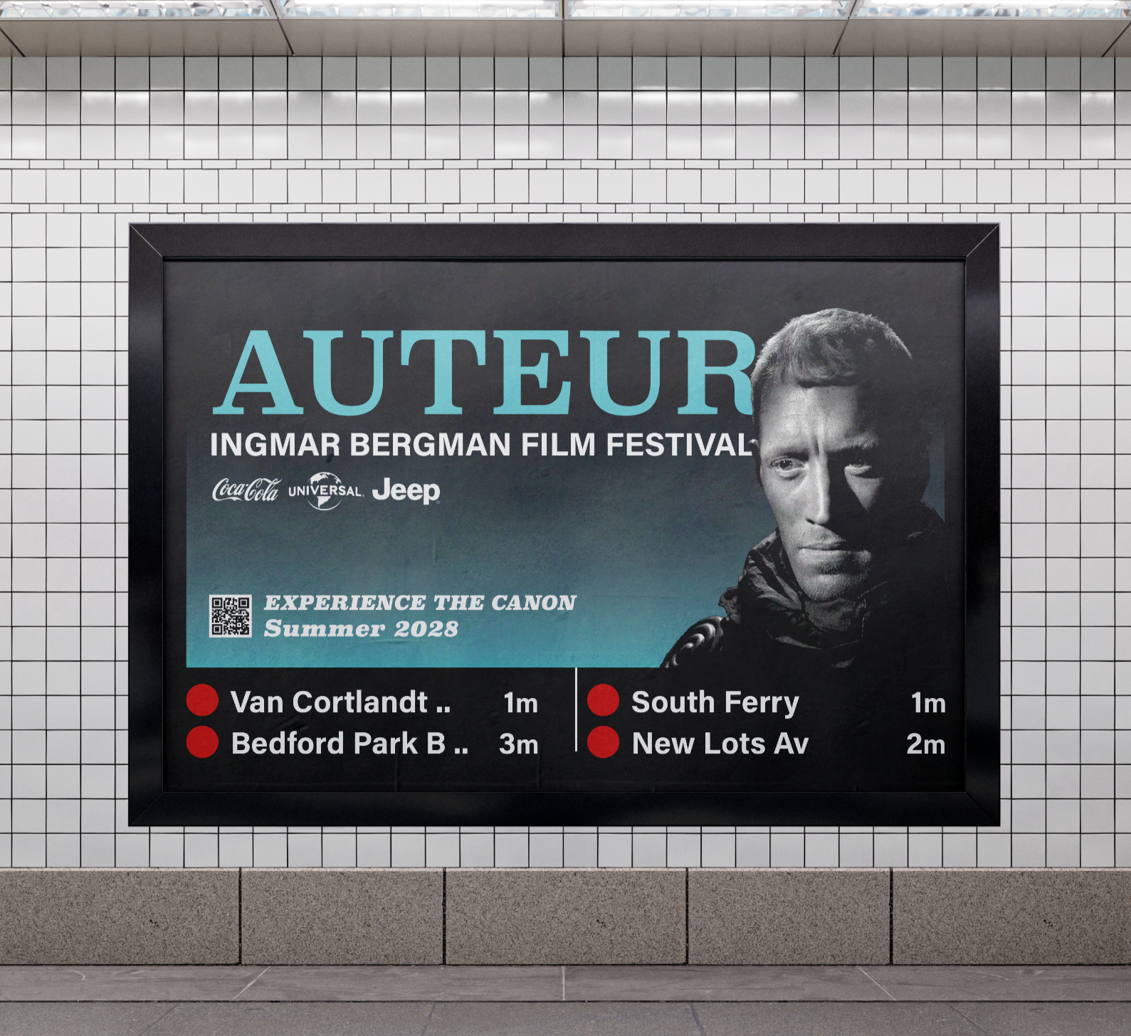
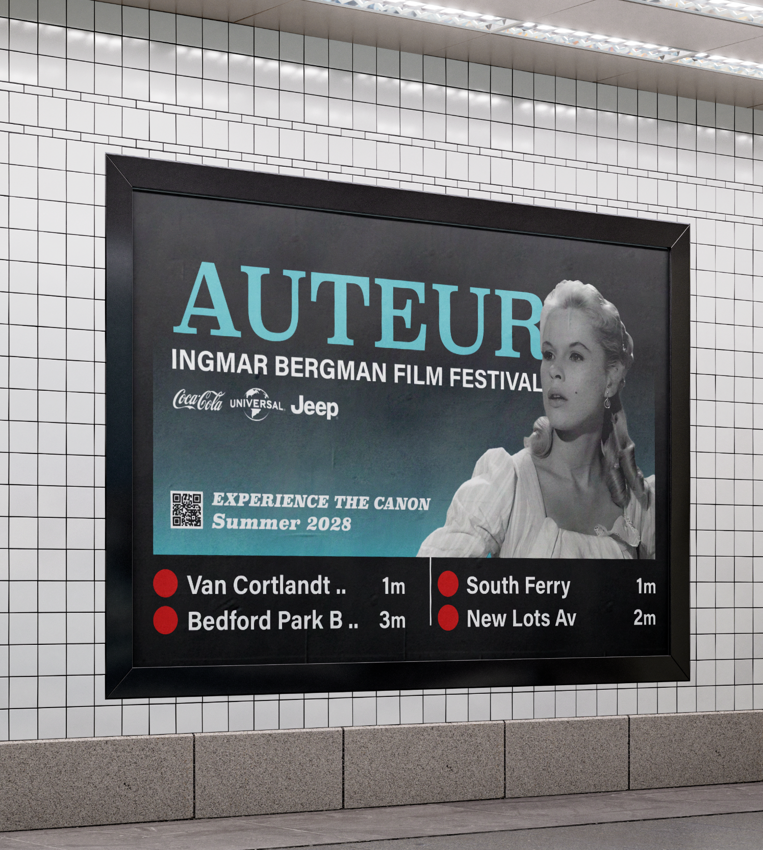
The urban transit panels bring the campaign into high-traffic subway environments. These large-format digital panels combine cinematic portraiture, the AUTEUR festival identity, sponsor logos, and a realistic subway arrival board.
By placing the invitation to “Experience the Canon” directly beside live arrival-style information, the design makes the festival feel integrated into the daily commute. The panels turn a routine transit moment into a cinematic invitation, meeting potential audiences where they already are.

Background Research
Auteur Film Festival targets newer generations, especially audiences ages 18 to 35, who may recognize Bergman’s name but have never experienced his films in a theater. The campaign speaks to viewers who are culturally curious but may feel disconnected from older black-and-white cinema.
The project also responds to several barriers: Bergman’s films can be perceived as depressing, some younger viewers may resist black-and-white films, and Swedish-language subtitles may feel like an obstacle. The campaign addresses those hesitations by making the work feel bold, stylish, accessible, and event-worthy.
Auteur also competes for attention with major film festivals and streaming platforms. Since audiences can easily watch films at home, the campaign needed to make the big-screen festival experience feel special, social, and worth leaving home for.
Project Reflection
This project challenged me to build one consistent campaign system across four very different advertising environments: print, mobile/tablet interstitials, Instagram, and urban transit panels. Each format required its own approach to scale, hierarchy, pacing, and audience behavior while still feeling connected to the same festival identity.
It also required solving two communication problems at once. The B2B ads needed to convince sponsors that the festival offered cultural value and audience reach, while the consumer-facing pieces needed to make a Swedish filmmaker from the 1950s feel exciting, accessible, and worth experiencing on the big screen today.
Through this project, I strengthened my ability to adapt a visual system across multiple formats, build audience-specific messaging, and create advertising that feels both strategic and visually cohesive. A link to the full creative brief is included below for a deeper look at the campaign strategy, research, and project direction.